No projects found.
In 16777216.site pixels behave differently: once a pixel is colored on this online drawing canvas, it is occupied and can never change again. Subsequently, all the 16777216 RGB colors can be drawn once on a single pixel on the 4096x4096 pixel canvas. Programmed by Ingo Valente.
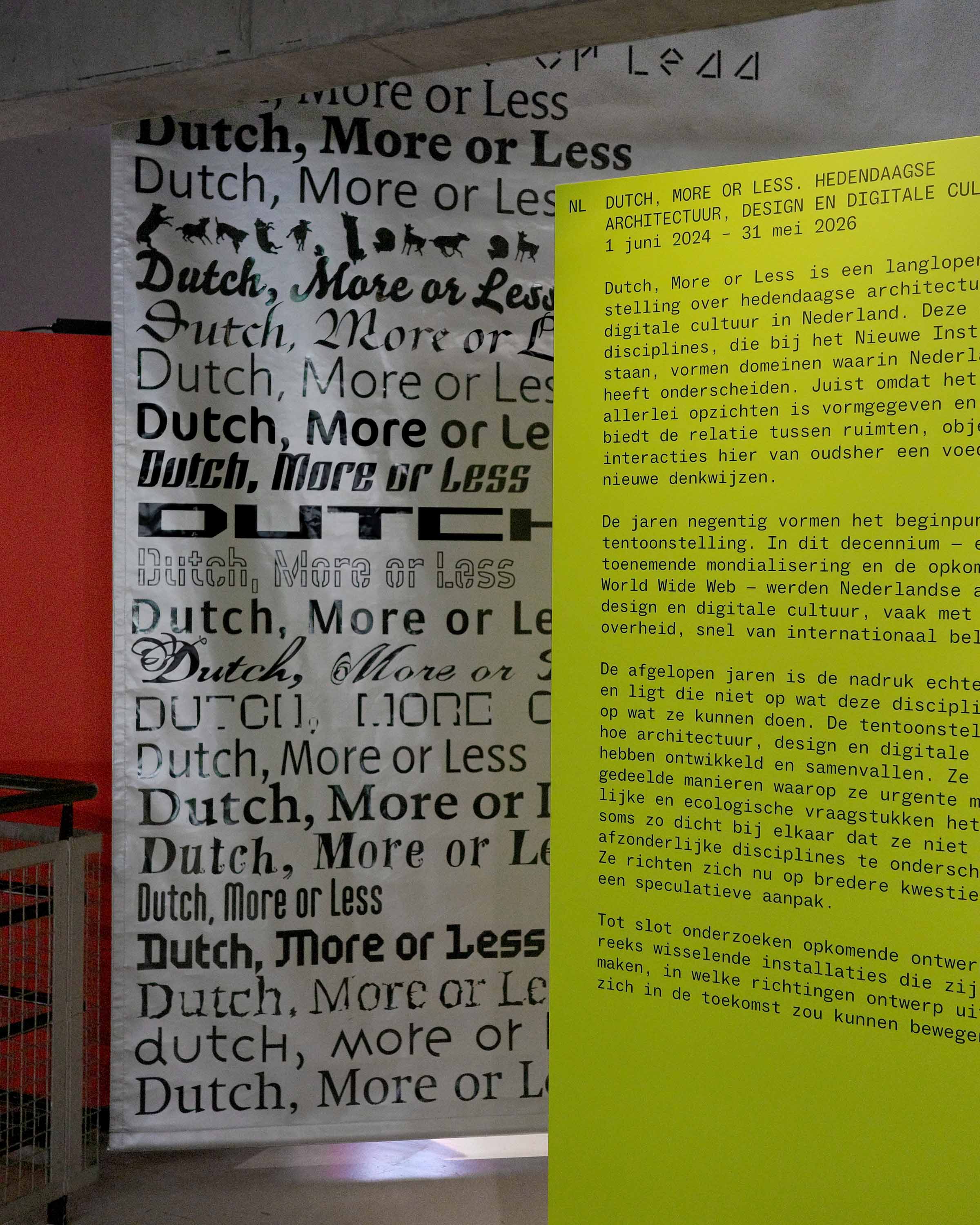
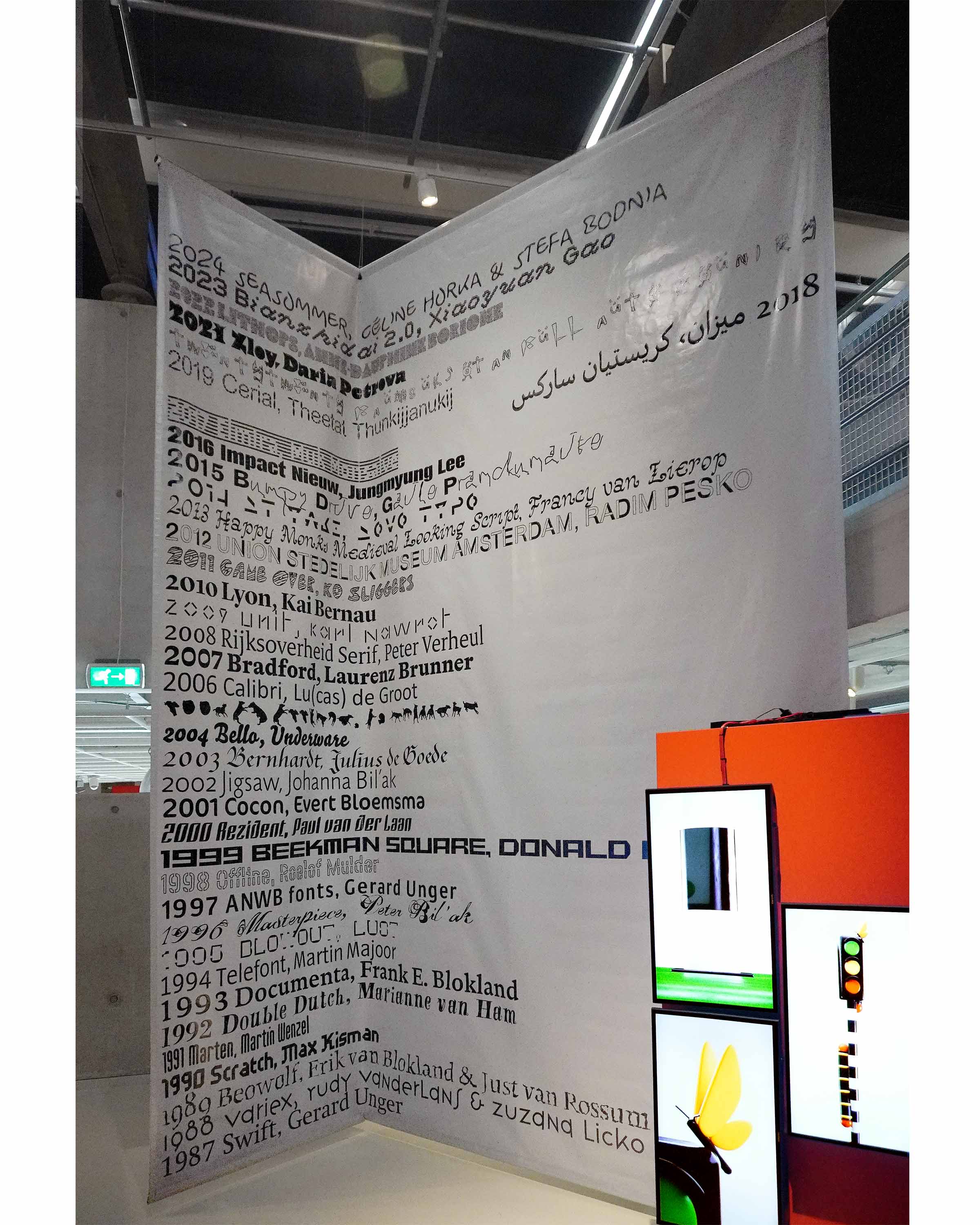
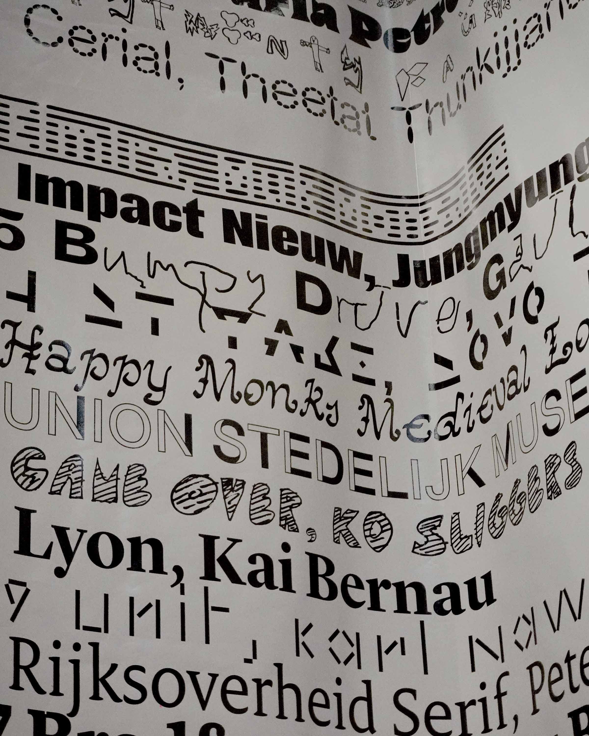
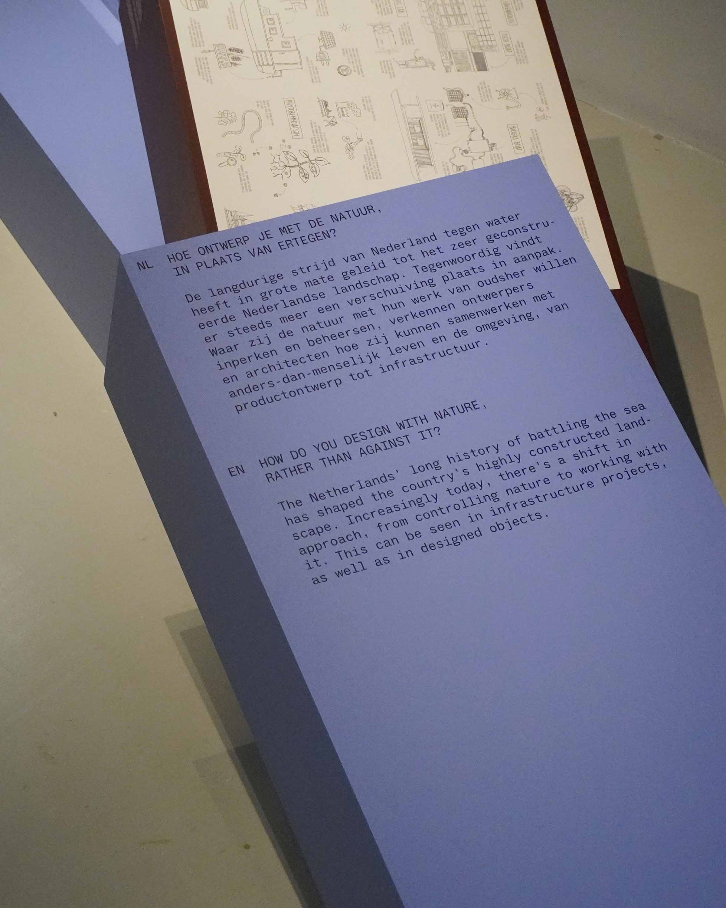
Exhibition graphics for Dutch More or Less, an exhibition showcasing Dutch design from the 90s onward at Nieuwe Instituut. The exhibition graphics are based on a chronology of over 30 years of typefaces created by Dutch and (previously) Dutch-based designers. The timeline covers the chronological span of the exhibition, with each year represented by a different typeface designed in that year. These include institutional, governmental, experimental, artisanal, open source and other designs. The rhythm of the typography throughout the exhibition corresponds to the years in which the works in each section were made. Spatial design of the exhibition was done by Koos Breen and Jeannette Slütter.
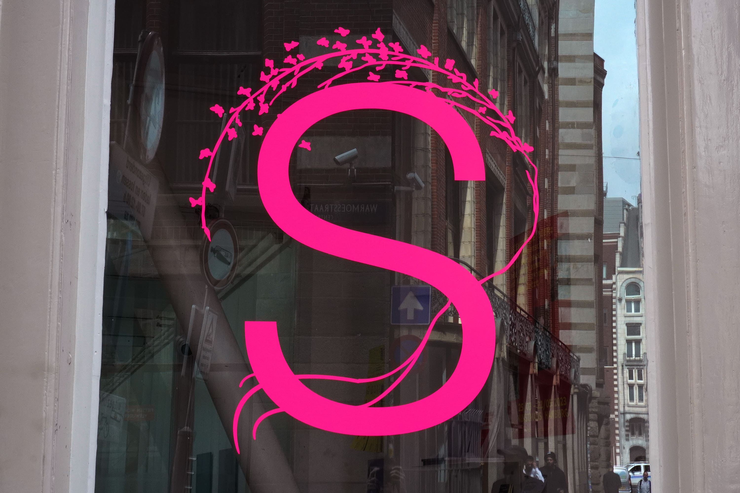
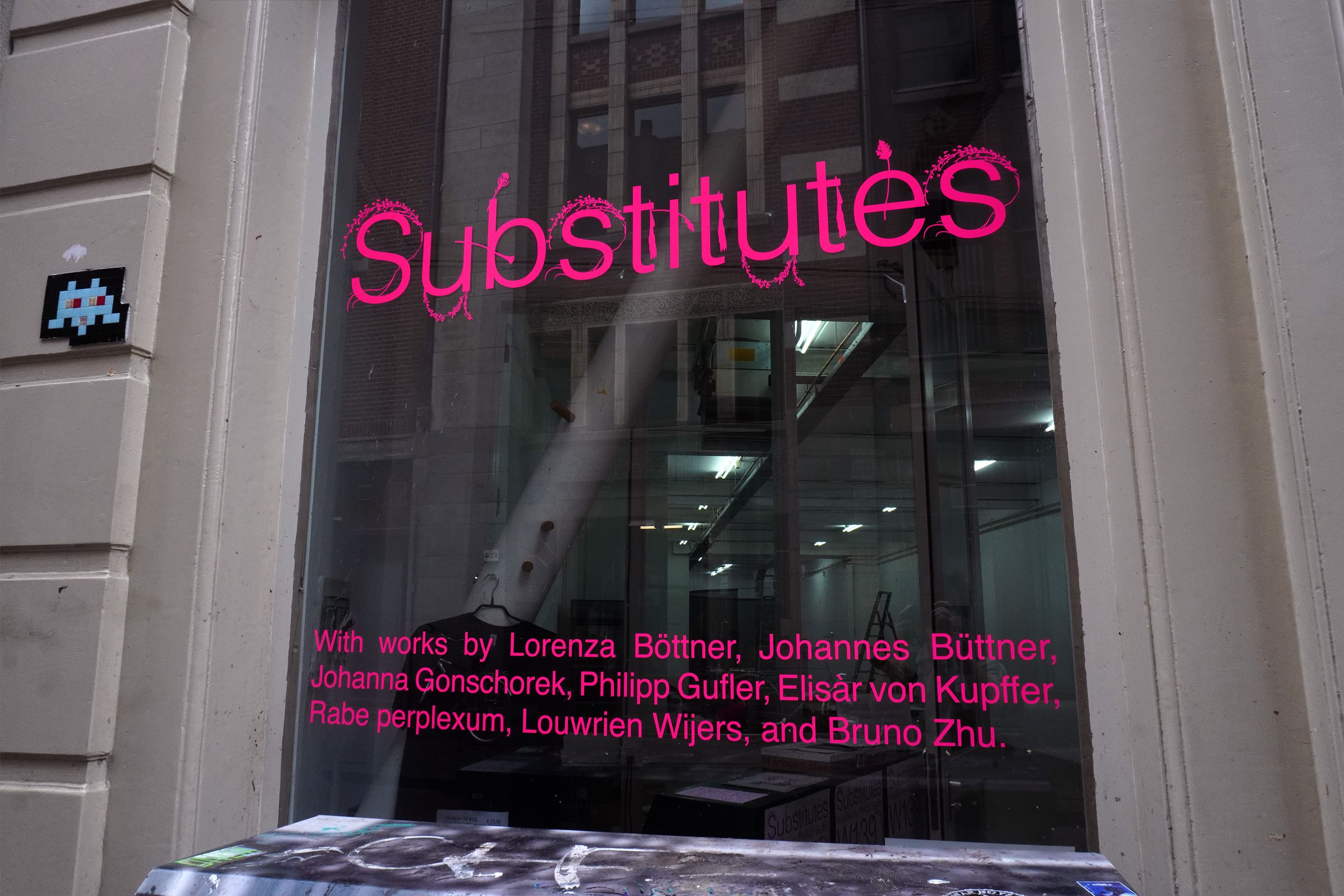
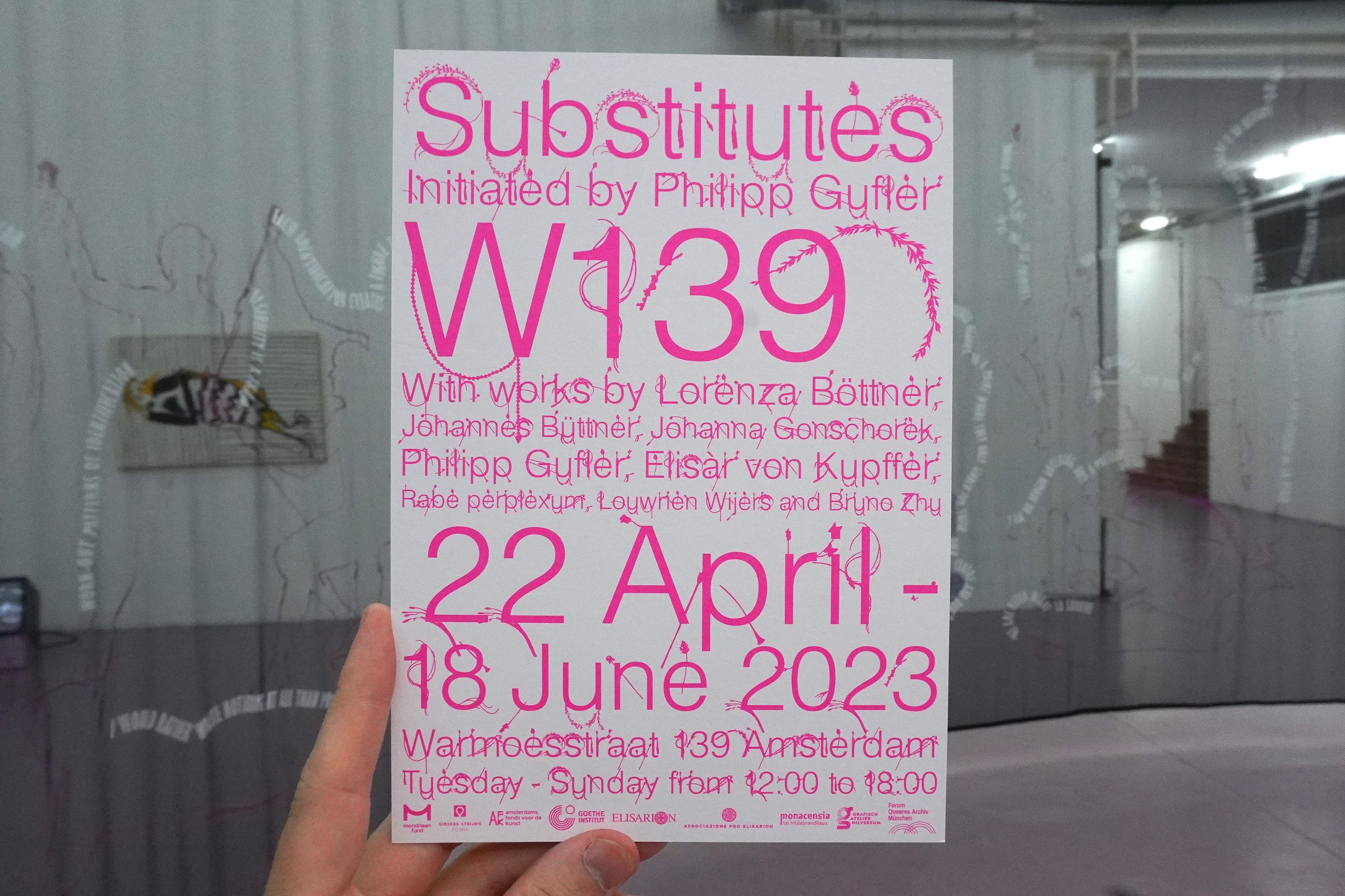
Visual identity and exhibition graphics for Substitutes, a show at W139 initiated by Philipp Gufler. The show engages with queer history and discourses around the body, gender, and sexuality, it explores the absence of bodies, the abstraction of the body, and the tools and language we use to maintain or describe our bodies—costuming, staging, masks, layering, clothing. For the Visual identity I made a custom typeface called Elisàr Helvetica. The typeface uses the sticks, flowers and accessories held by the characters in a painting of Elisàr von Kupffer as a costume for its letterforms.
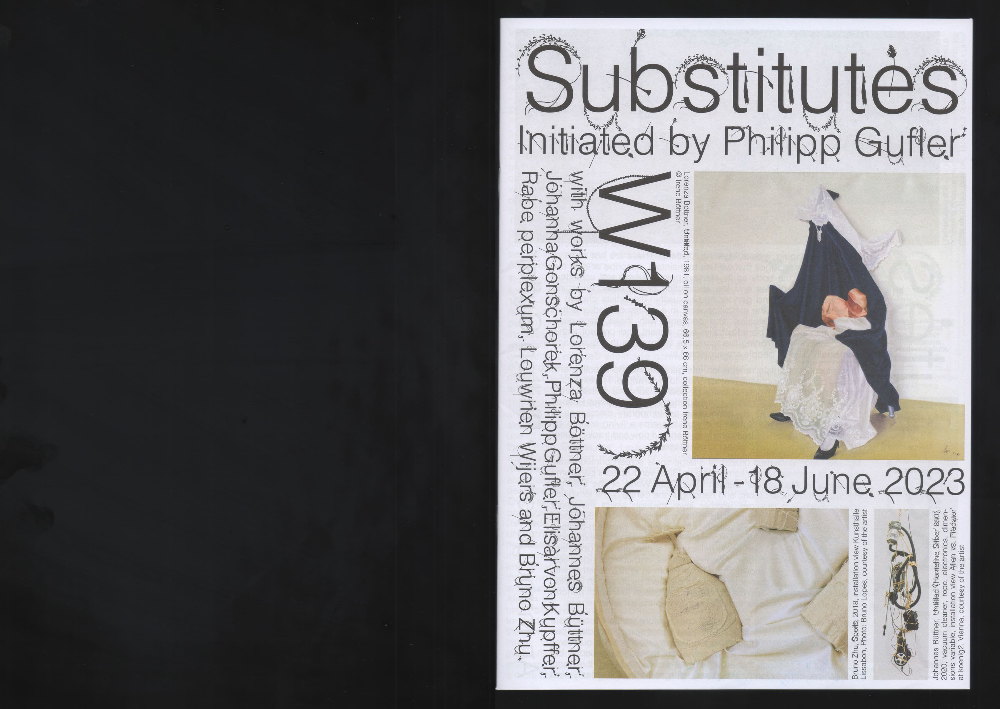
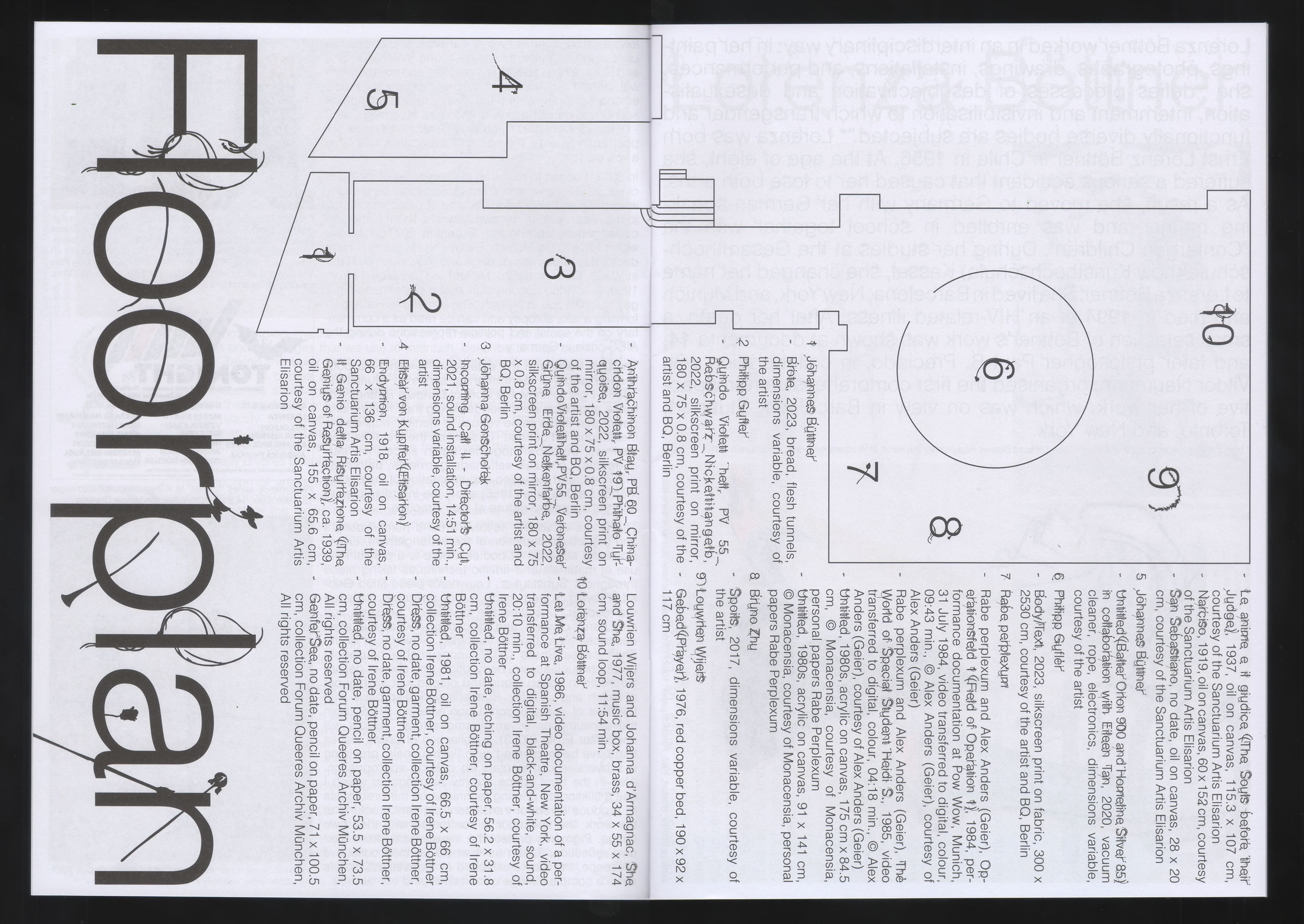
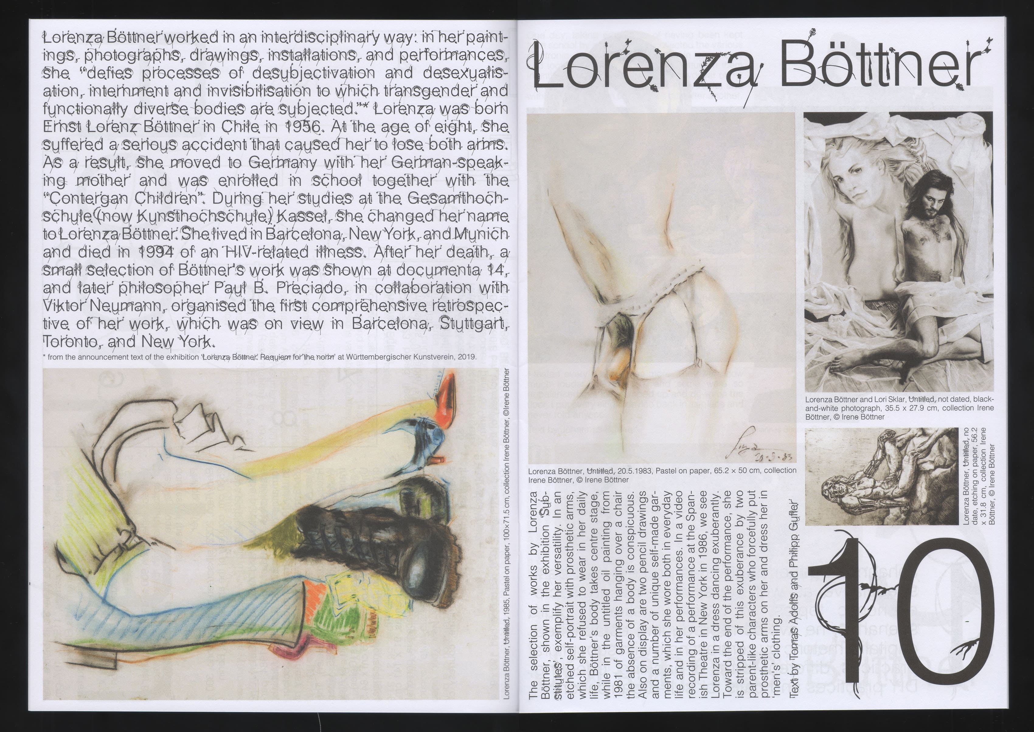
Zine made for Substitutes functioning as a map for the exhibition and to dive deeper into the exhibited works. Made in collaboration with Youngeun Sohn.
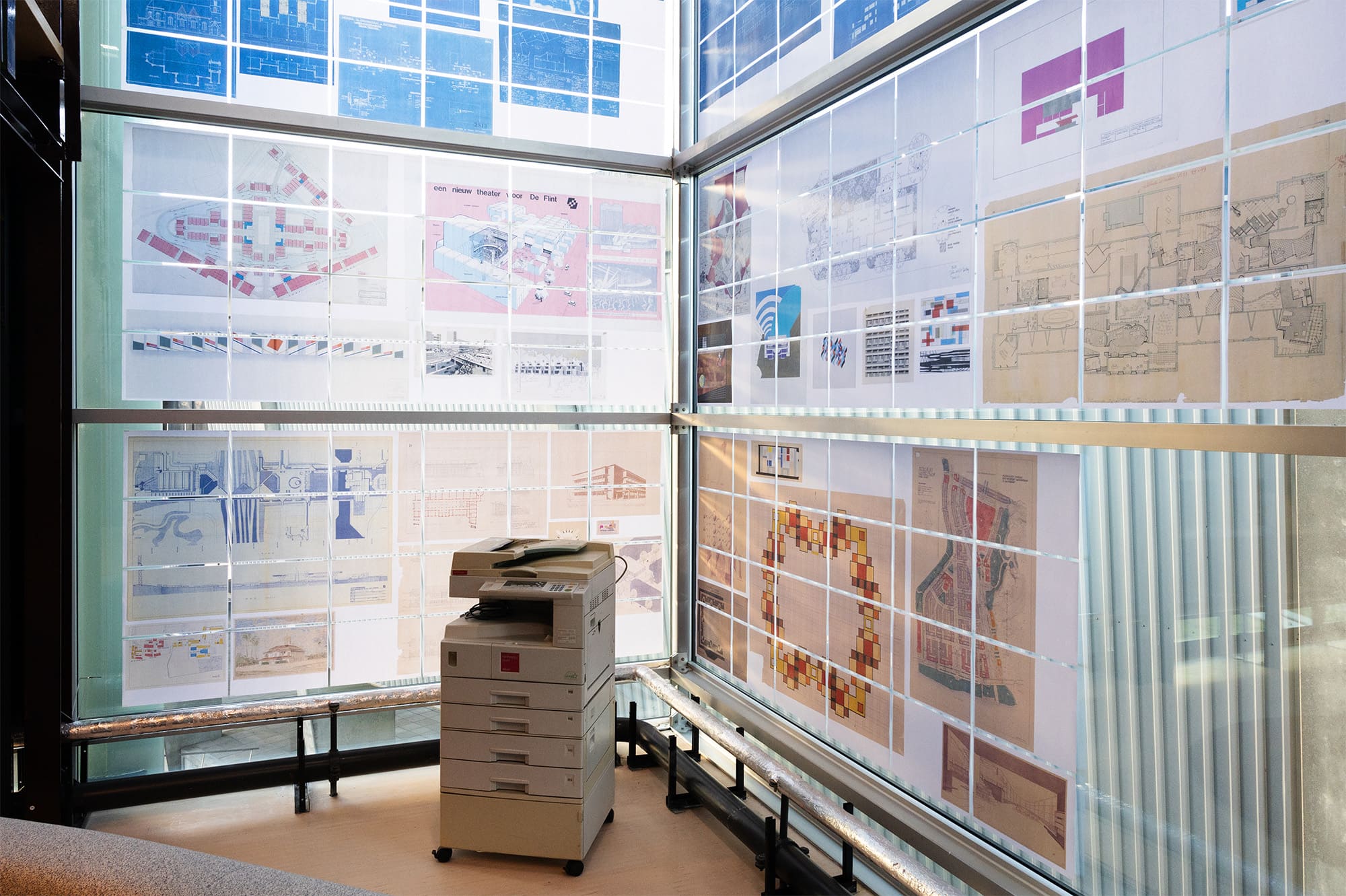
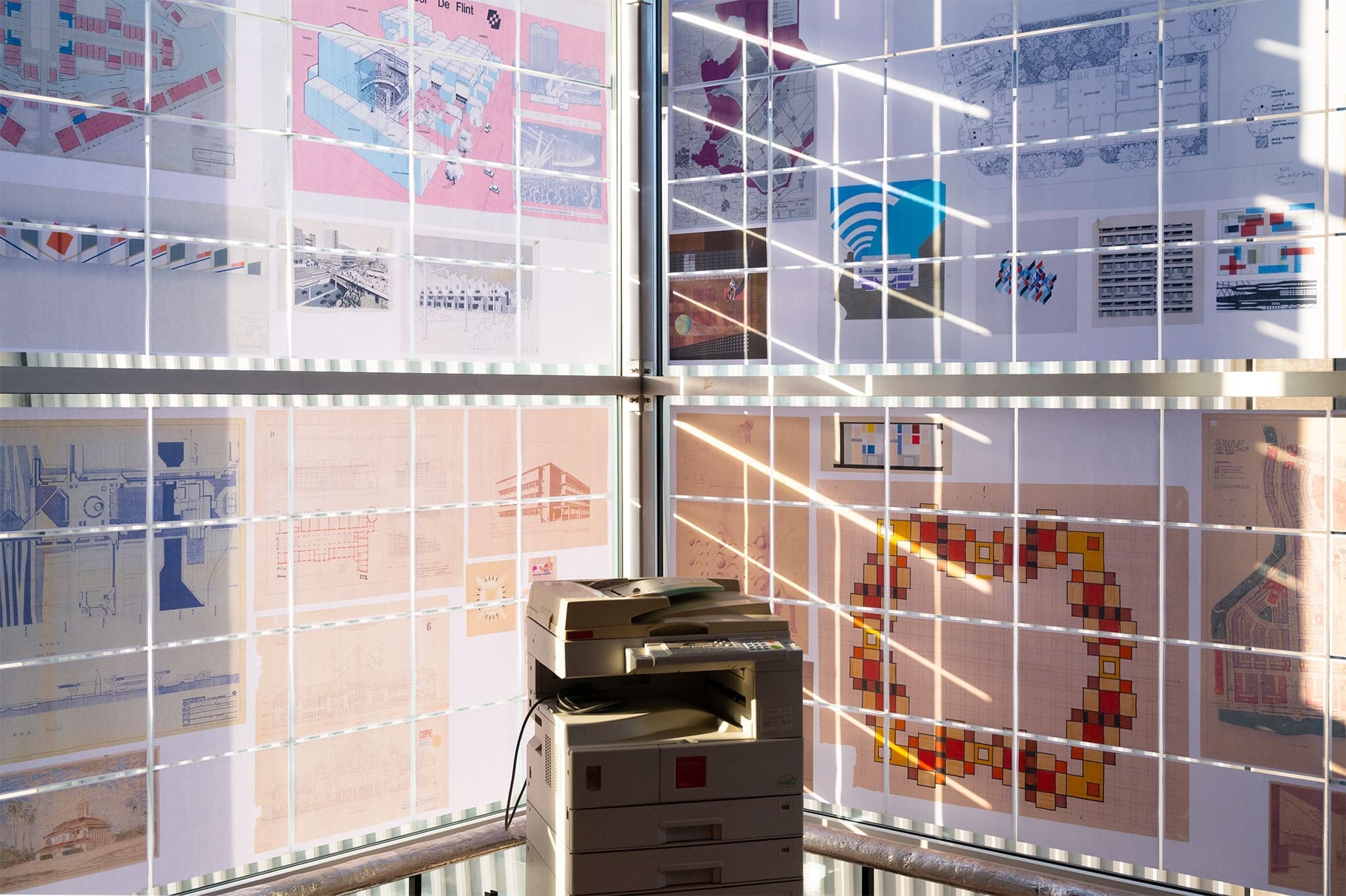
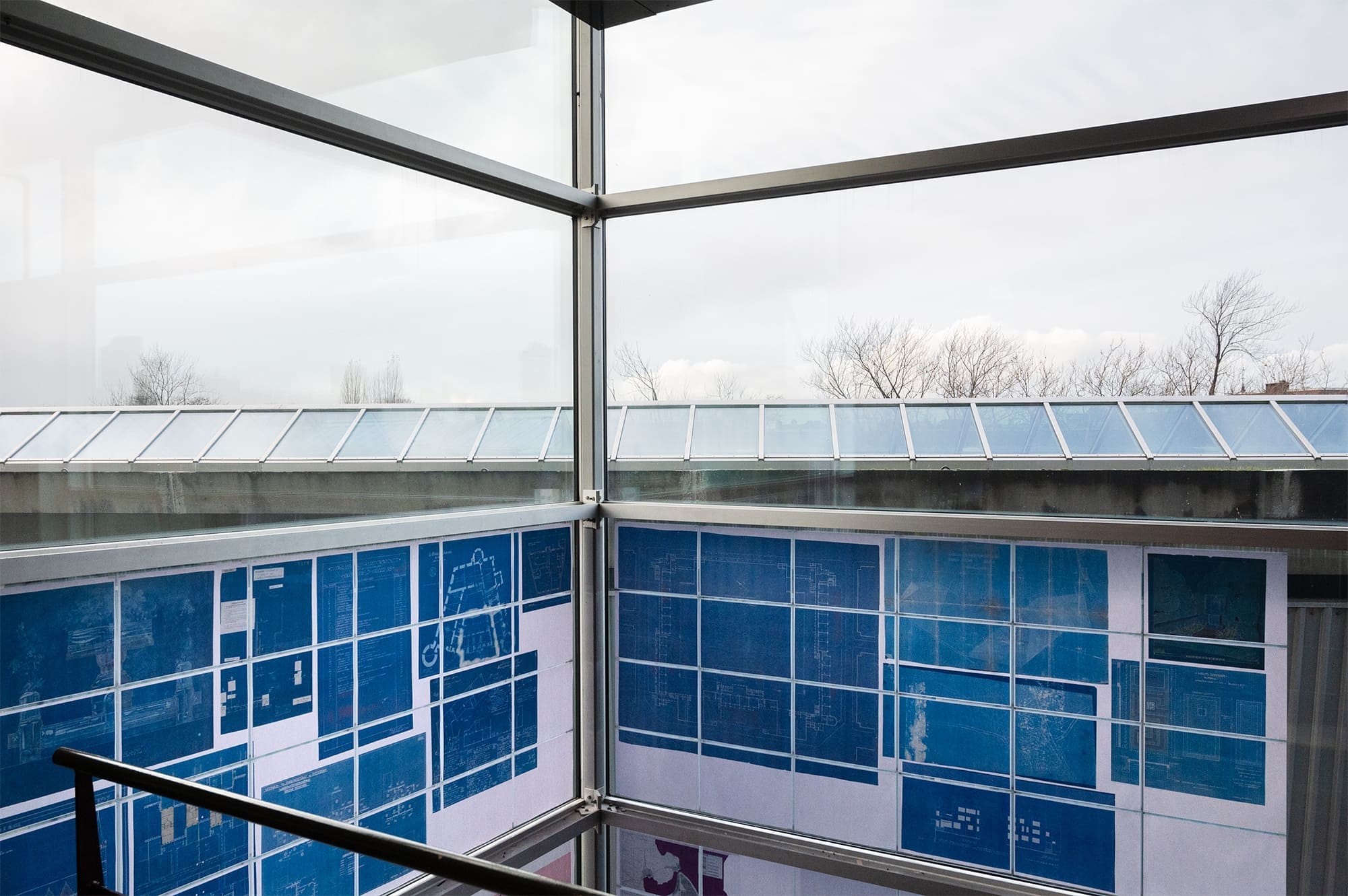
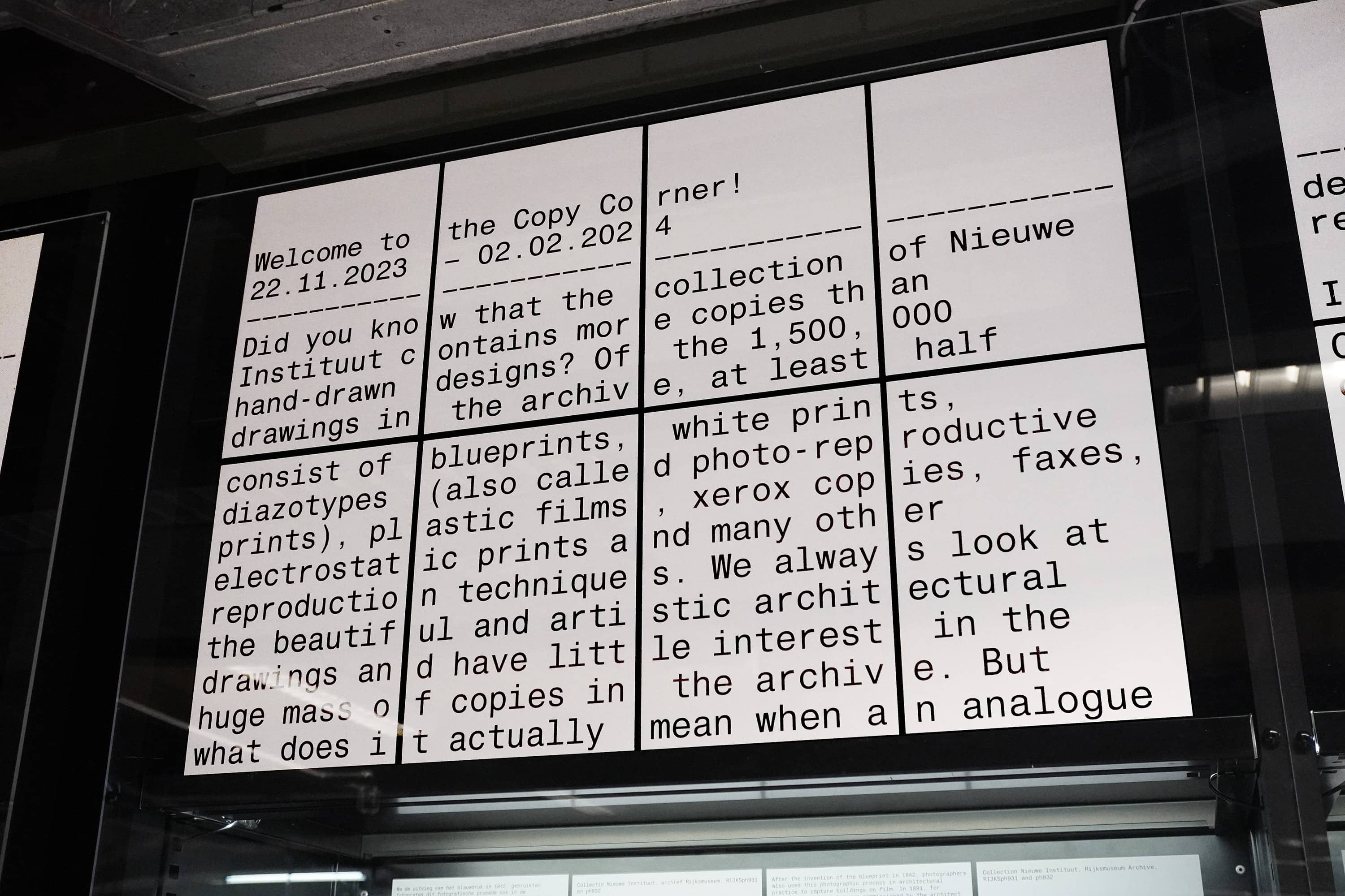
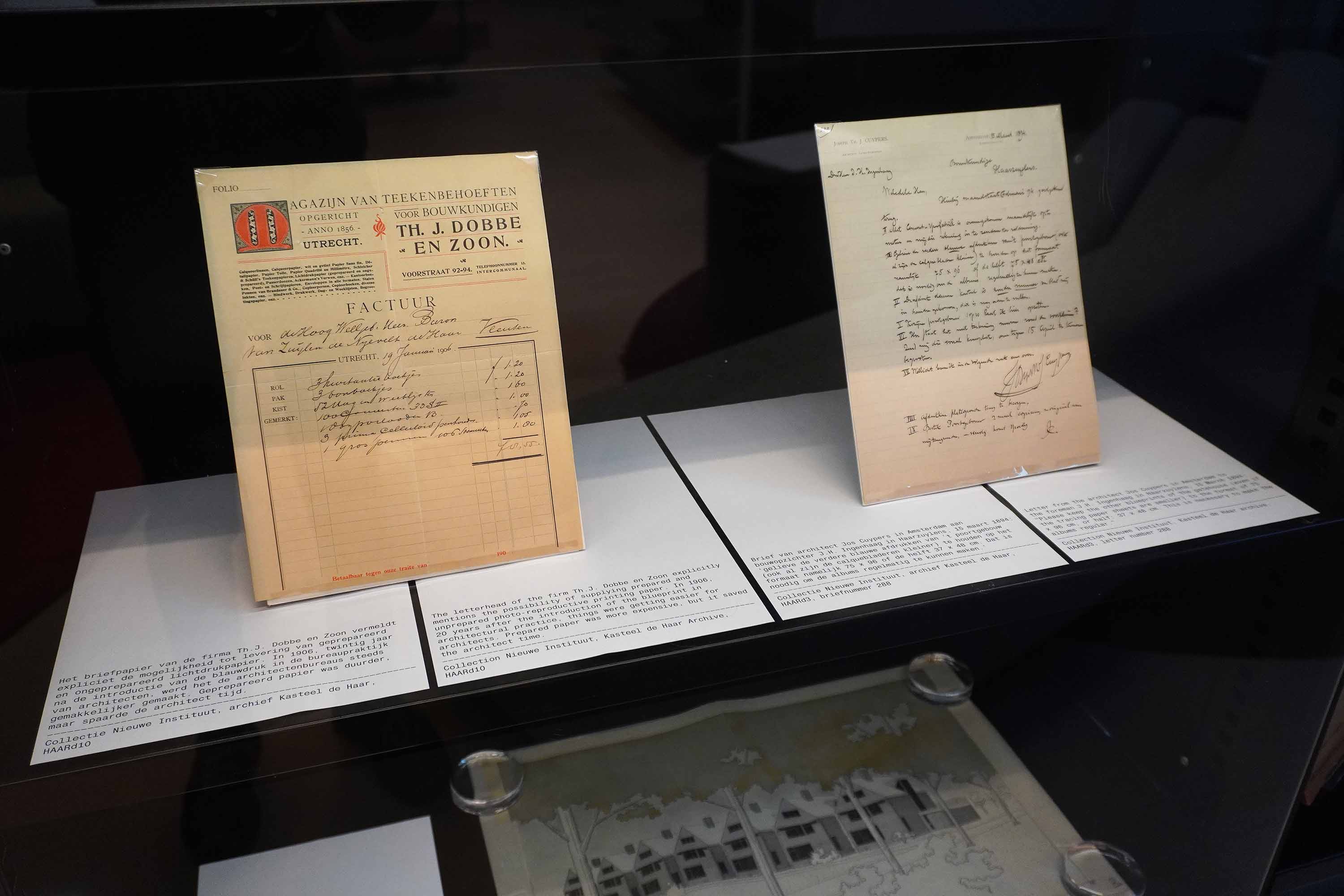
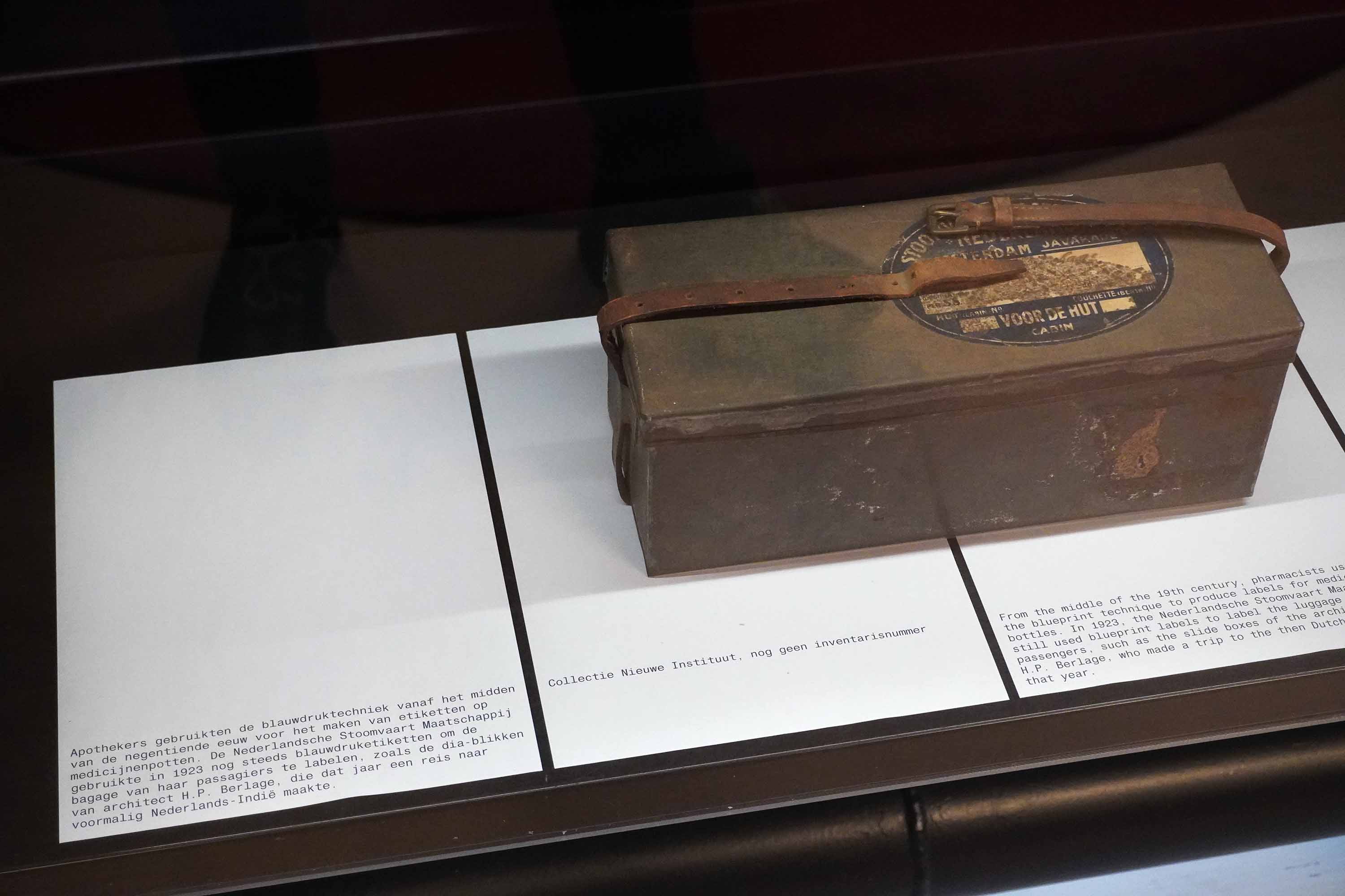
Exhibition design, visual identity and book for Copycorner, an exhibition presented at Nieuwe Instituut. The exhibition focuses on the copies existing in the collection of the instituut such as blueprints, white prints, diazotypes, plastic films, xerox copies, faxes, electrostatic prints and many other reproduction techniques. The design for the exhibition uses the Xerox machine as the tool for designing all the elements of the show, resulting in A4 sized labels, tiled poster and banners, and a publication that can be used for copying the architectural drawings. Made in collaboration with Youngeun Sohn.
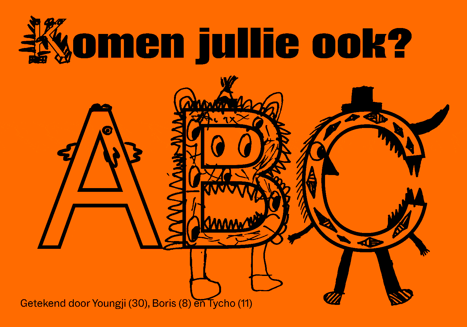
Identity for the Co-Educatie department of Nieuwe Instituut. The department organizes tours, events, exhibitions and workshops for and with students. For the typeface of the identity visitors of the institute were asked to draw a mascot from the letters of the alphabet.
Exhibition campaign for Reboot an exhibition at Nieuwe Instituut about pioneering digital art. The campaign uses the language of the blue screen for the information of the exhibition, an underlying layer flickering in and out of the screen.
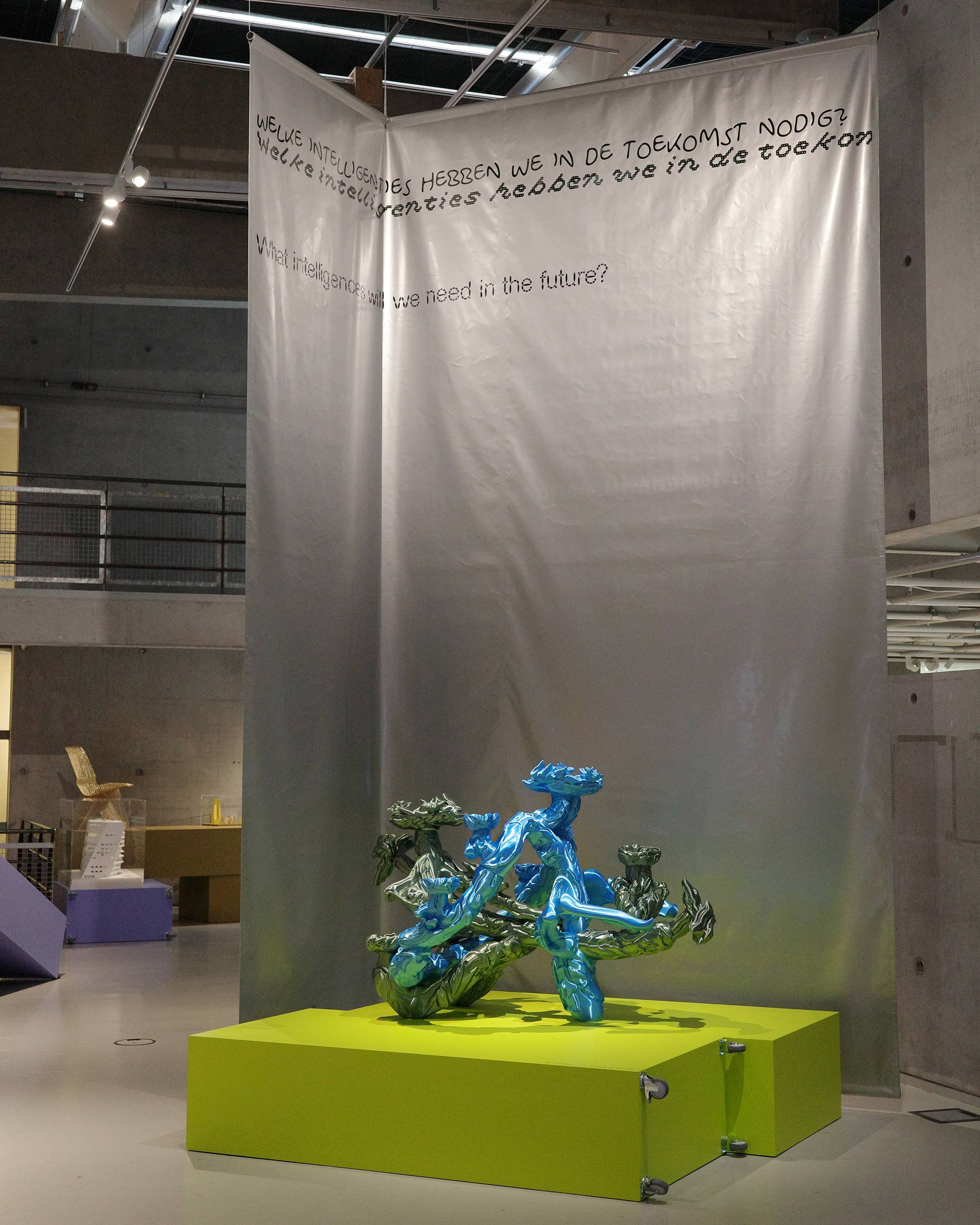
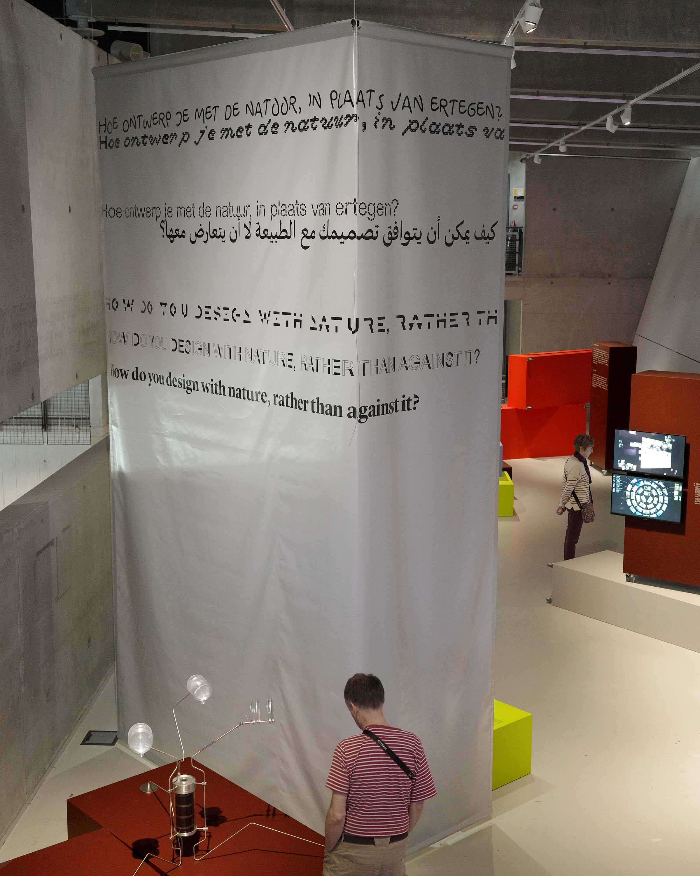
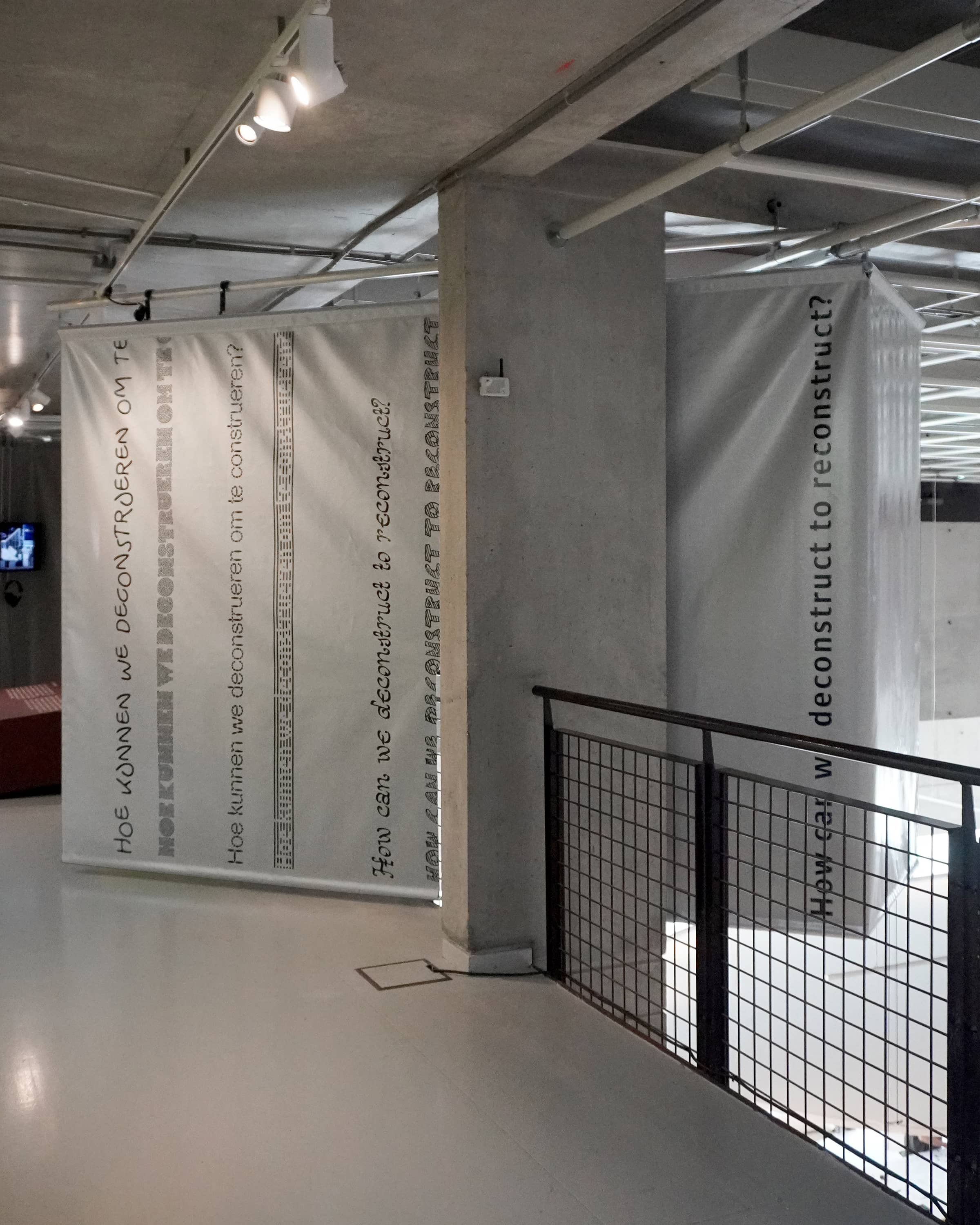
The new identity for Nieuwe Instituut was developed in collaboration with Maureen Mooren, Maud Vervenne, Cengiz Menguc and Vera van der Seyp. The identity takes as a starting point the many voices existing within the institute. In the identity two contrasting languages always exist as one. Using a growing collection of revival typefaces the identity continuously changes in form.
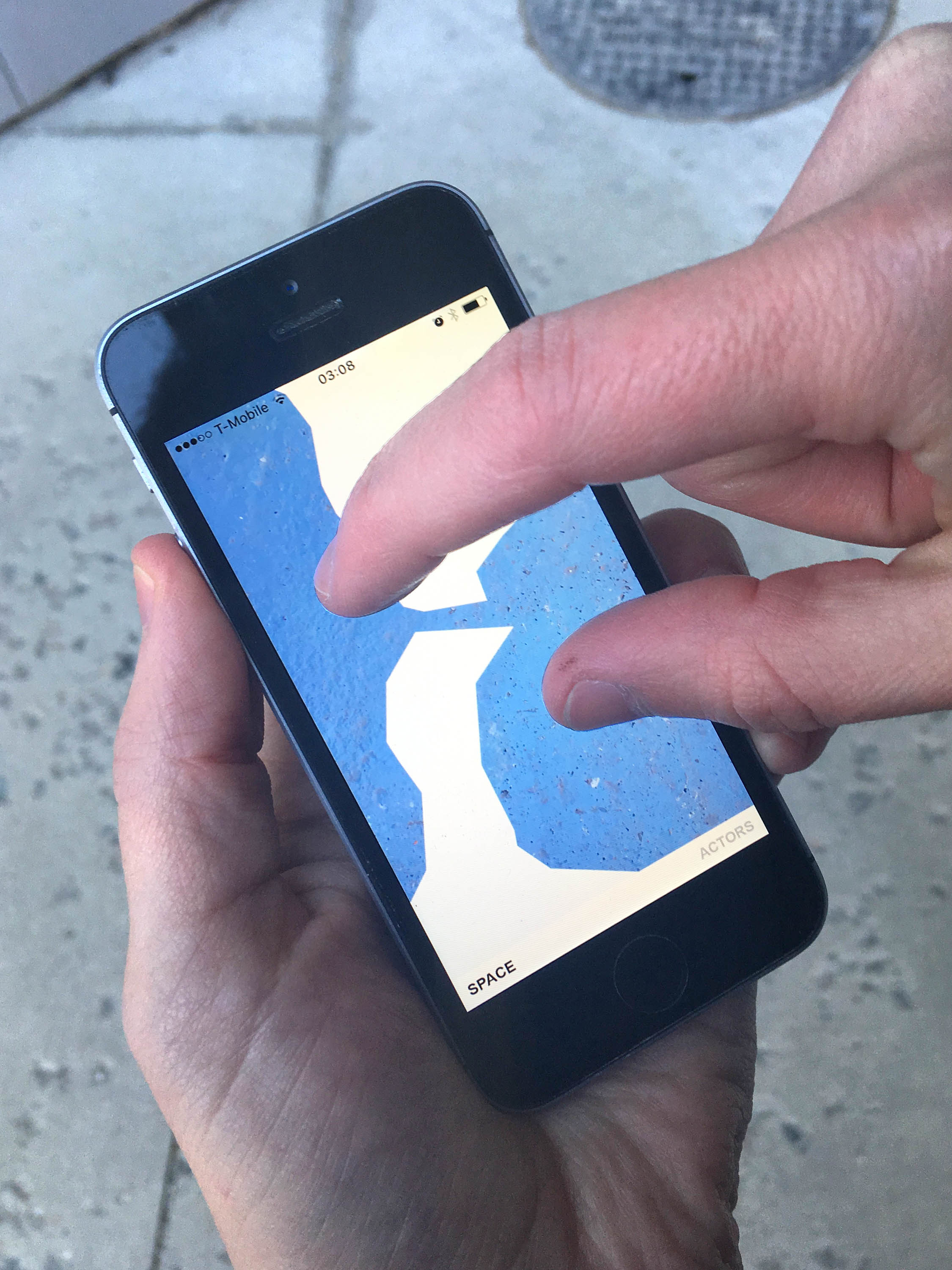
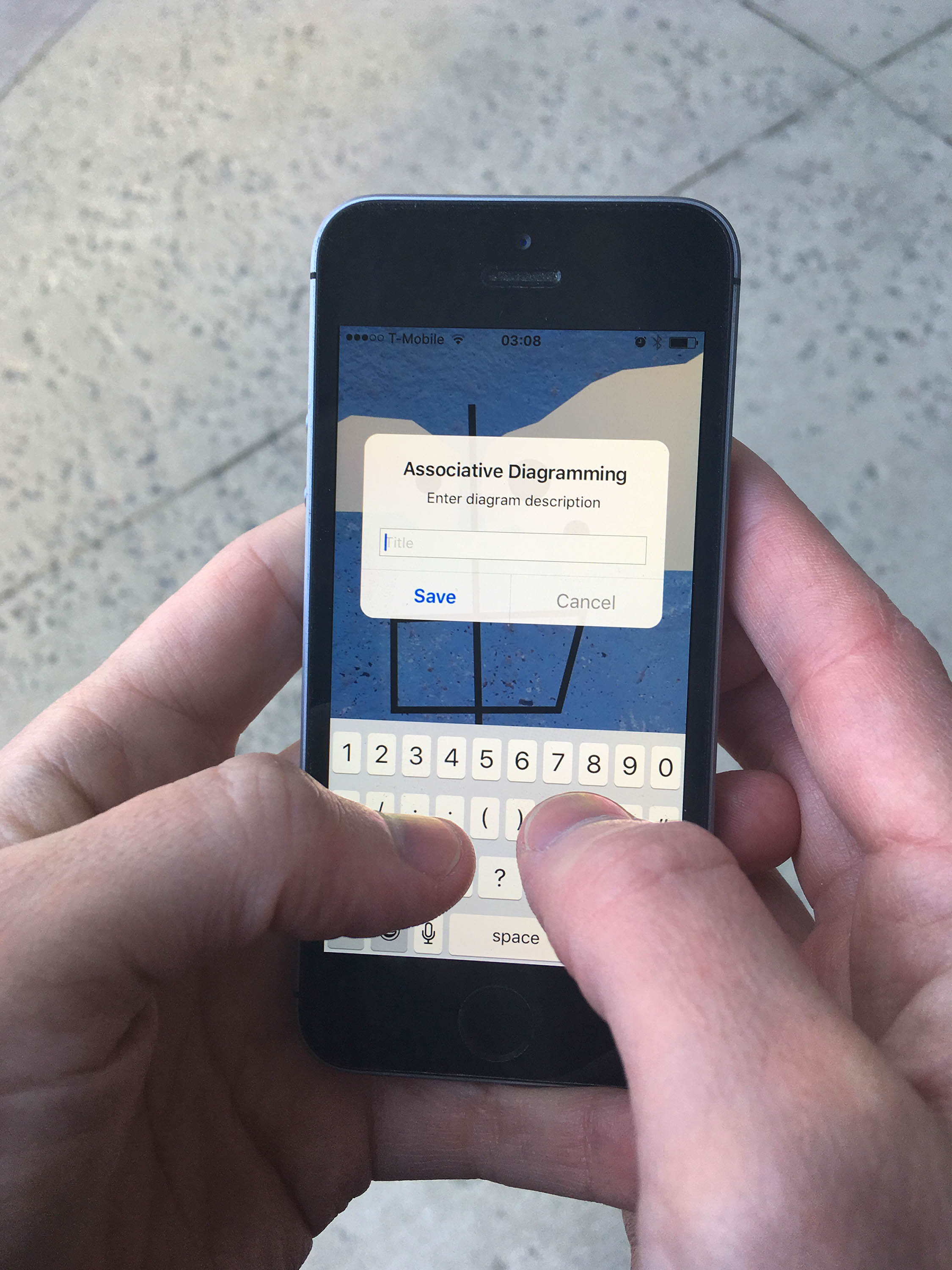
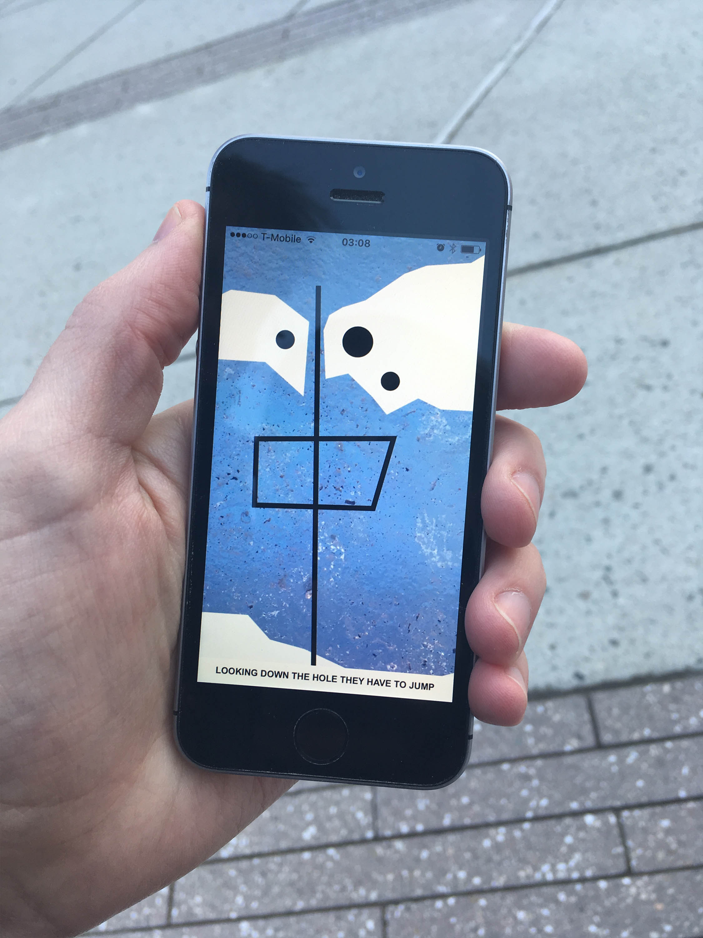
InvisiPaint is a regular drawing tool accept for one catch: it turns dark as soon as its touched, making it so you can’t see what your drawing until hitting the “finished” button. Made in collaboration with William Wheeler and Ingo Valente.
With ChromaDual two people can collaboratively draw on a shared, virtual canvas that is initially split down the middle by two colors. Each person wields one of the two colors, and can draw on top of the other person’s color. Creations necessitate teamwork as the painters give and take canvas space. Made in collaboration with William Wheeler and Ingo Valente.
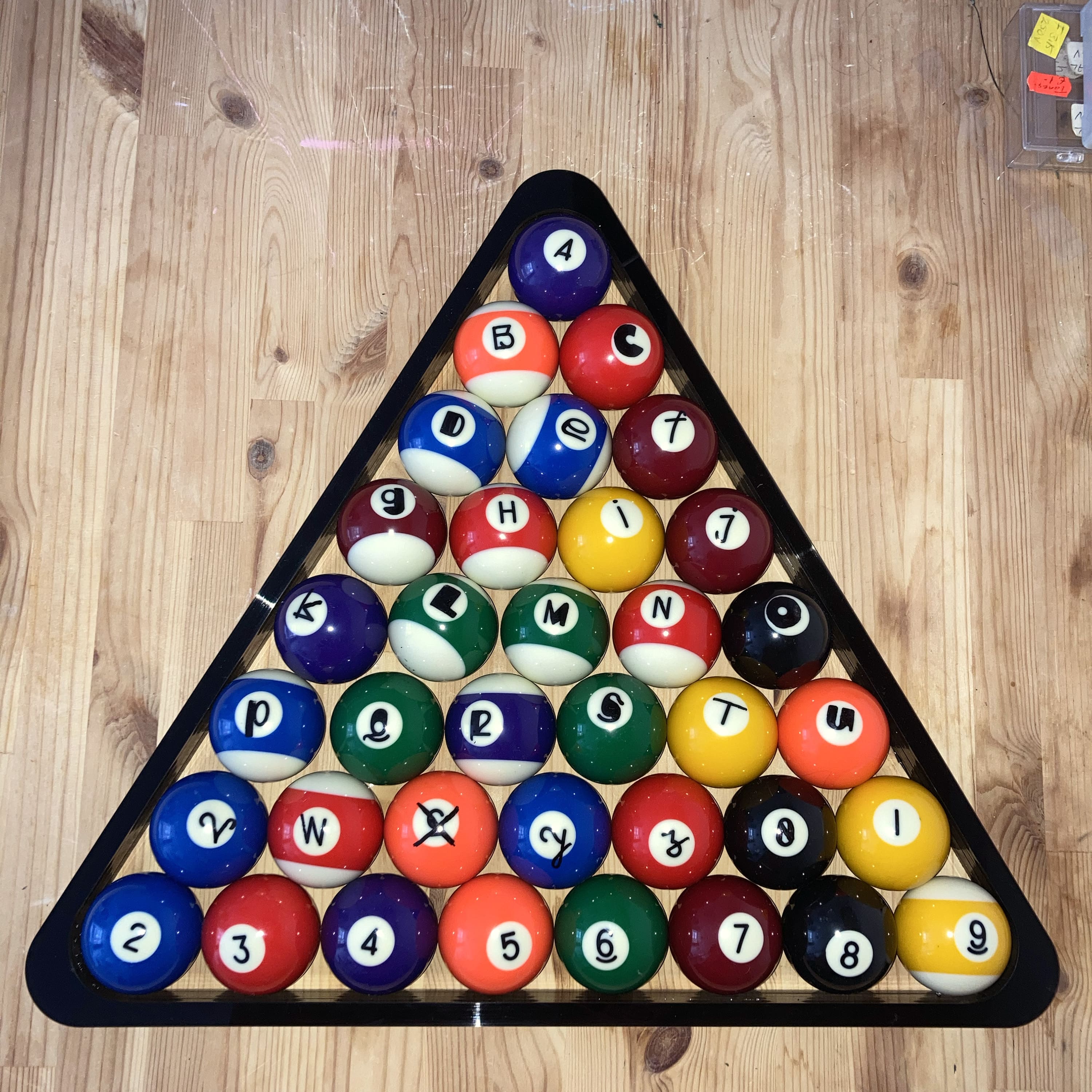
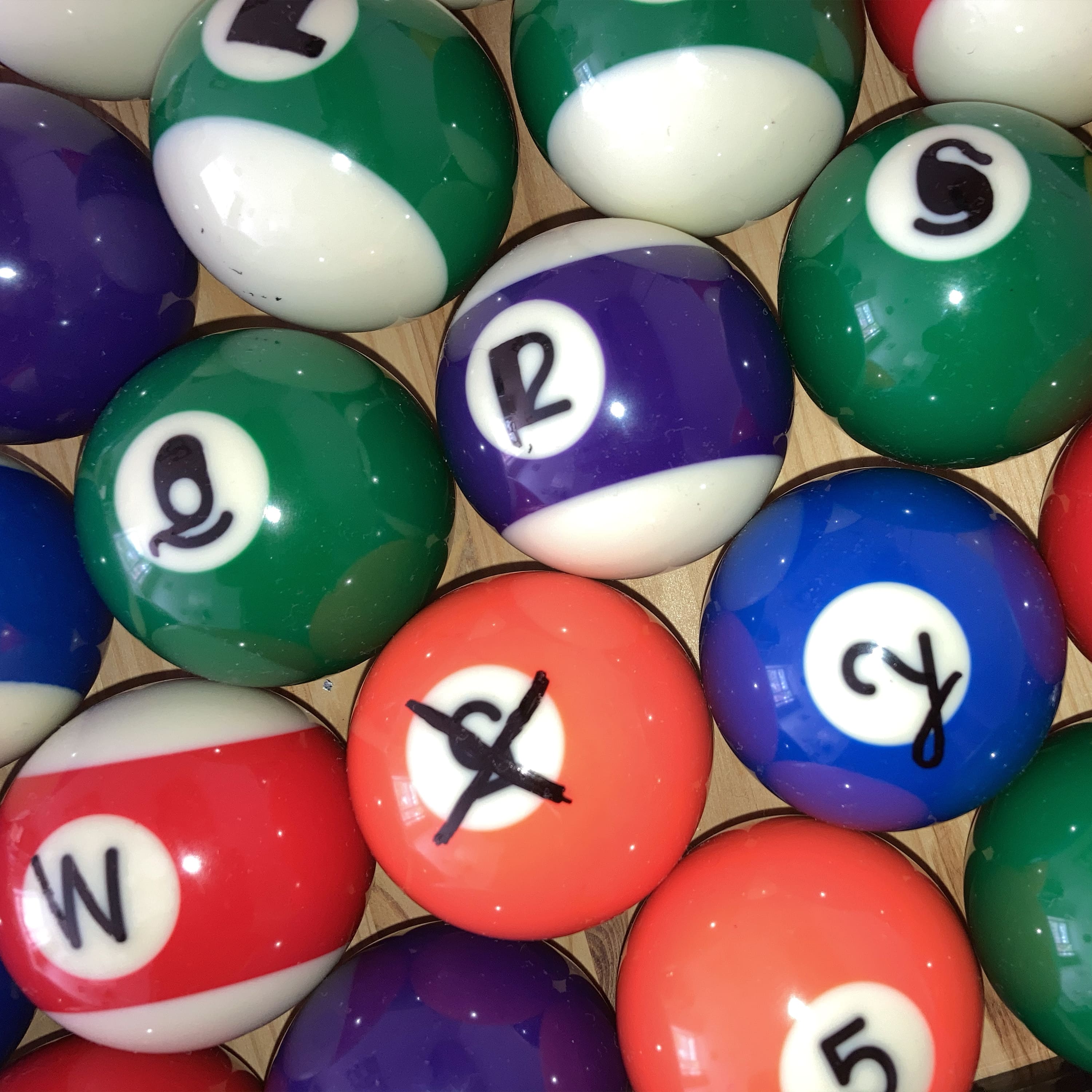
Keyboard for spelling out words on a pool table.
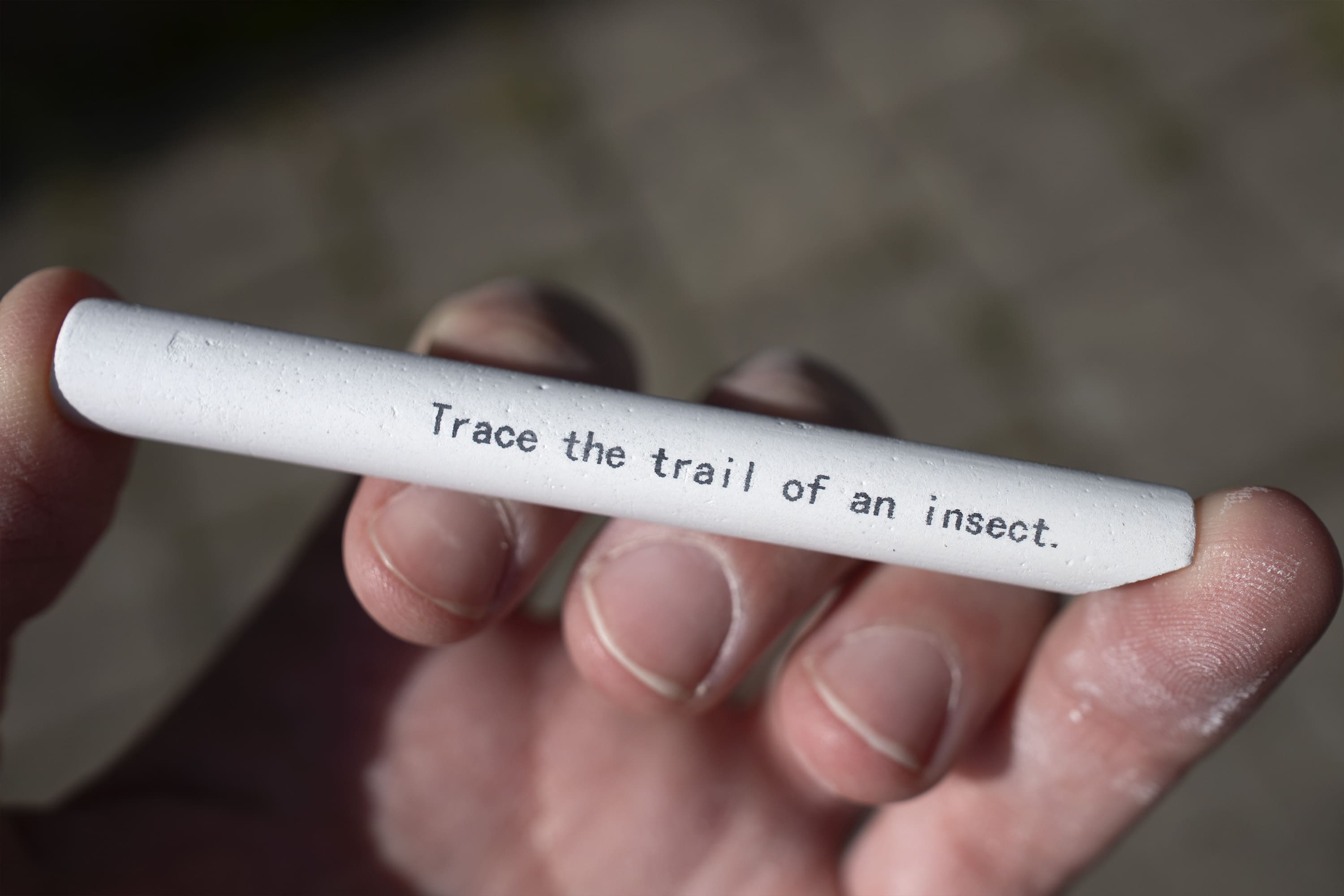
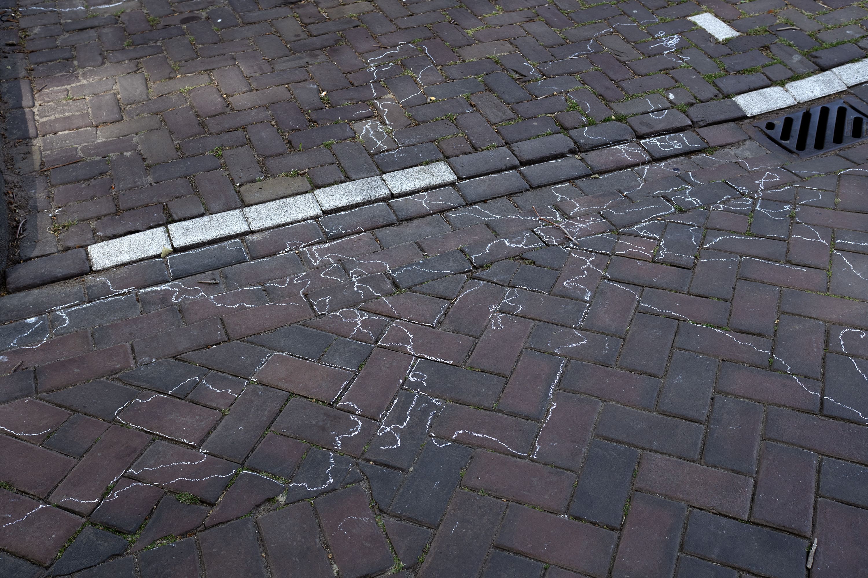
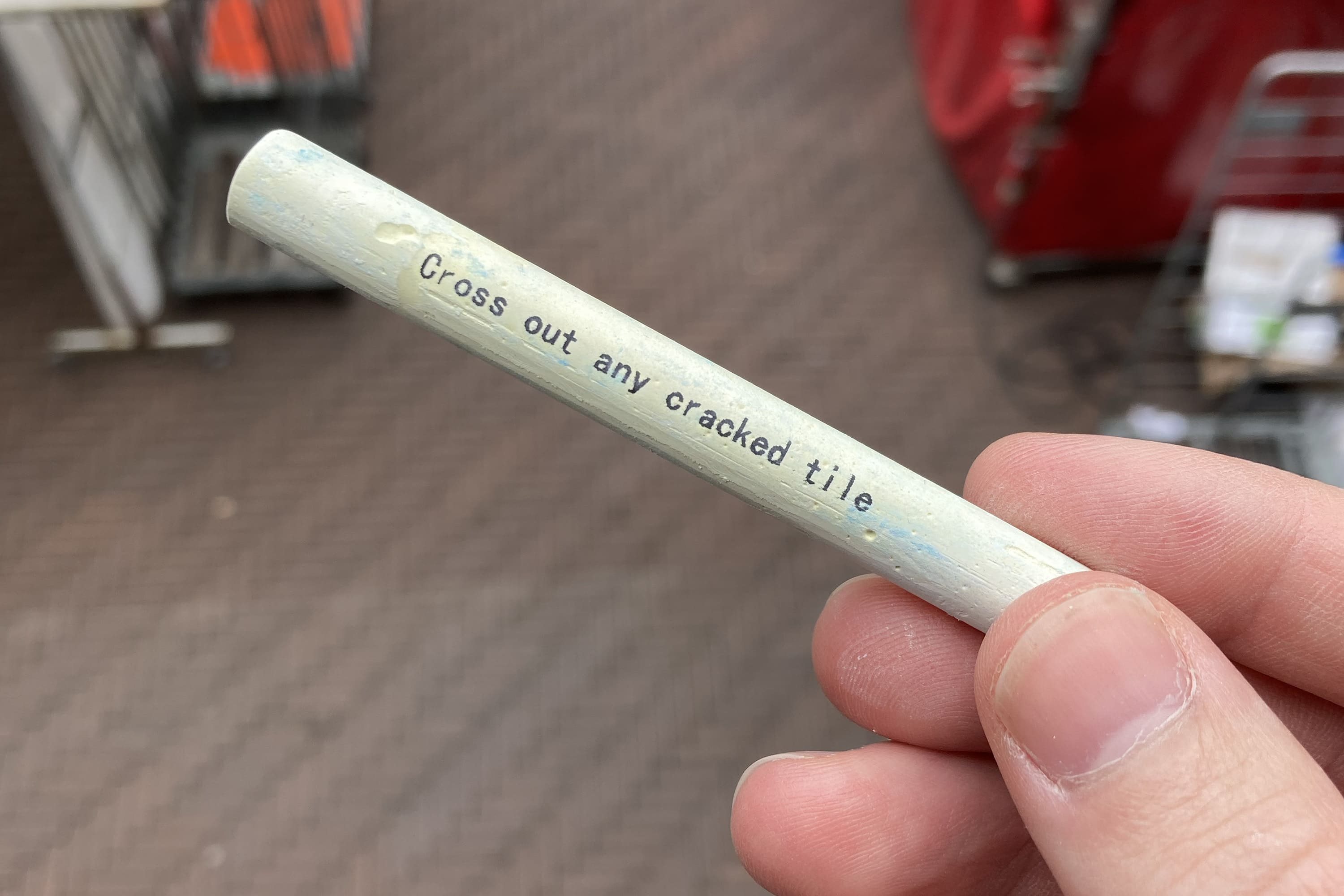
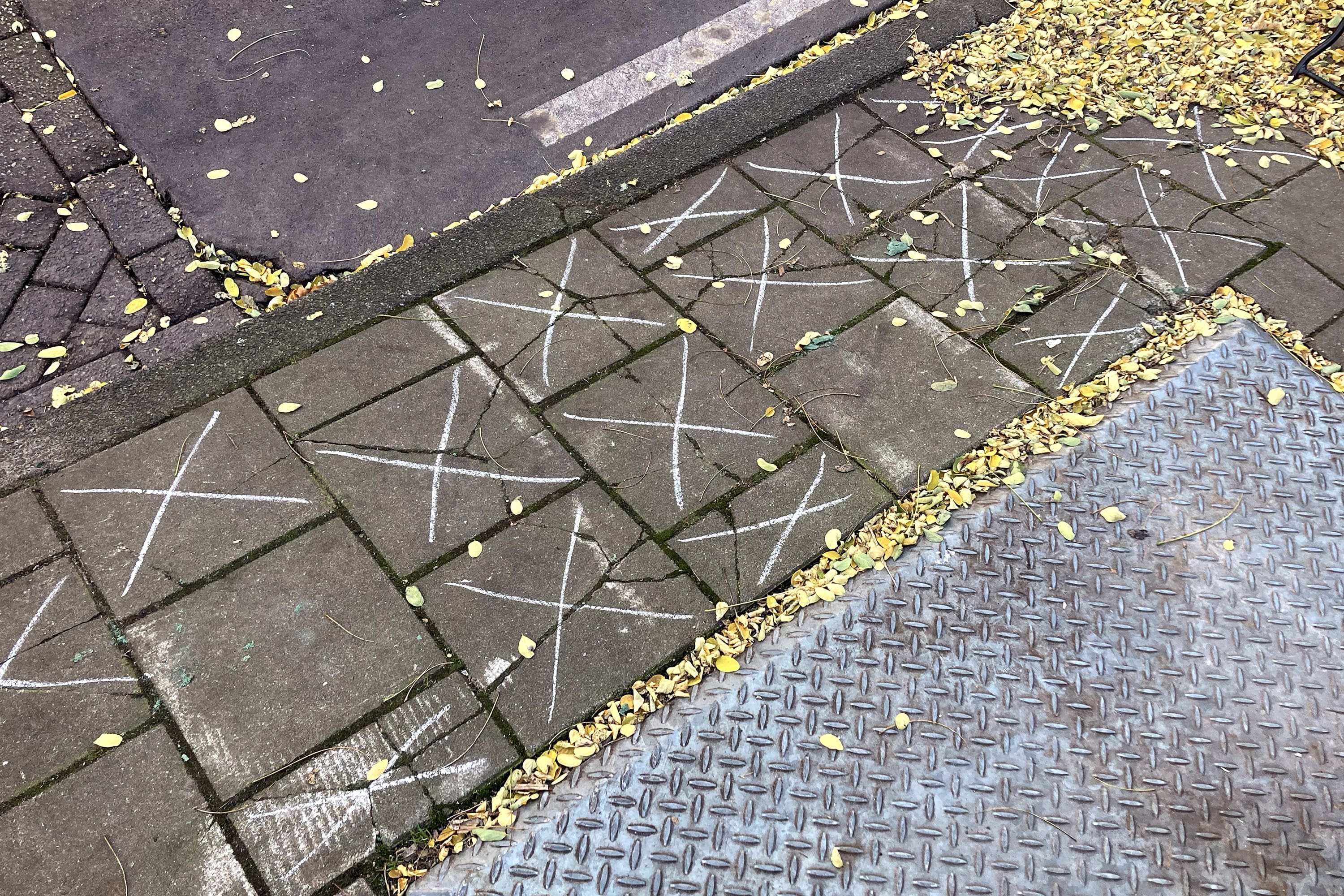
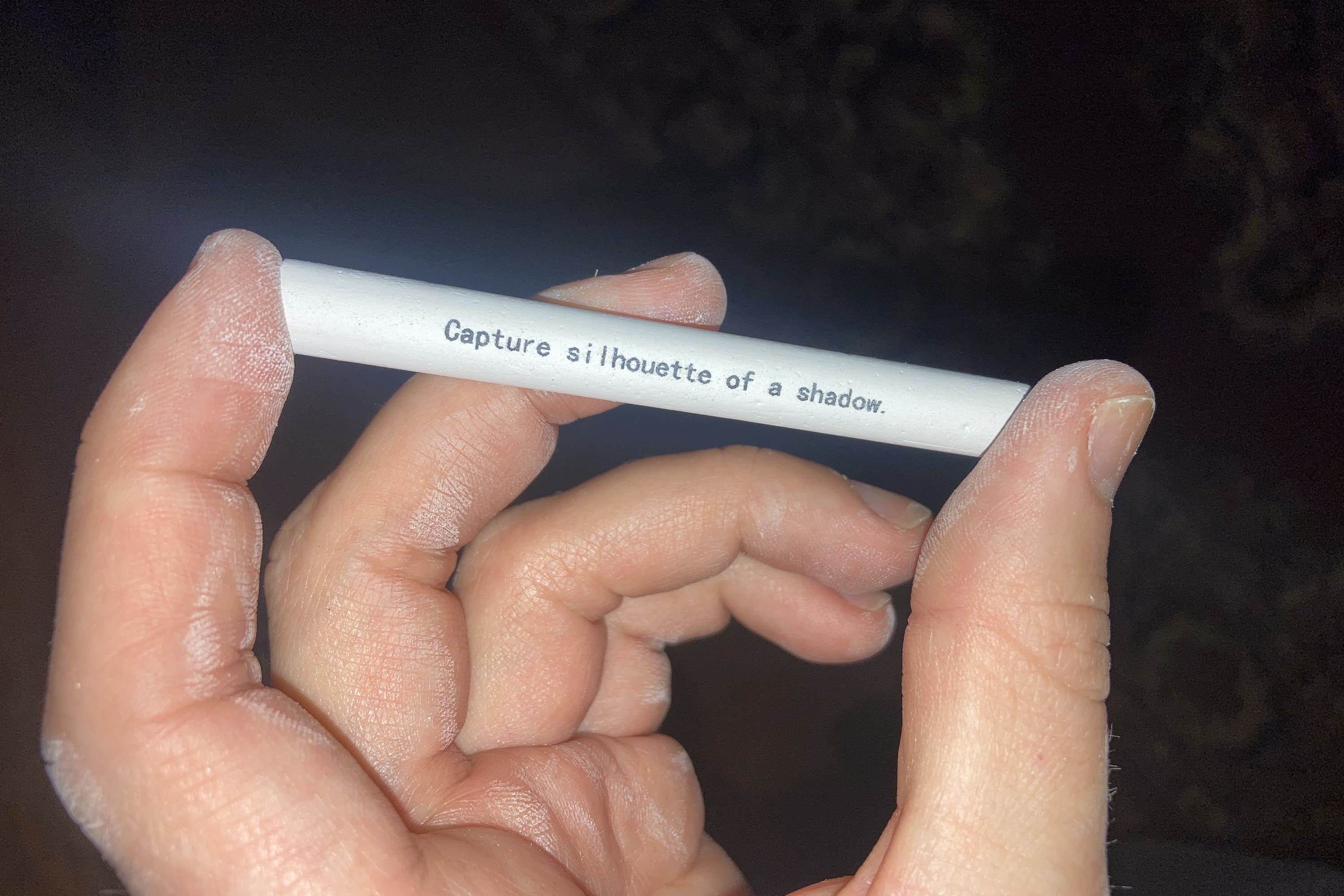
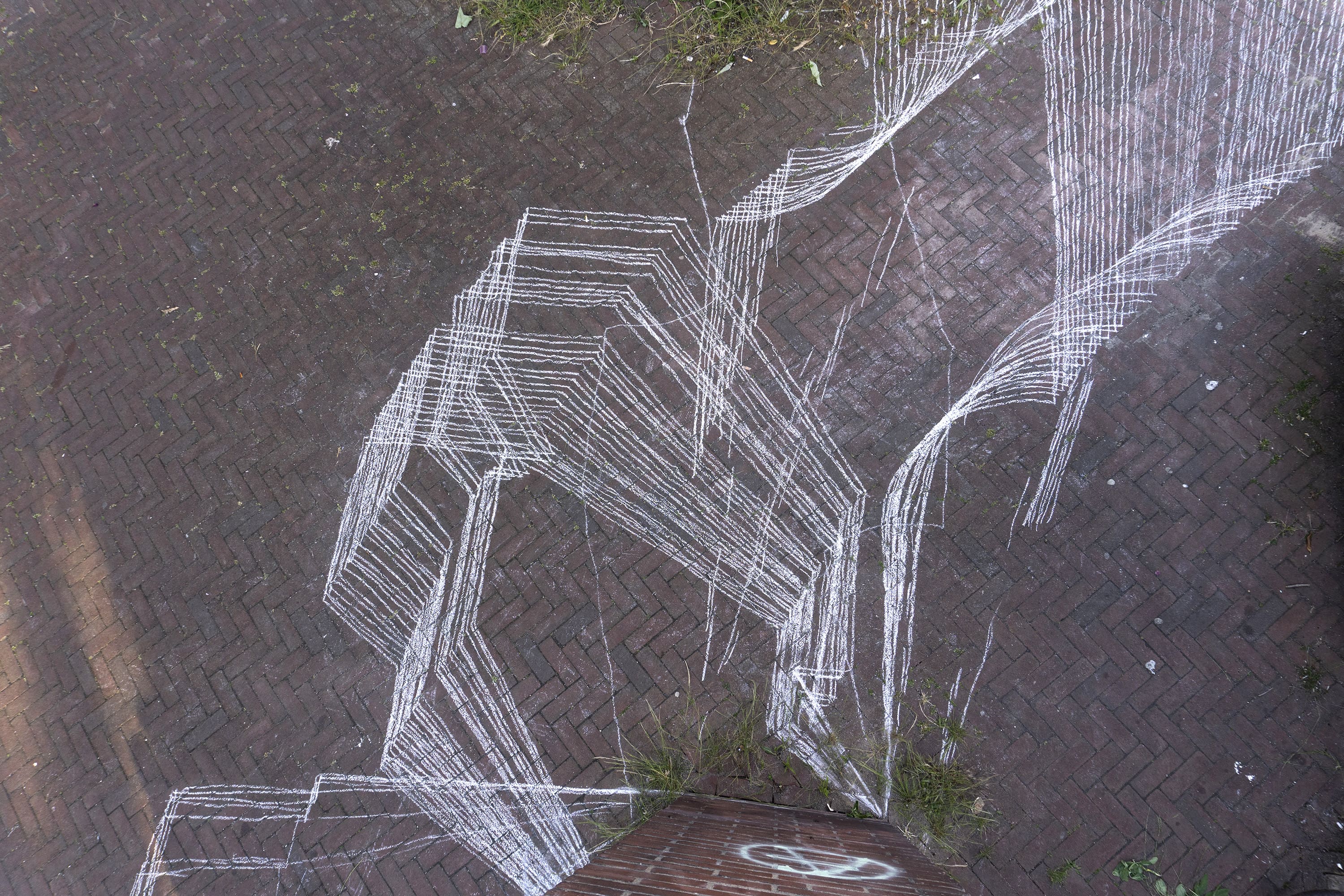
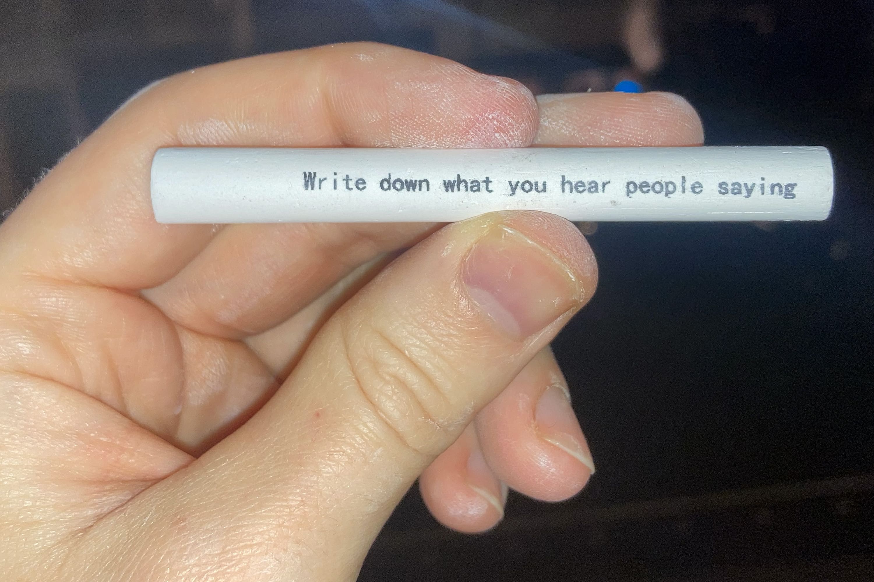
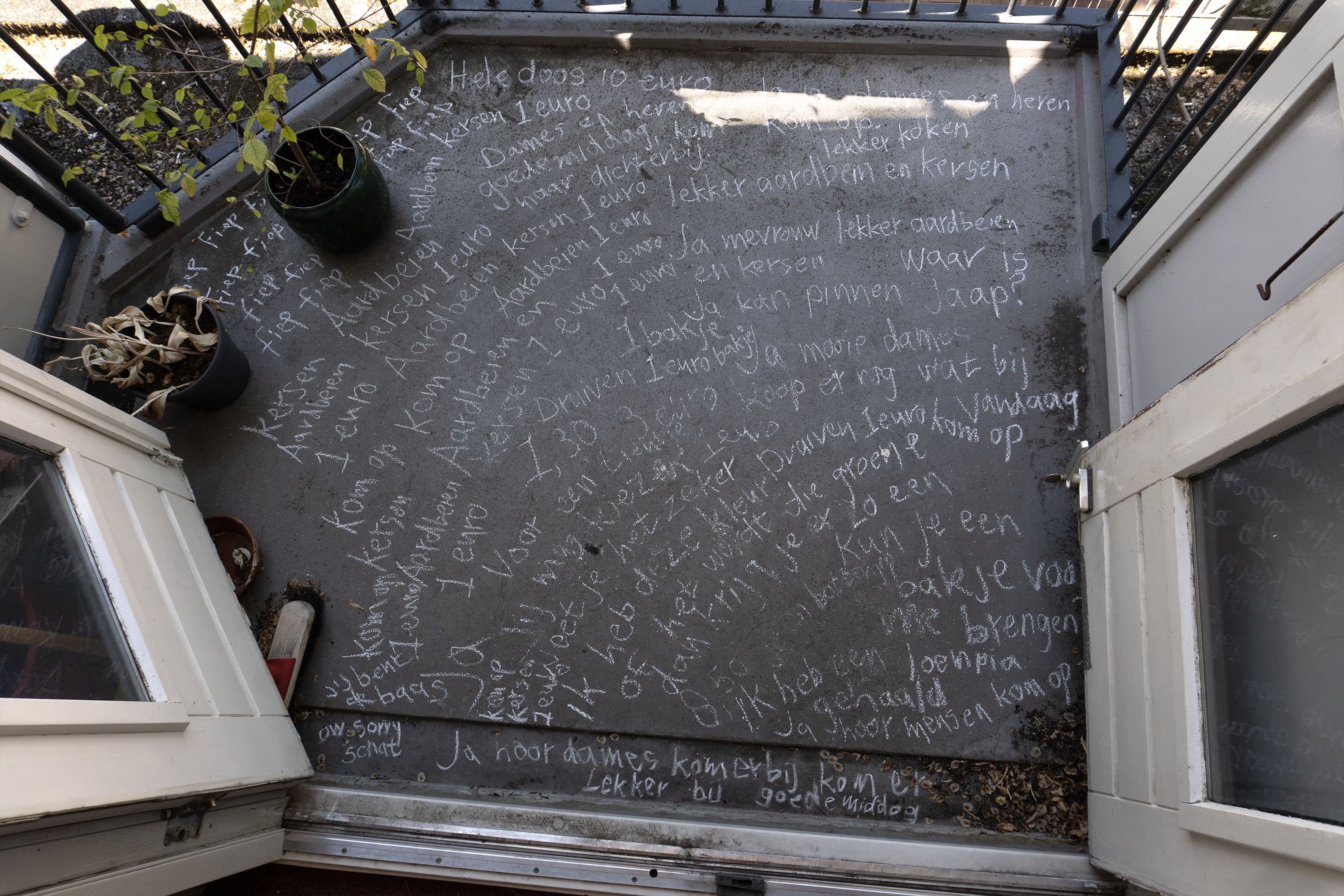
Chalk instructions are a series of prompts for trailing movements and actions in public.
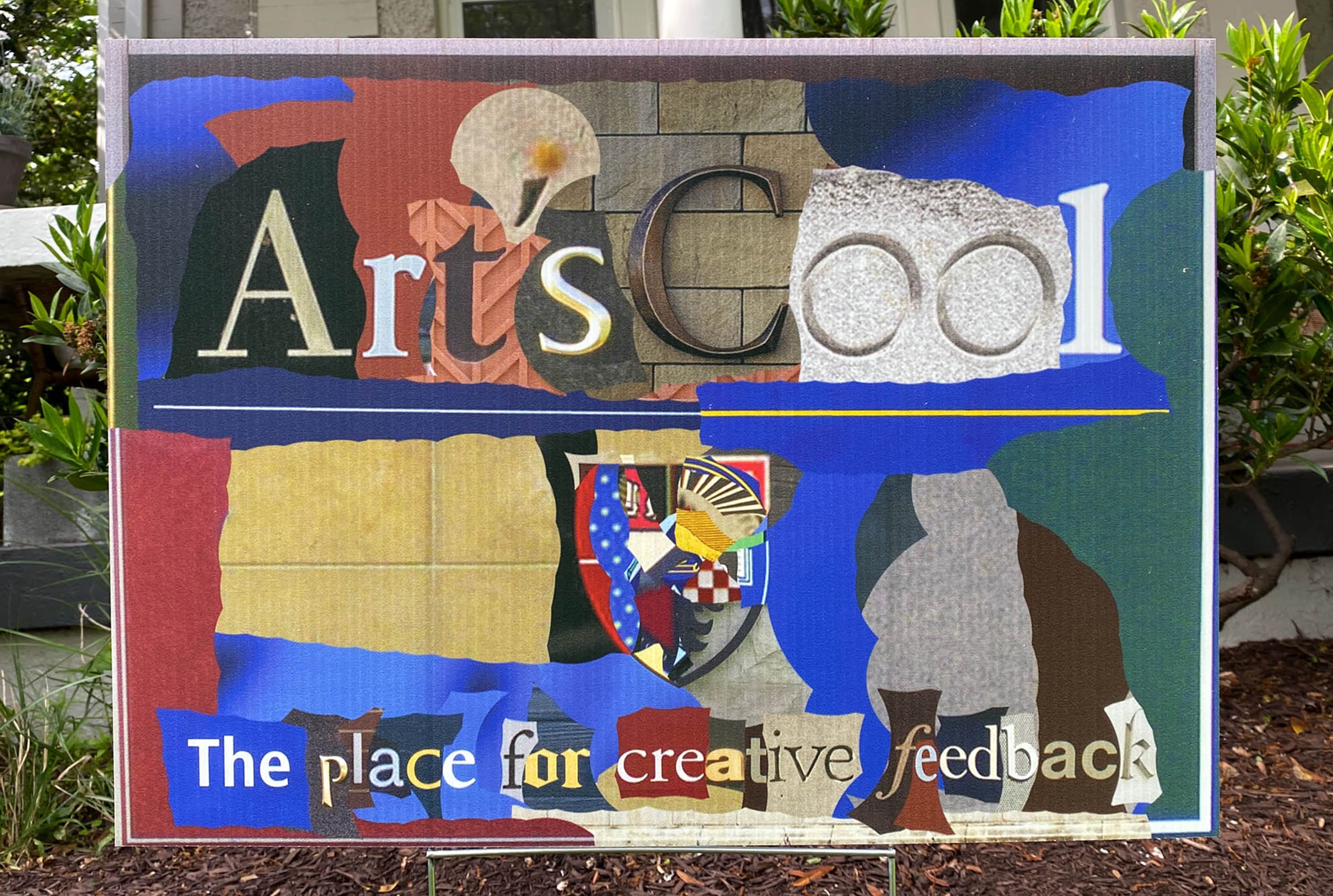
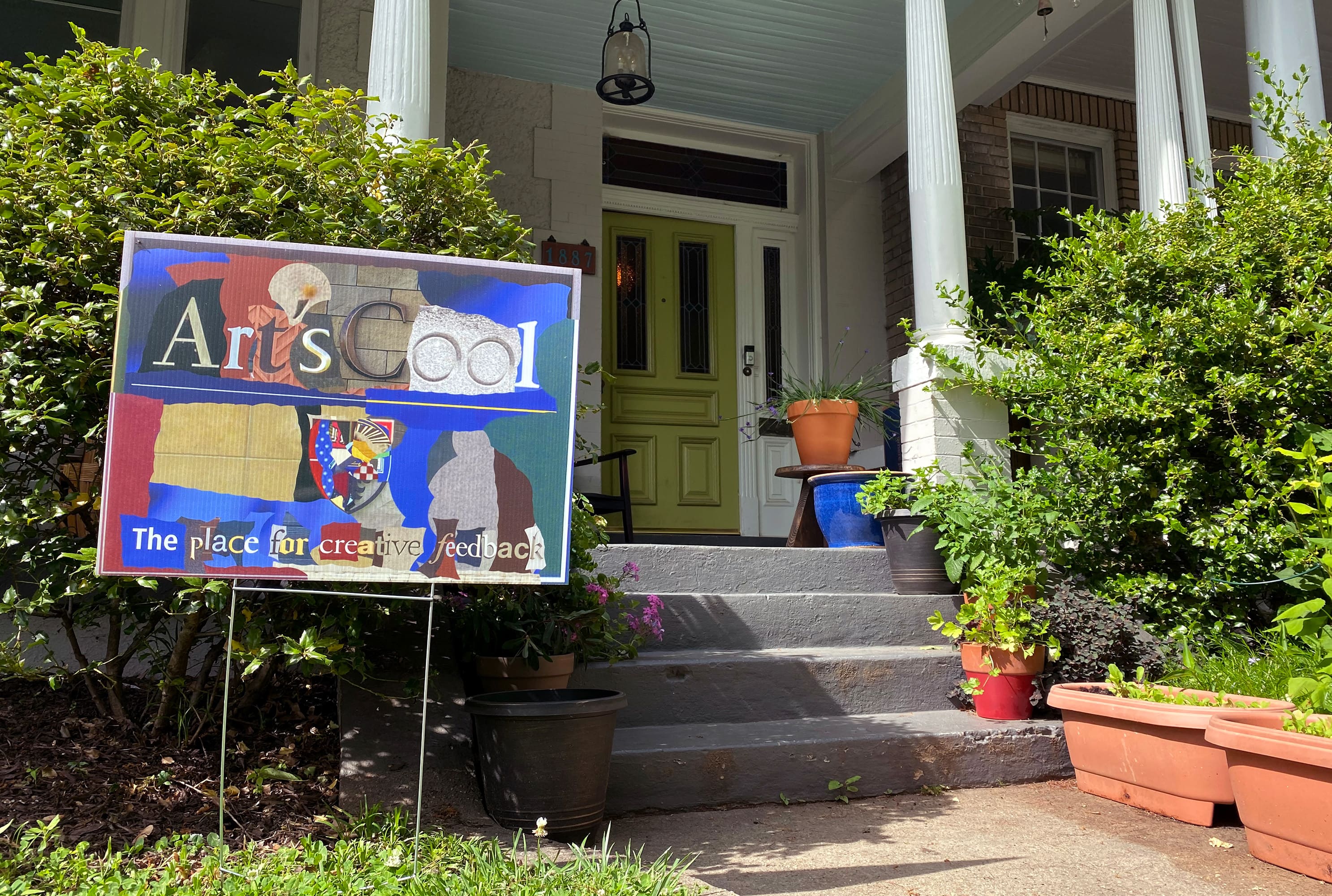
Yard Sign commisioned by Art’sCool a collective of educators providing online creative feedback for anyone who wants it. On the sign pieces of existing campus signs from other educational institutions are merged together to form the messaging for Art’sCool.
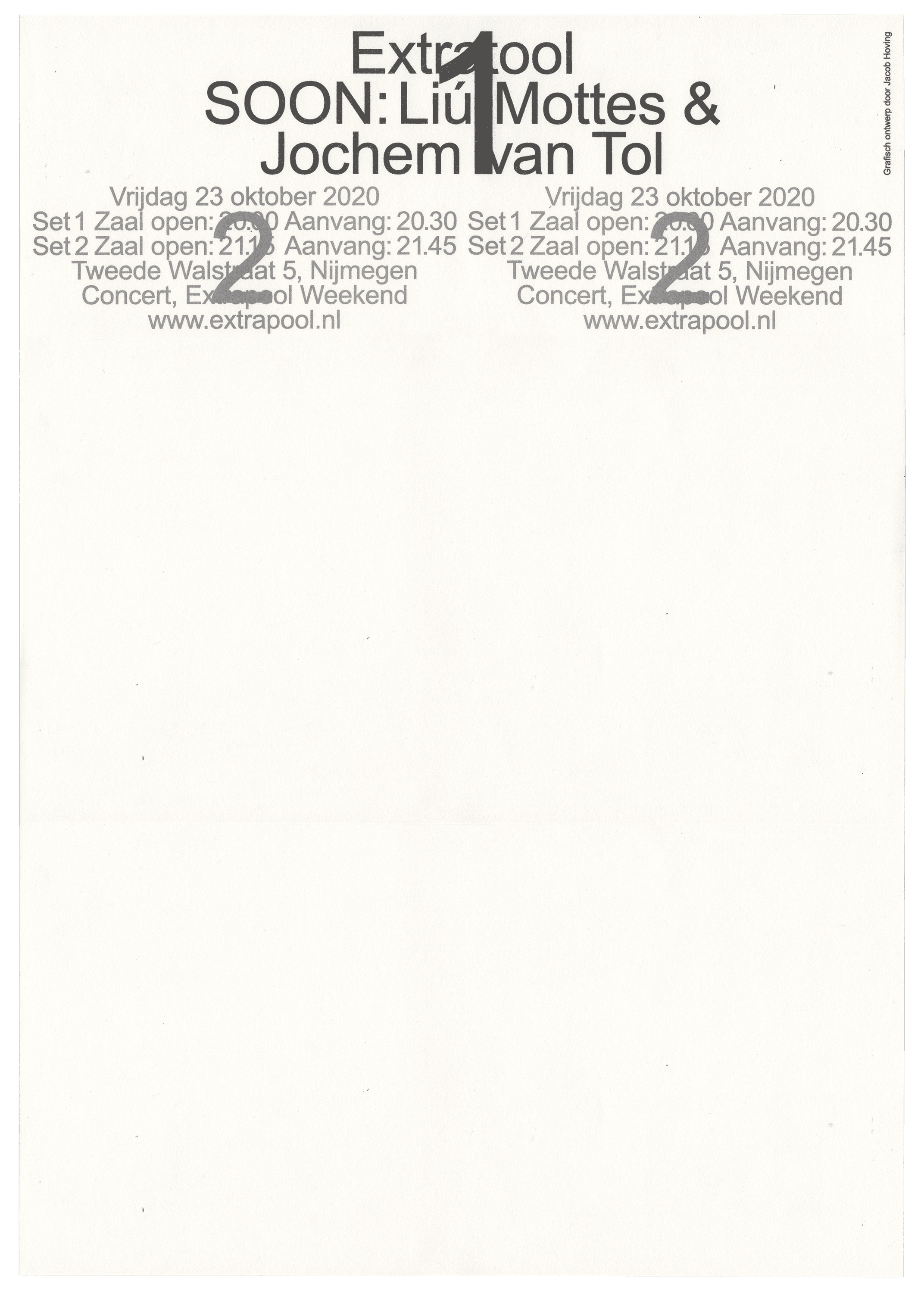
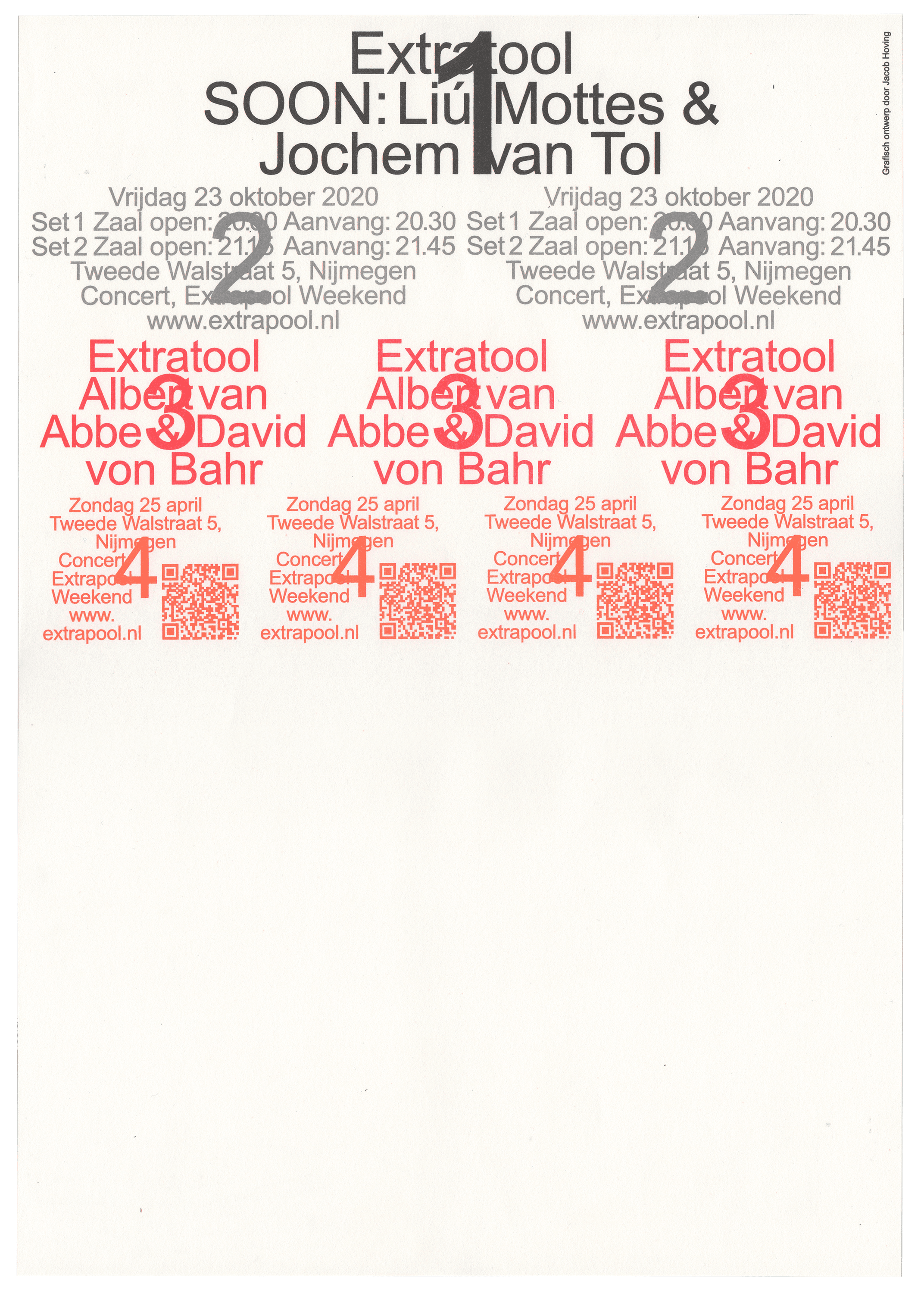
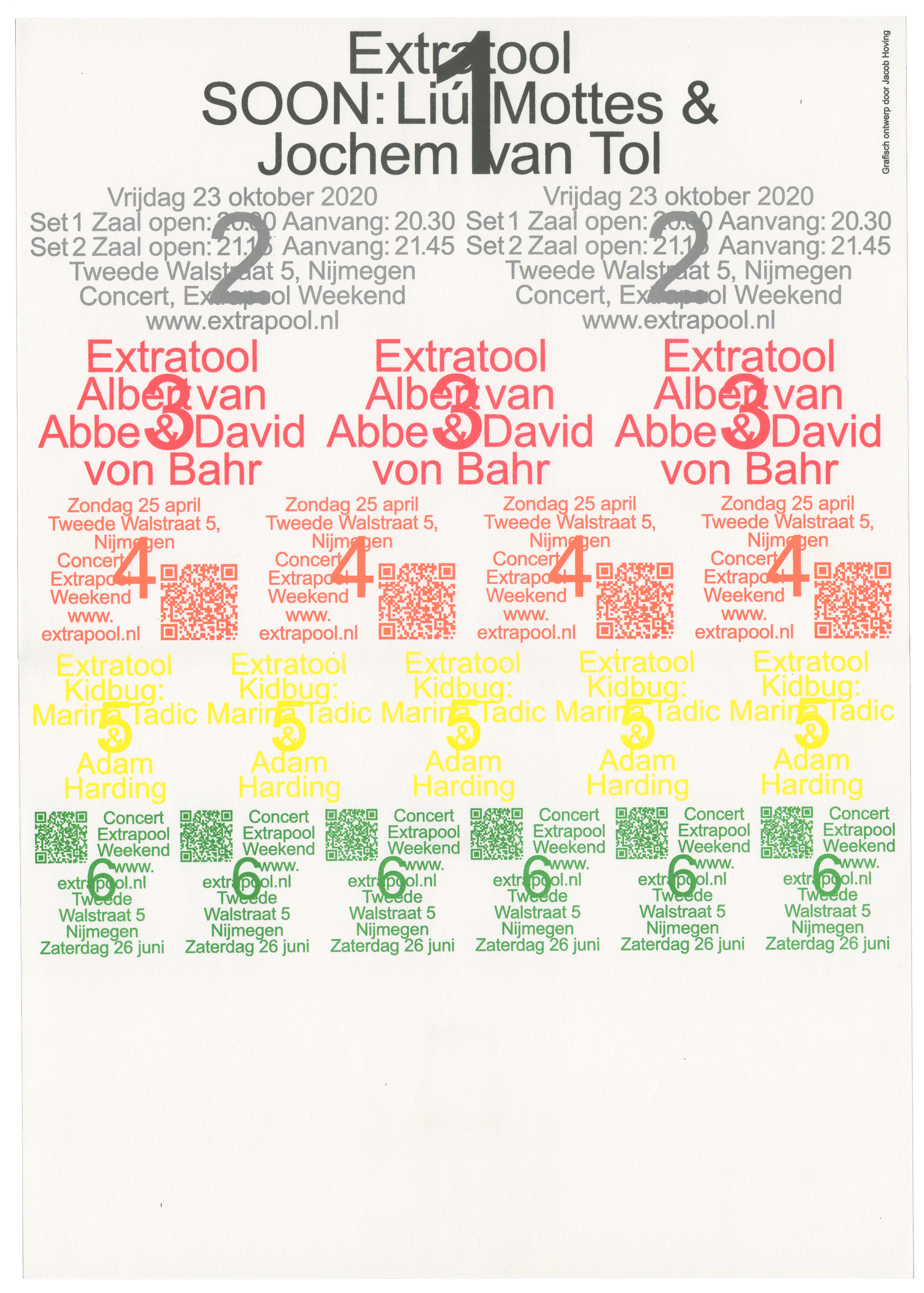
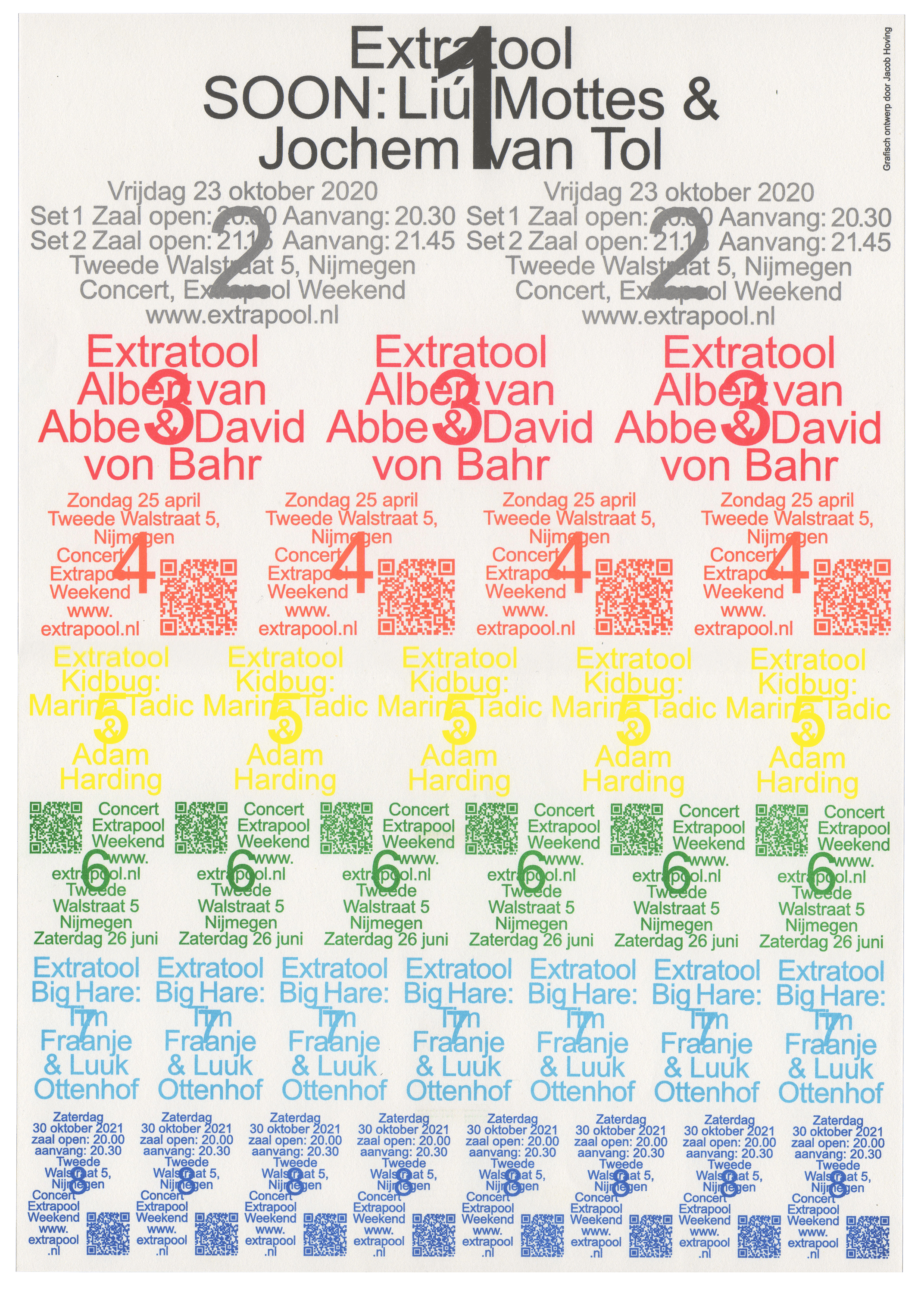
Poster series for Extratool, a residency program where two composers make two music compositions that will be performed live at Extrapool. For each new edition the information announcing the event is overprinted onto the poster of the previous edition.
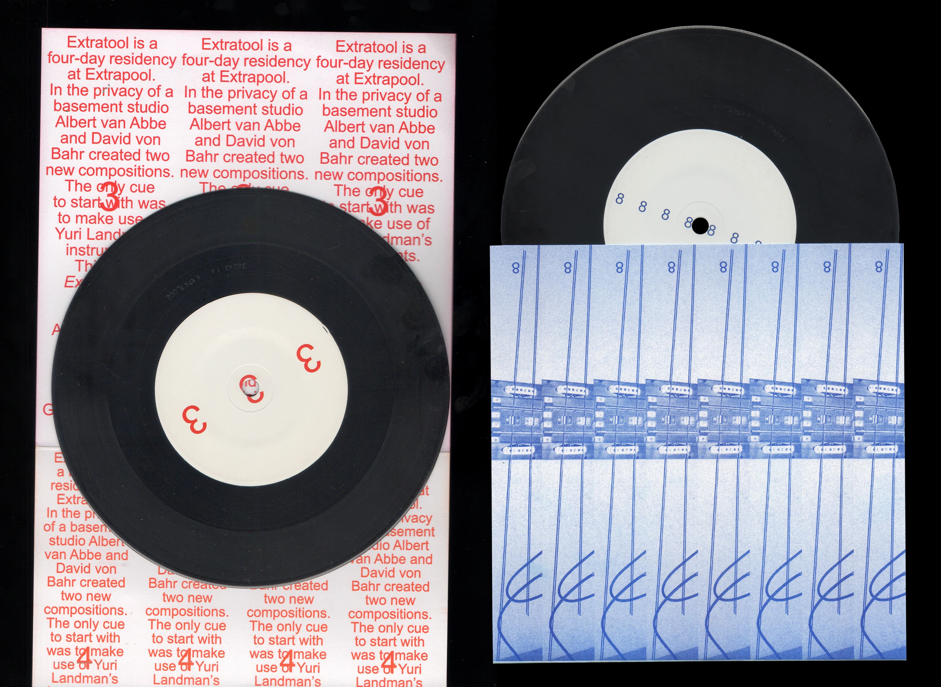
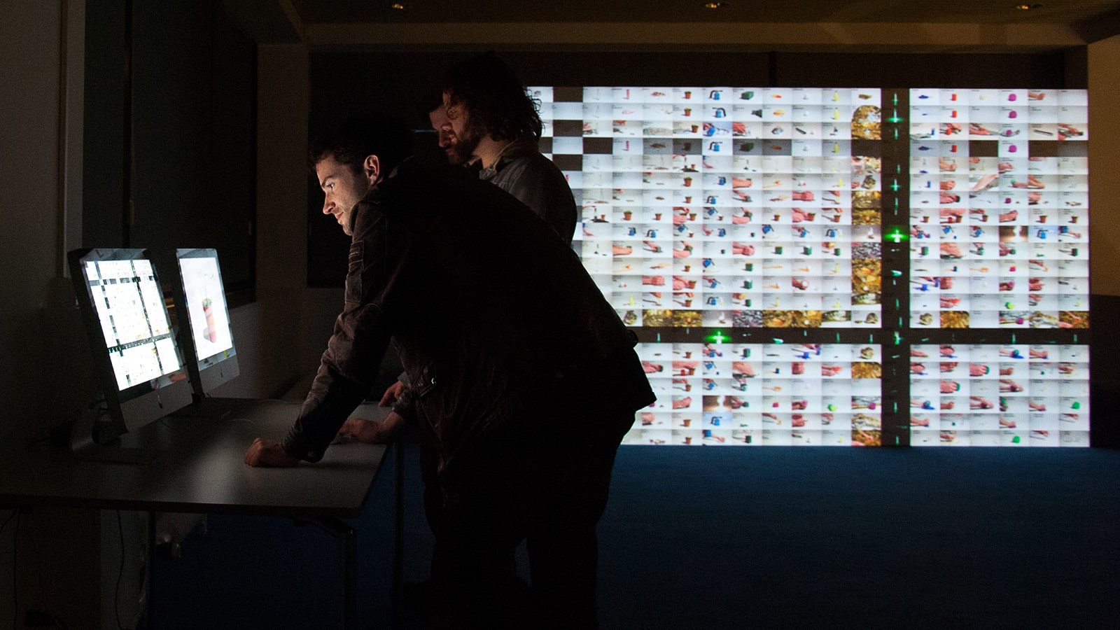
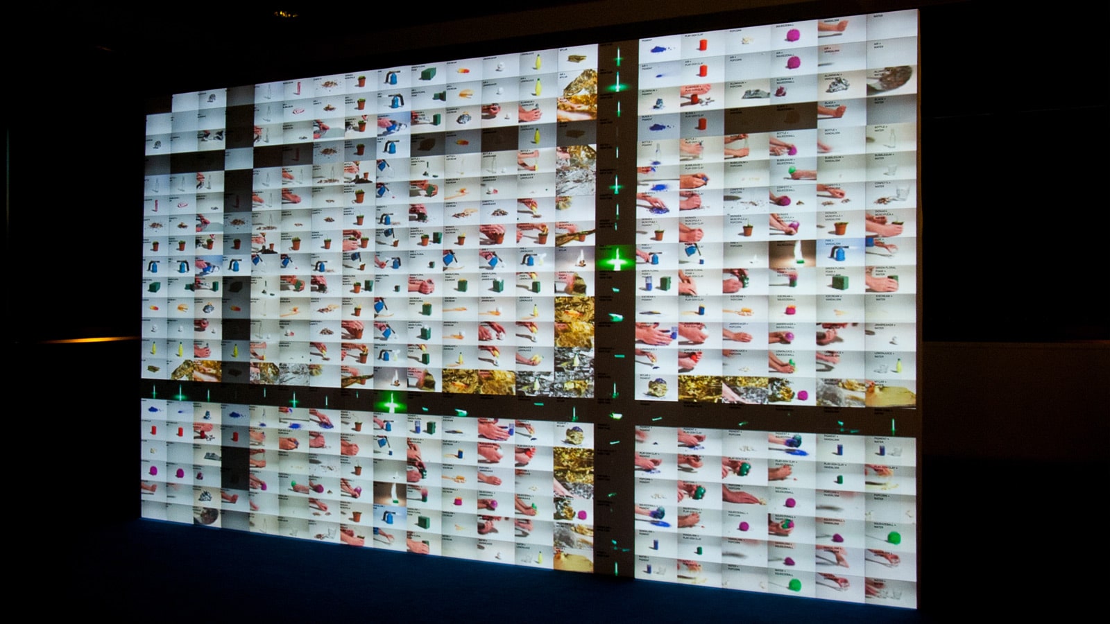
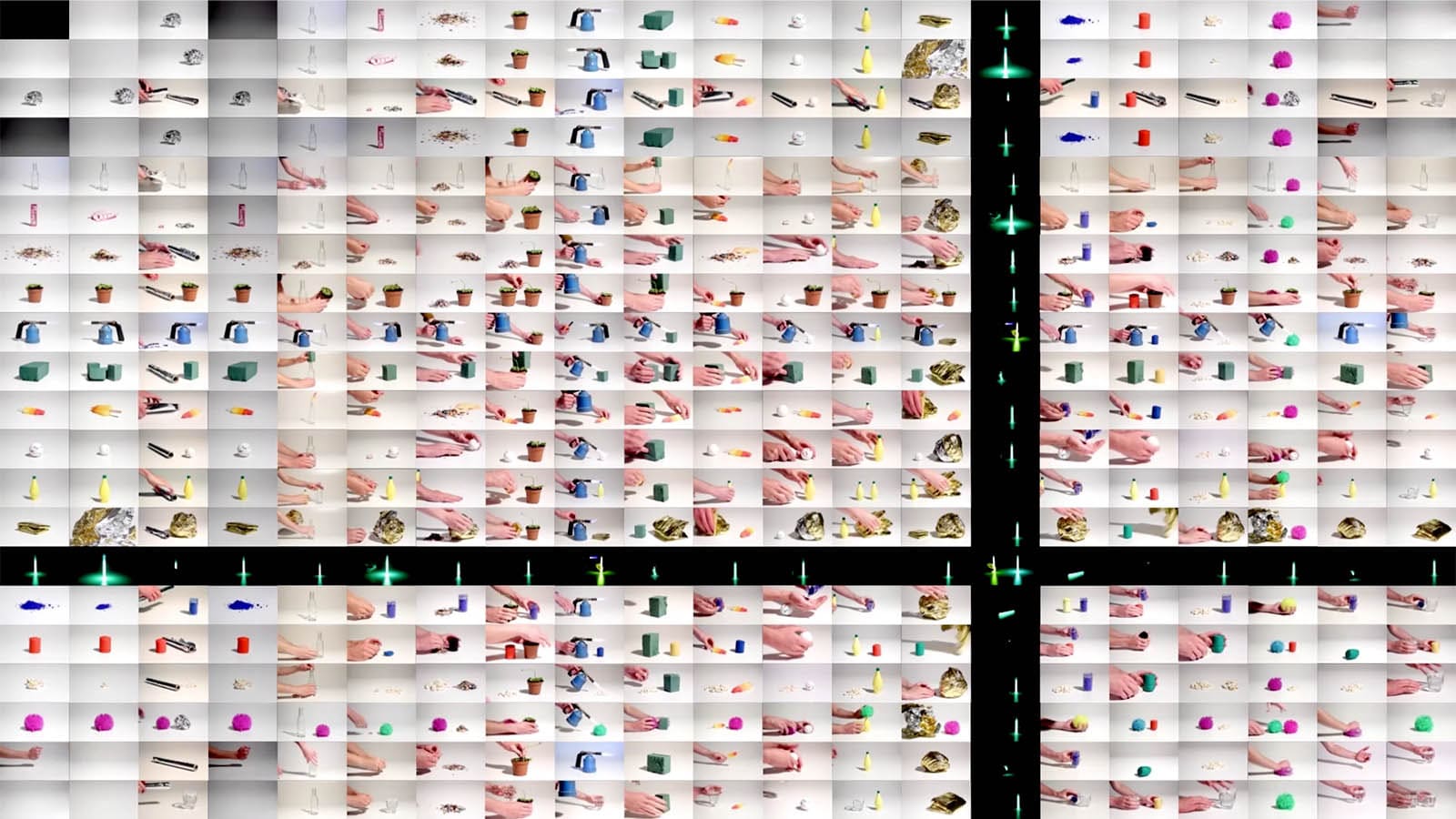
LPs made for the Extratool residency. In the residency two artists experimented with a collection of instruments made by Yuri Landman. The instruments originate from his research in Harmonics; the amount of waves formed within a snare (for example the first harmonics is one wave, the second harmonics two waves, etc). Similarly the concept of harmonics is used for the layout of the LP, as the number of music compositions made at Extratool grows, the content in the layout is repeated more and more.
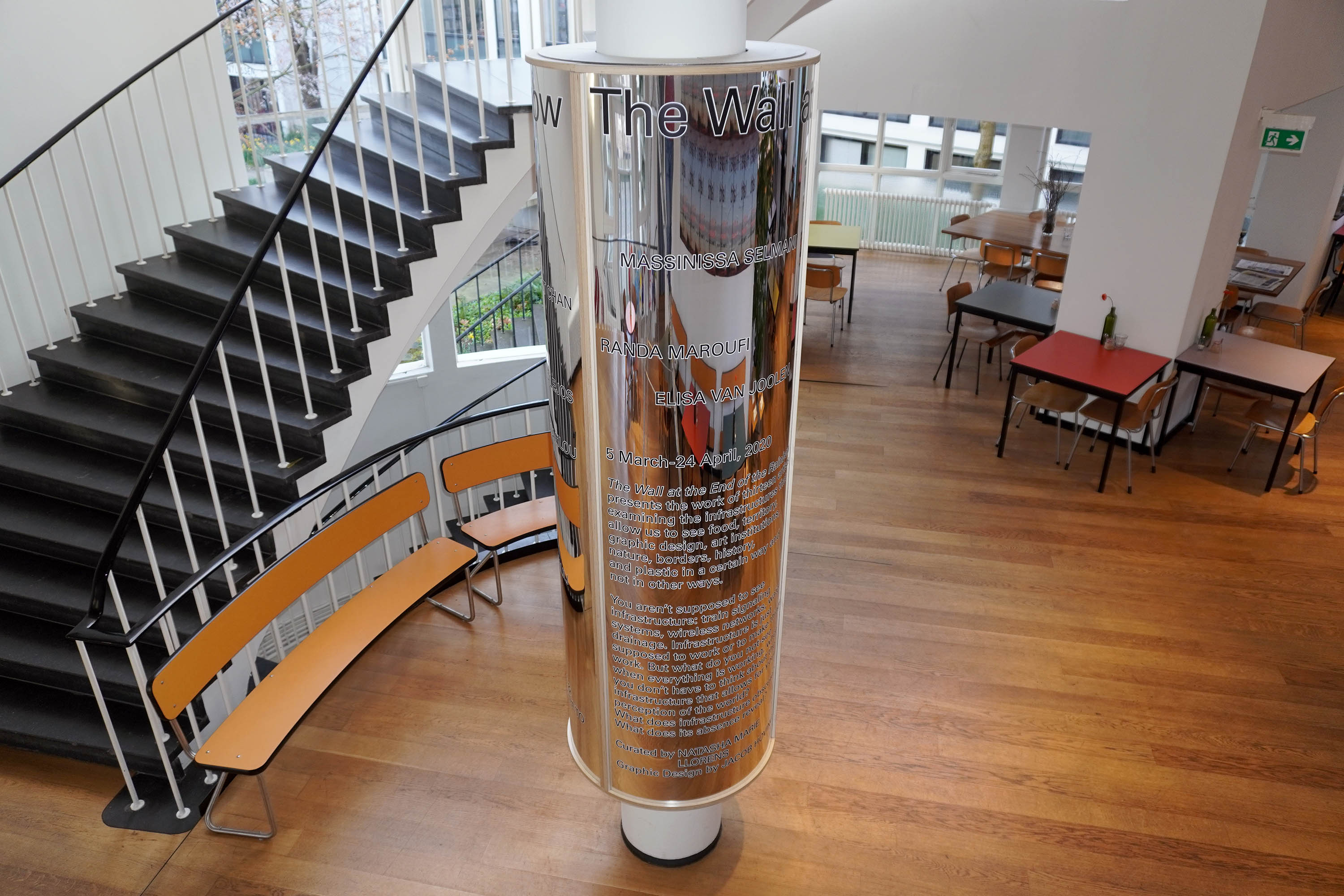
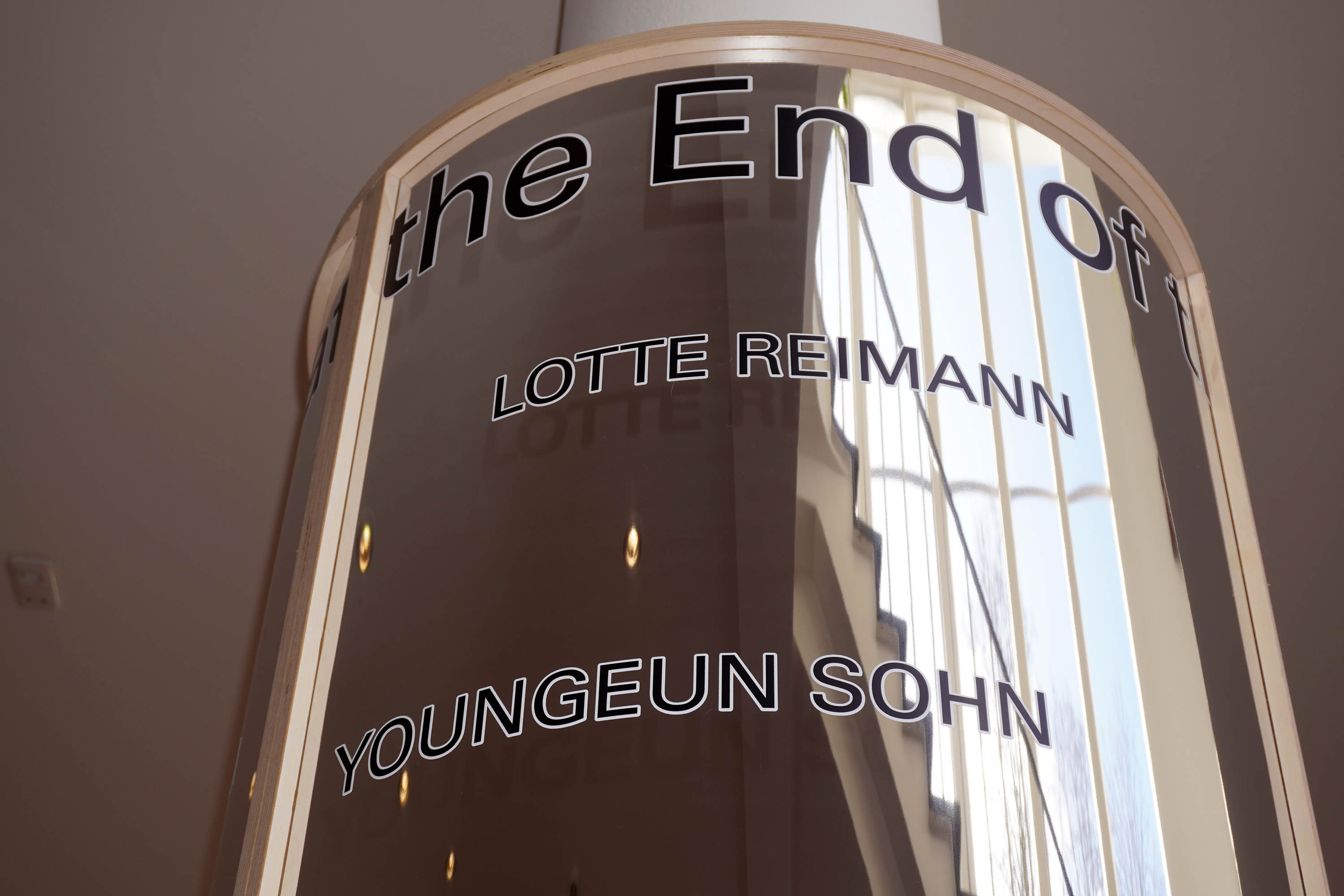
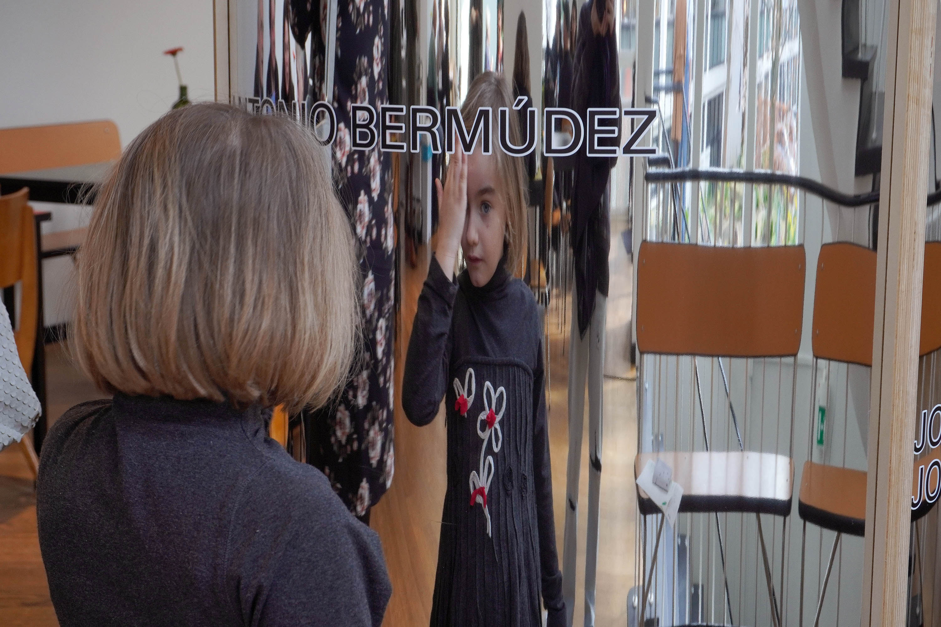
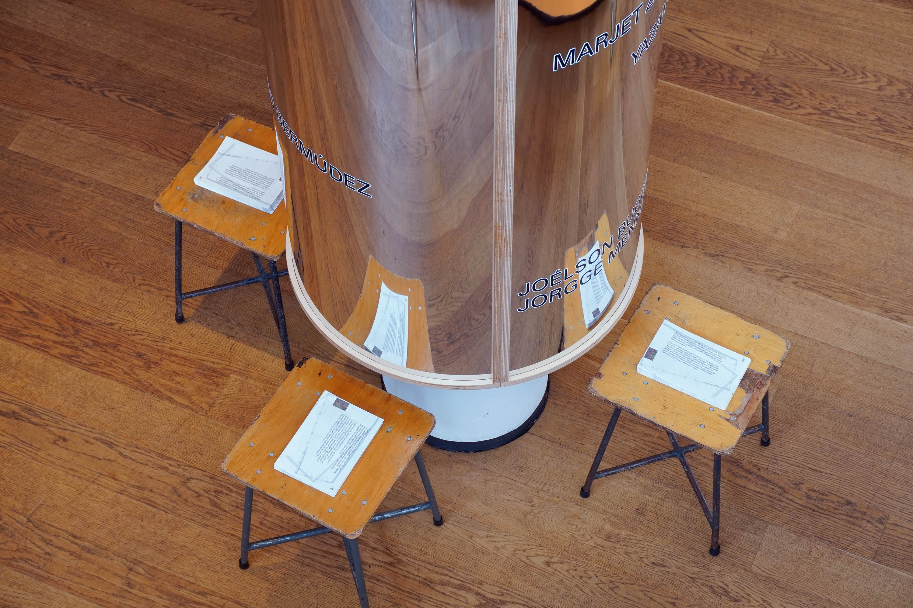
Exhibition graphics for The Wall at the End of the Rainbow, an exhibition curated by Natasha Marie Llorens that was presented at the Jan van Eyck Academy. The show presents the work of thirteen artists examining the infrastructures that allow us to see in a certain way and not in other ways. The exhibition graphics are presented on a mirror column located in the center of the exhibition. The names of the artists on this reflective surface, point towards the actual location of their work in the exhibition.
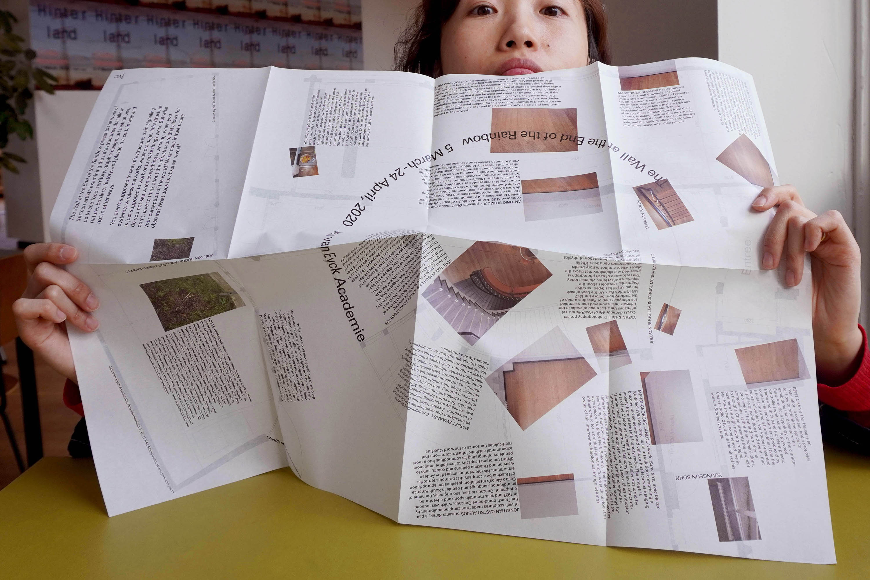
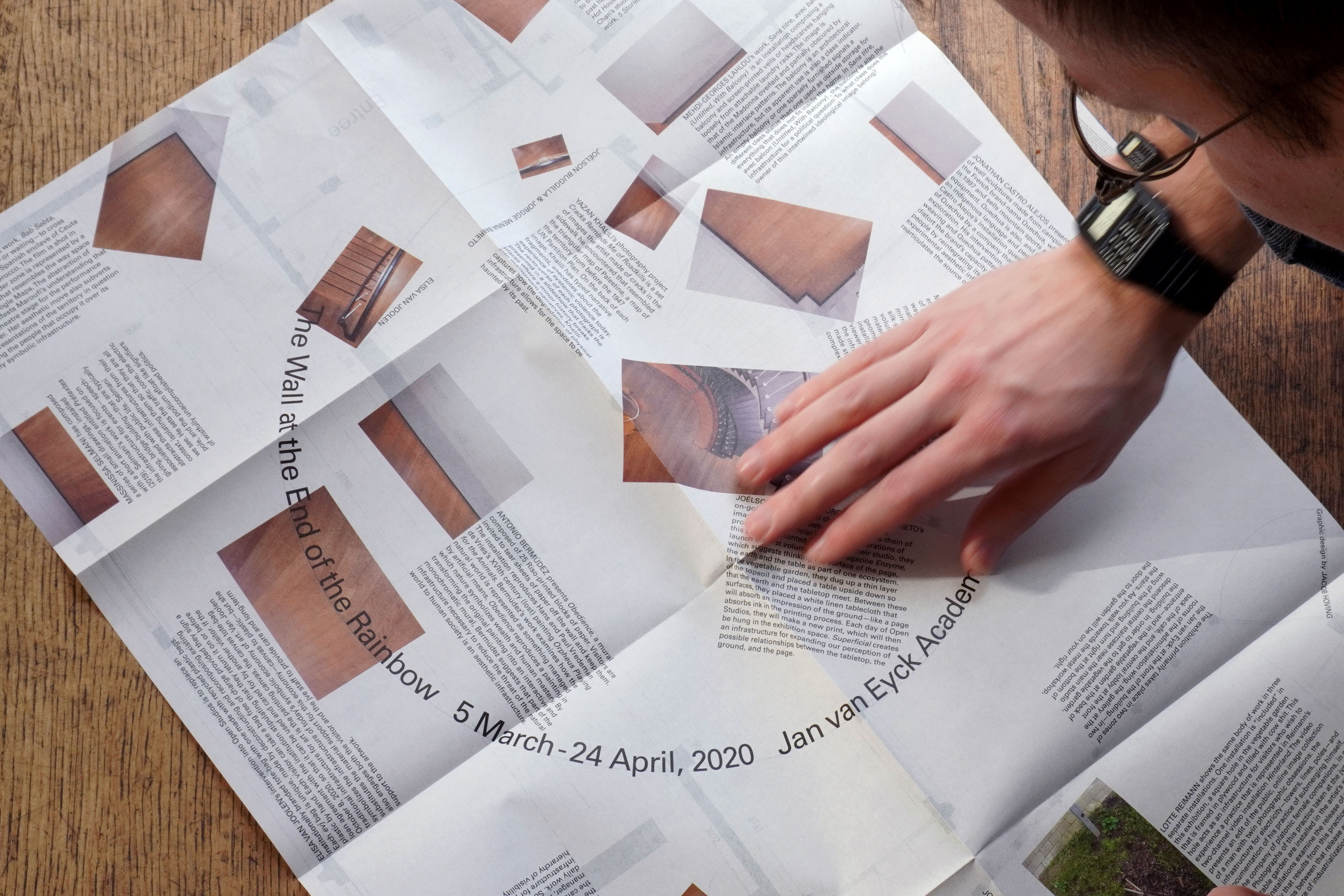
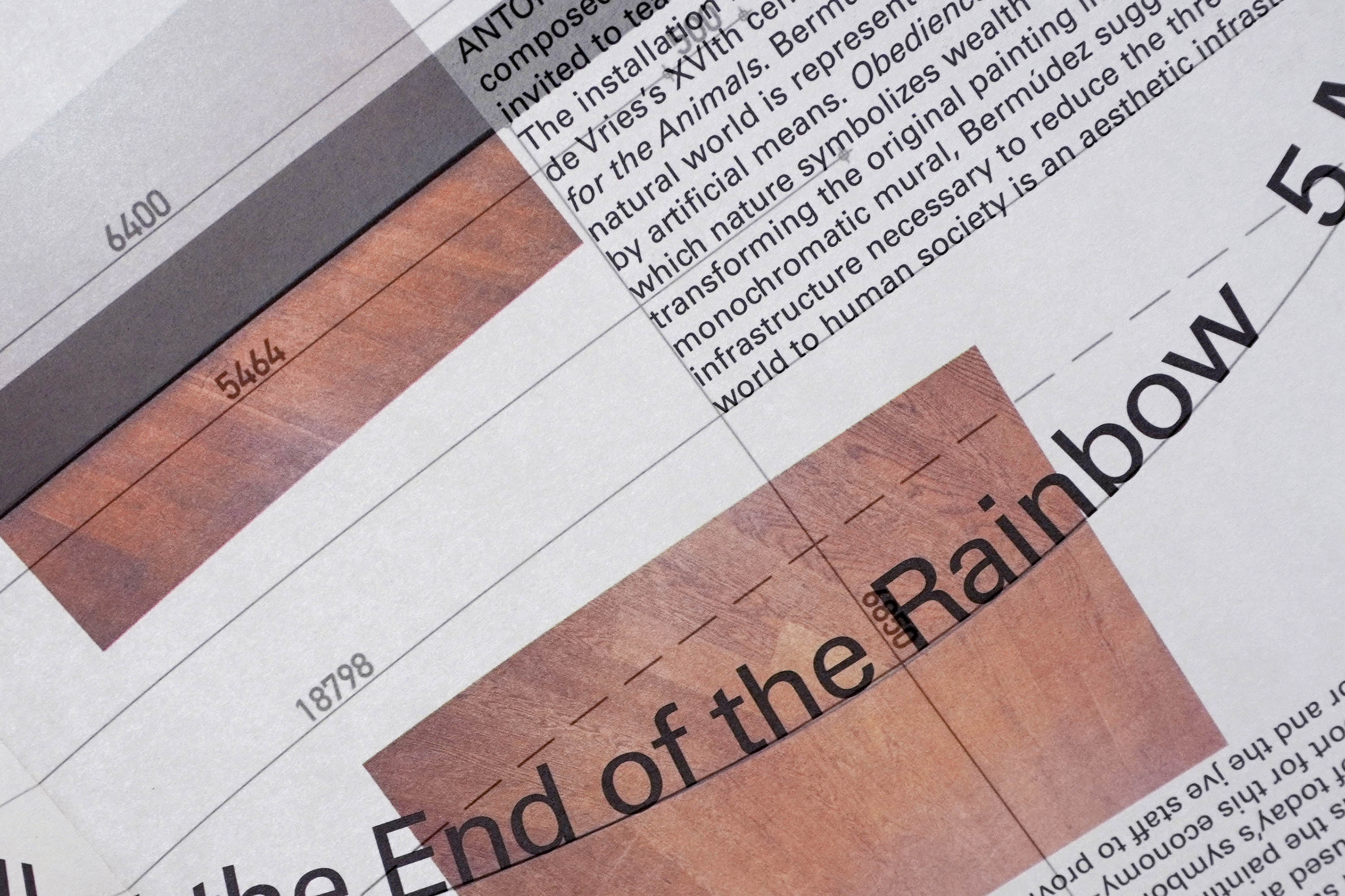
Handout for The Wall at the End of the Rainbow. This map uses the infrastructure of the exhibition space—the floorpan—as a grid for its content. The empty floor images on the map indicate the designated locations of the works in the exhibition.
Website for the artist, Ian Page. On this site, Ian’s works are presented as little machines, each having their own automated logic for behaving within this digital space.
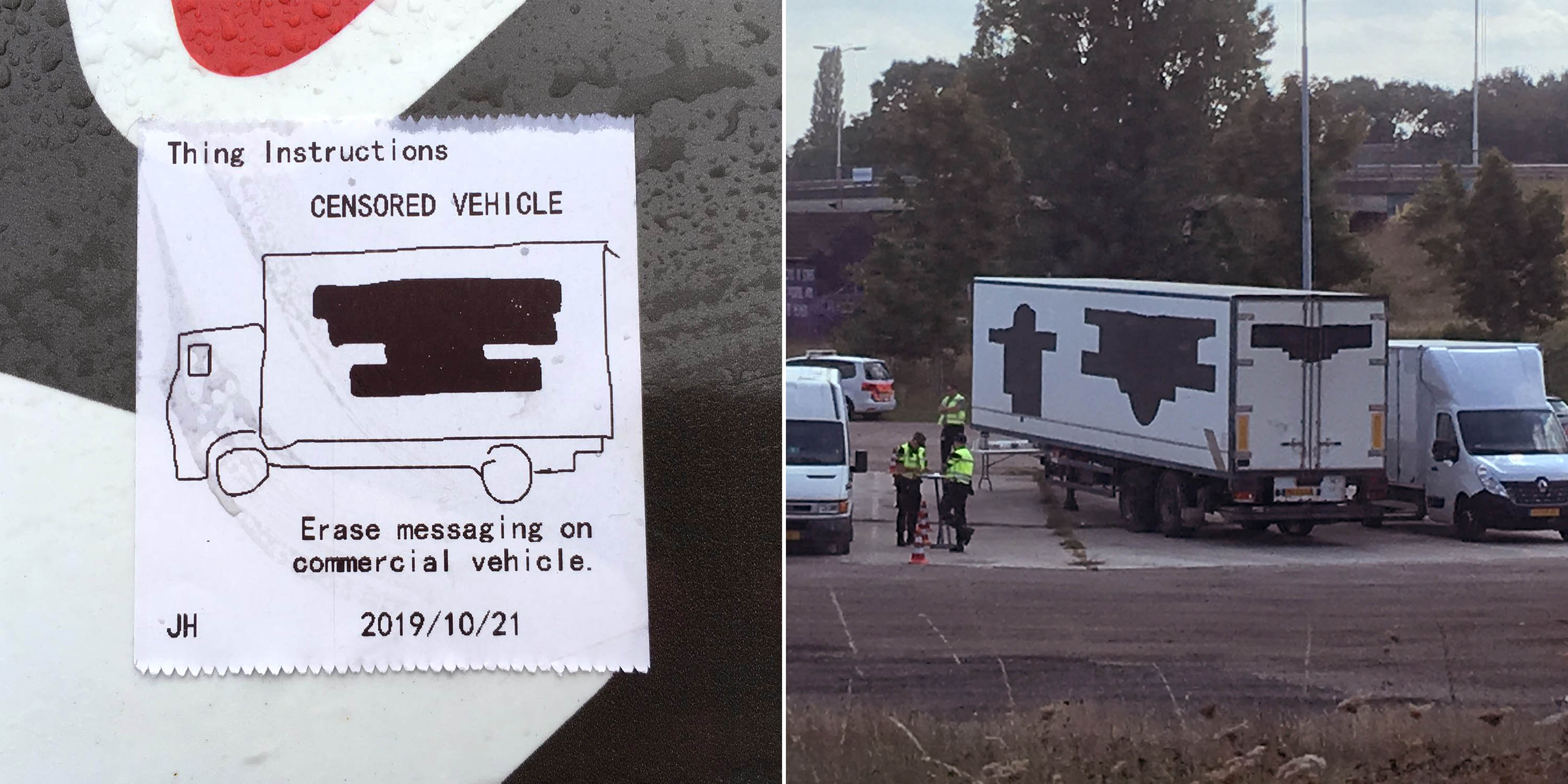
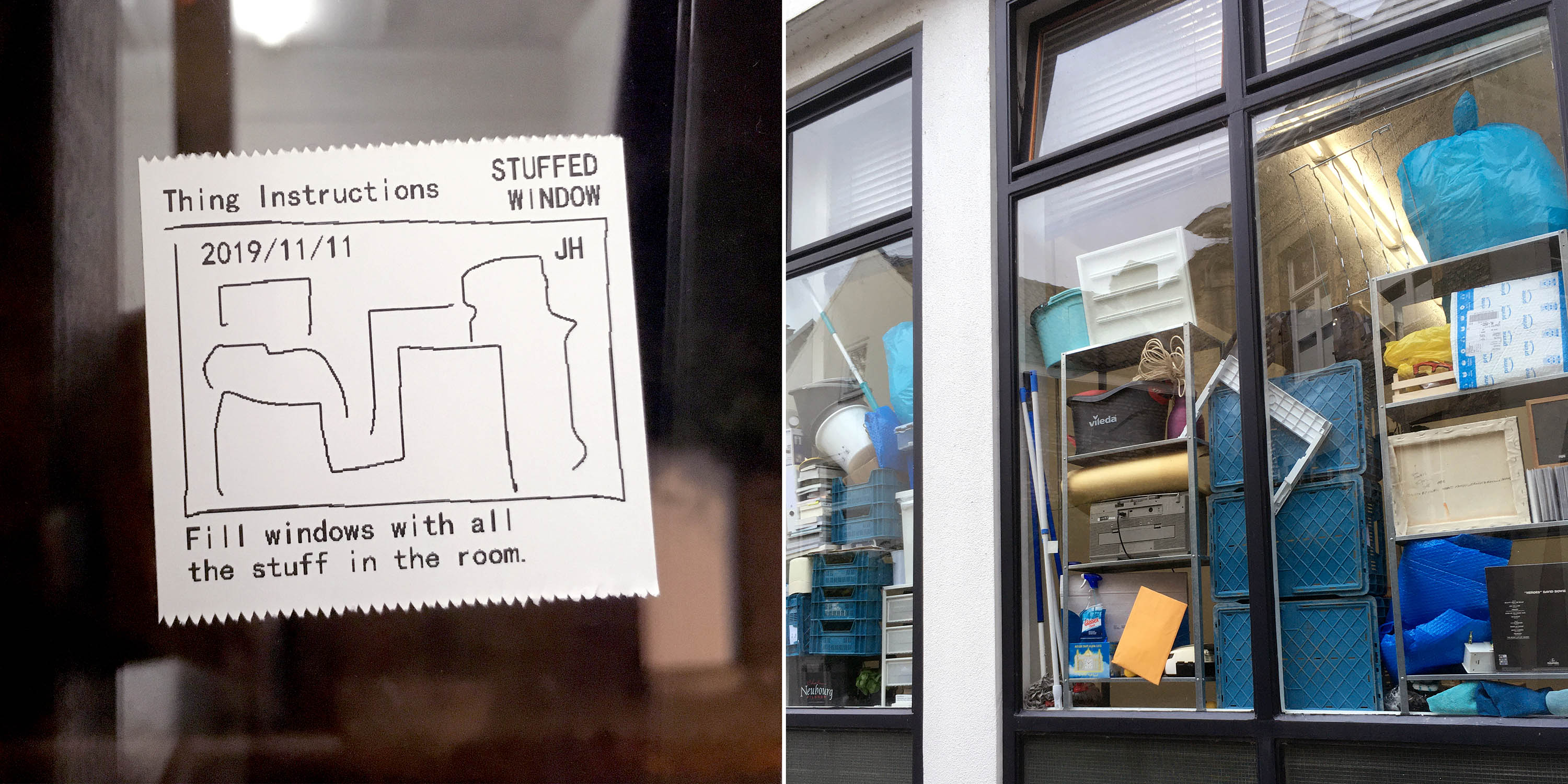
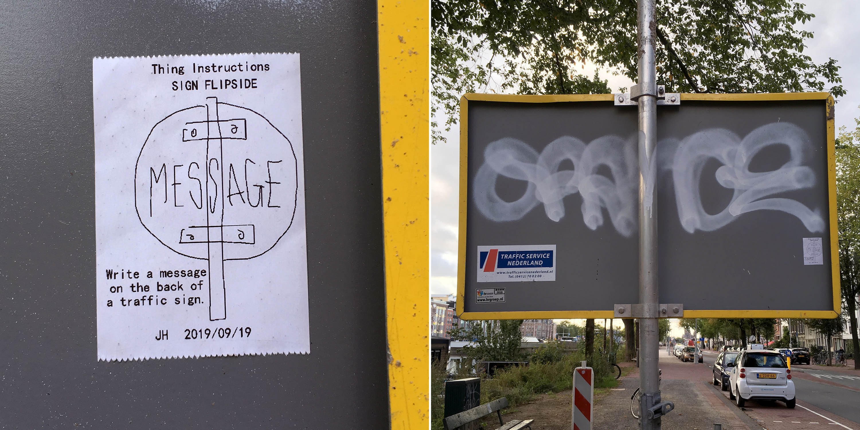
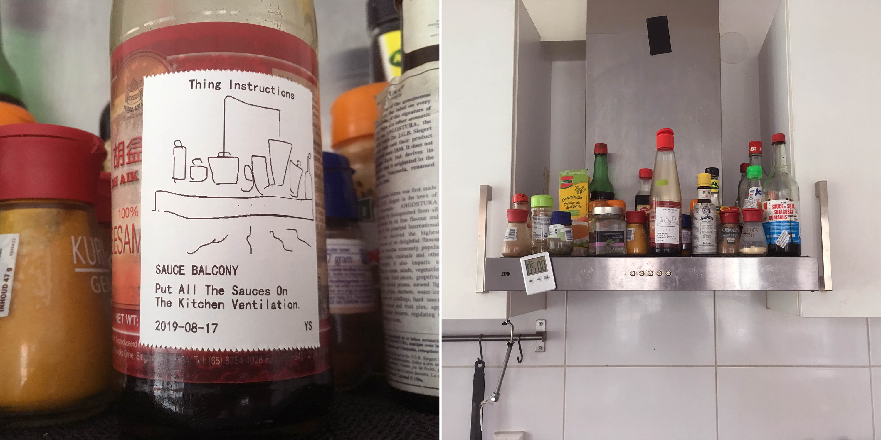
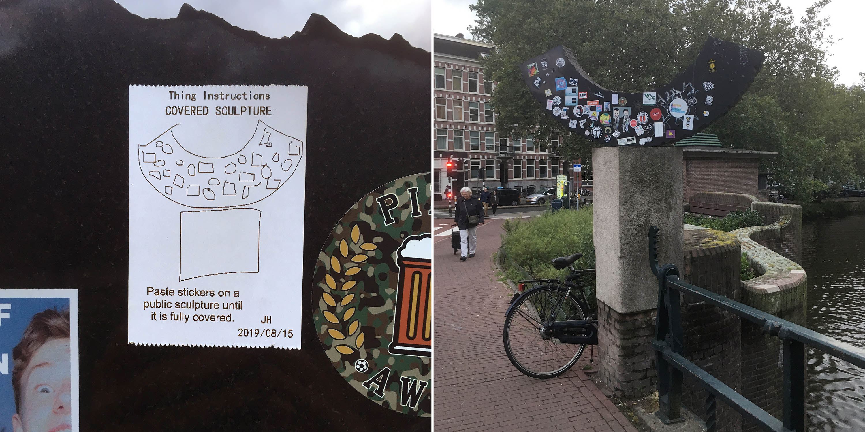
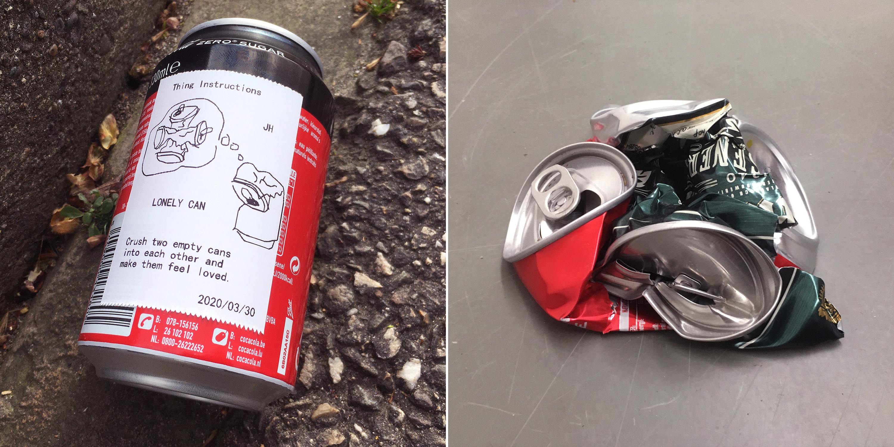
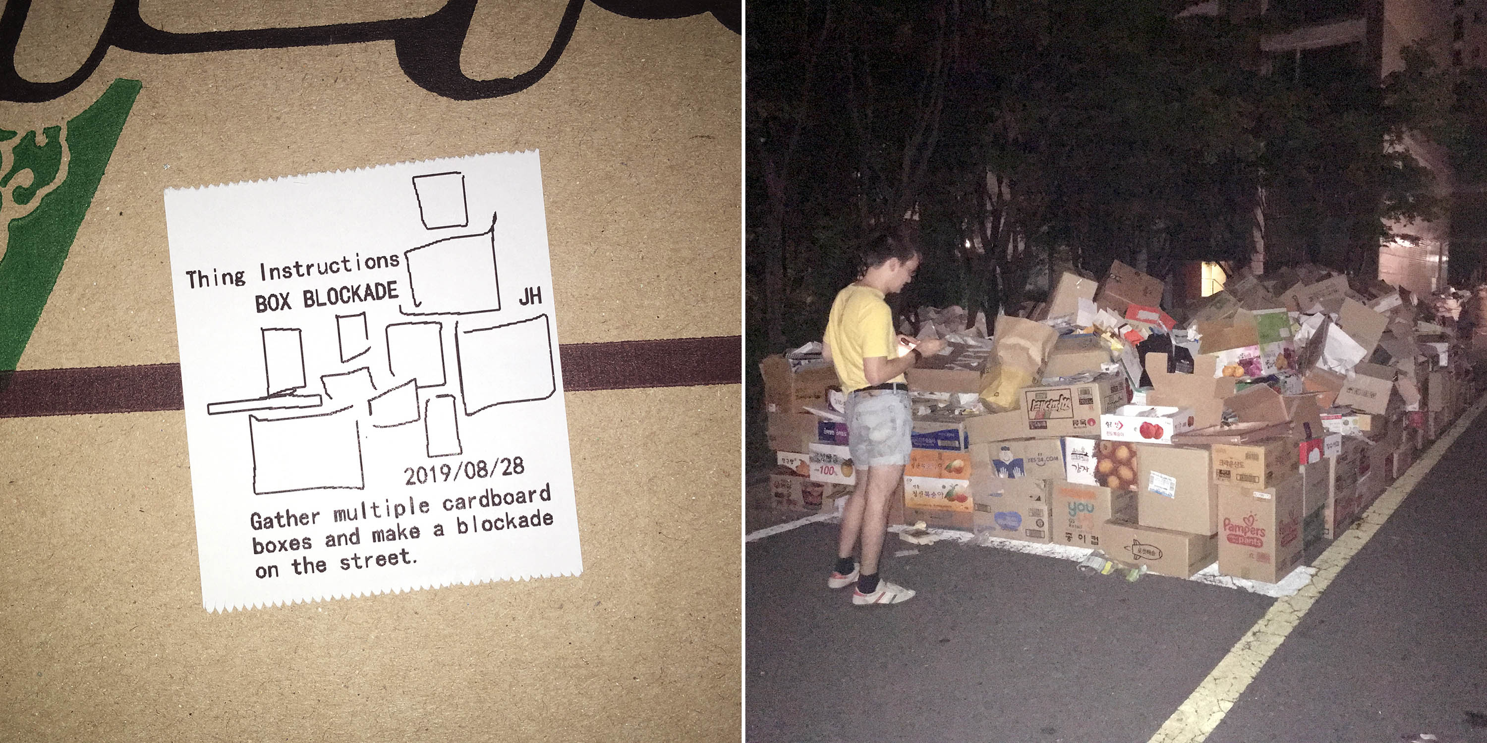
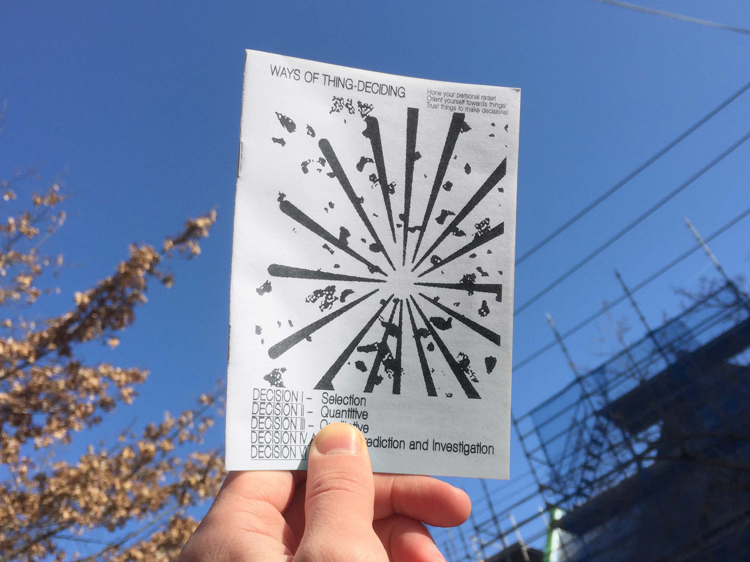
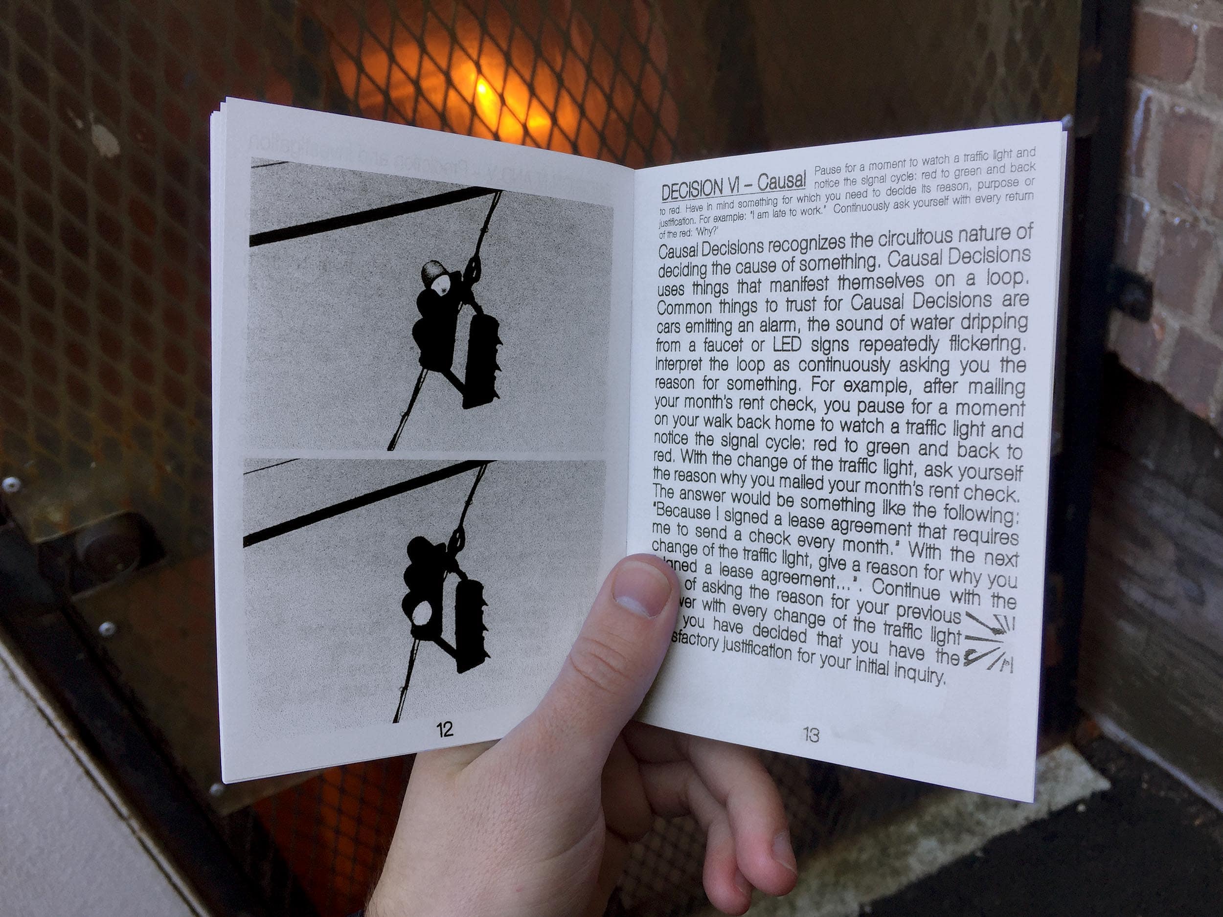
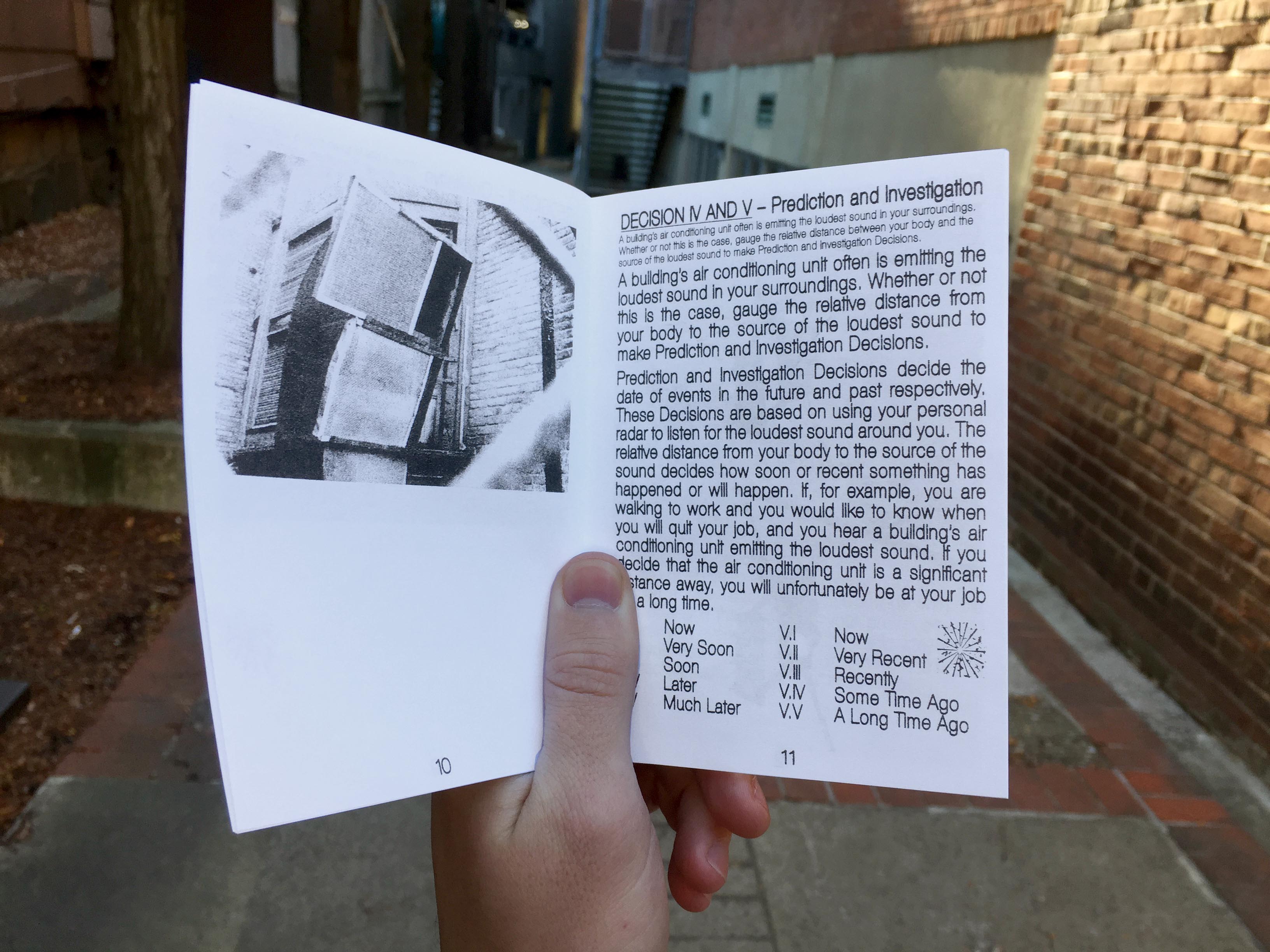
Thing Instructions are a series of Instructional labels stuck onto things, products and technologies in public and private spaces, suggesting alternative approaches for their usage.
Excerpt from a tour given through the office, storage, printshop and street of Extrapool, an art space in Nijmegen. Together with the audience we acted out a series of Thing Instructions with objects at hand.
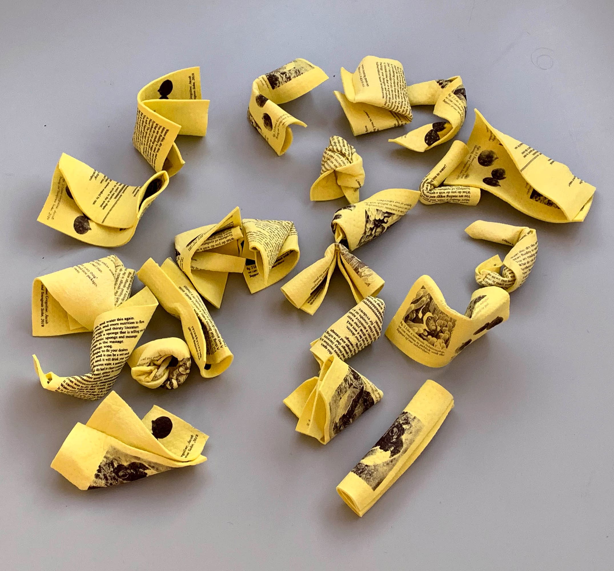
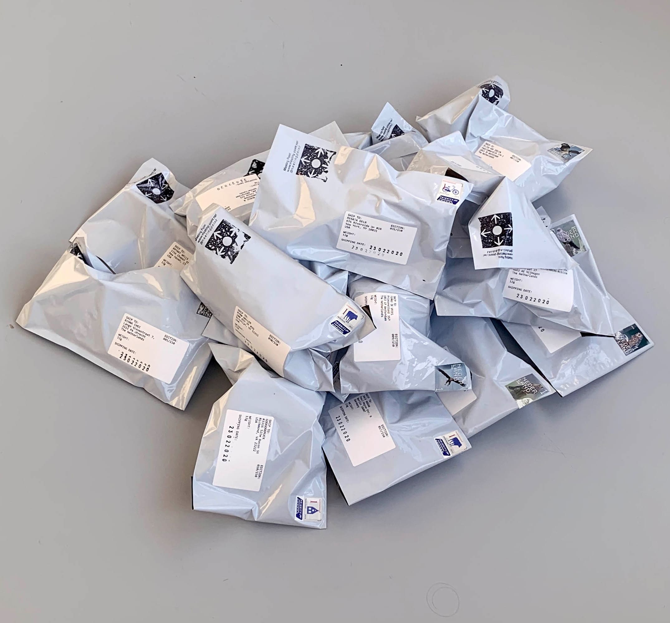
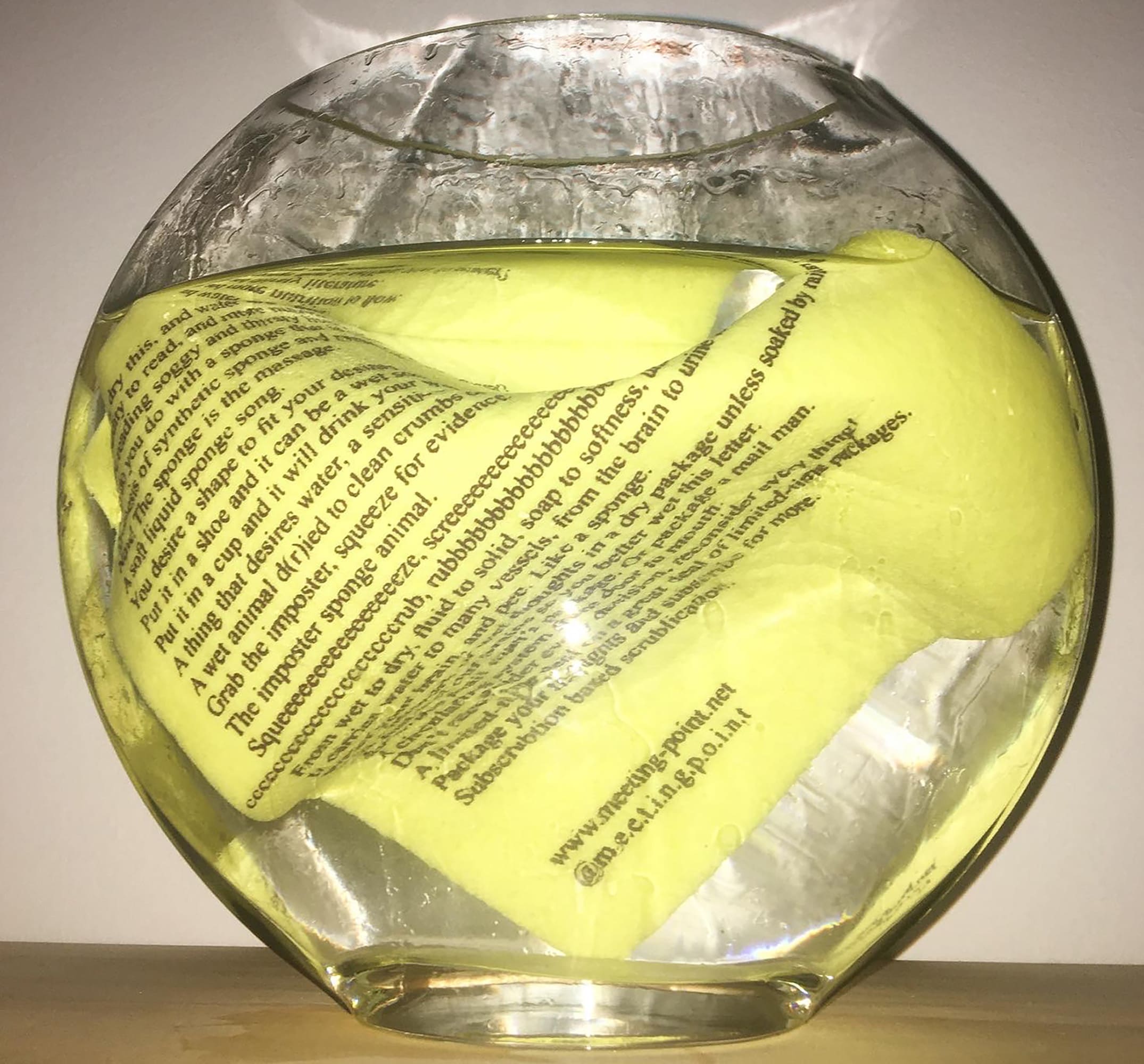
Meeting Point Issue 1: Sponge literature has to be watered in order to be read and each time dries up in a new sculptural shape. We distributed this lightweight object across all borders, upon request or wherever we pleased! Meeting Point publishes artists' multiples distributed through mail & more. MP is run by Emma Gregoline, Youngeun Sohn and I. You can find us on Instagram. @m.e.e.t.i.n.g.p.o.i.n.t and www.meeting-point.net
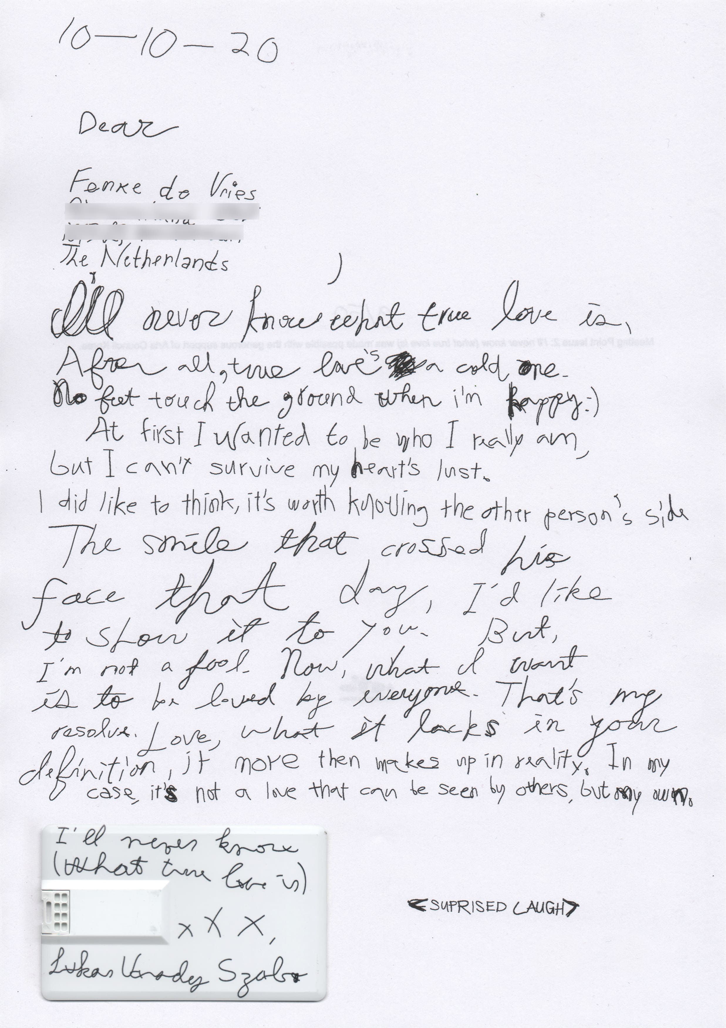
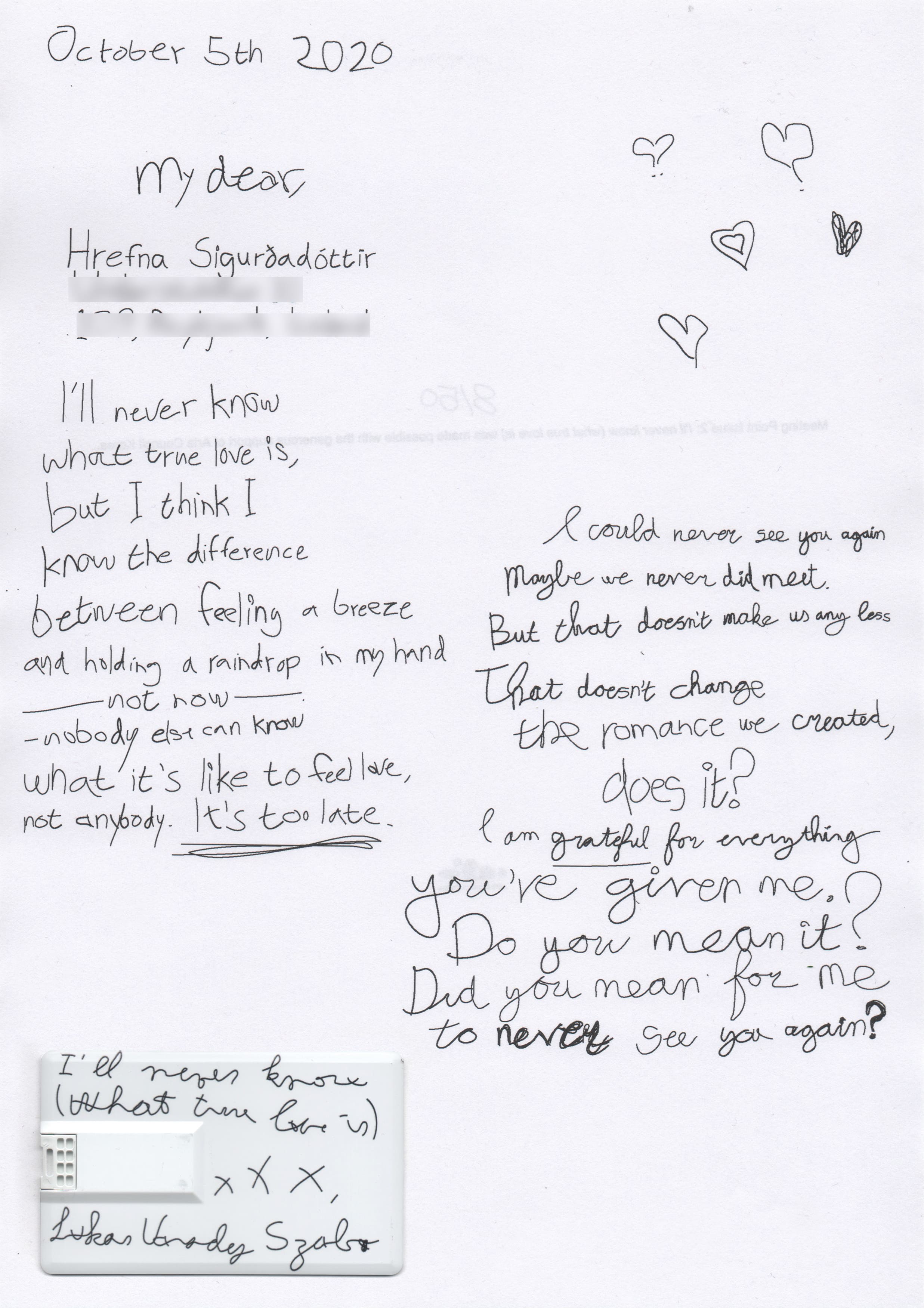
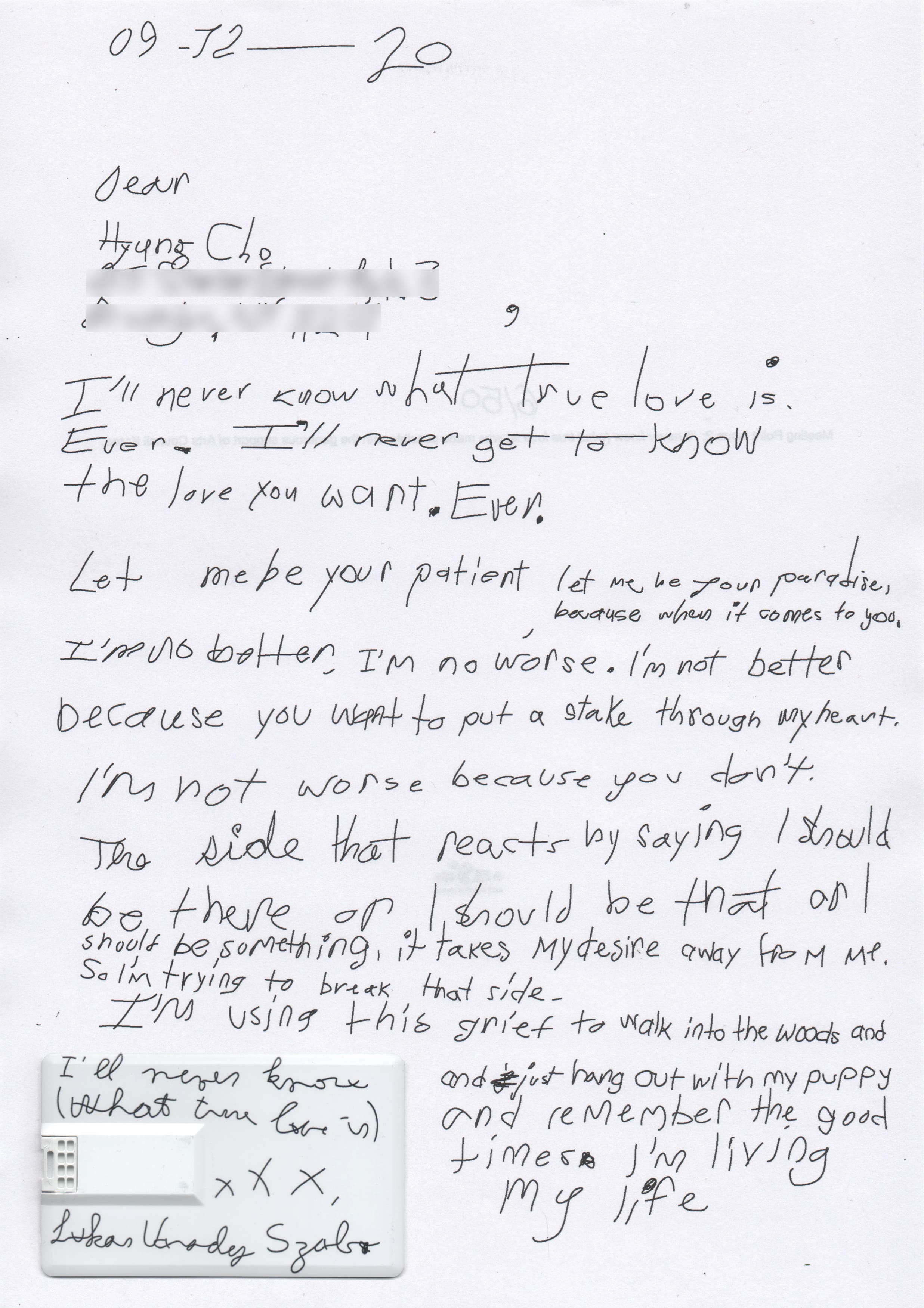
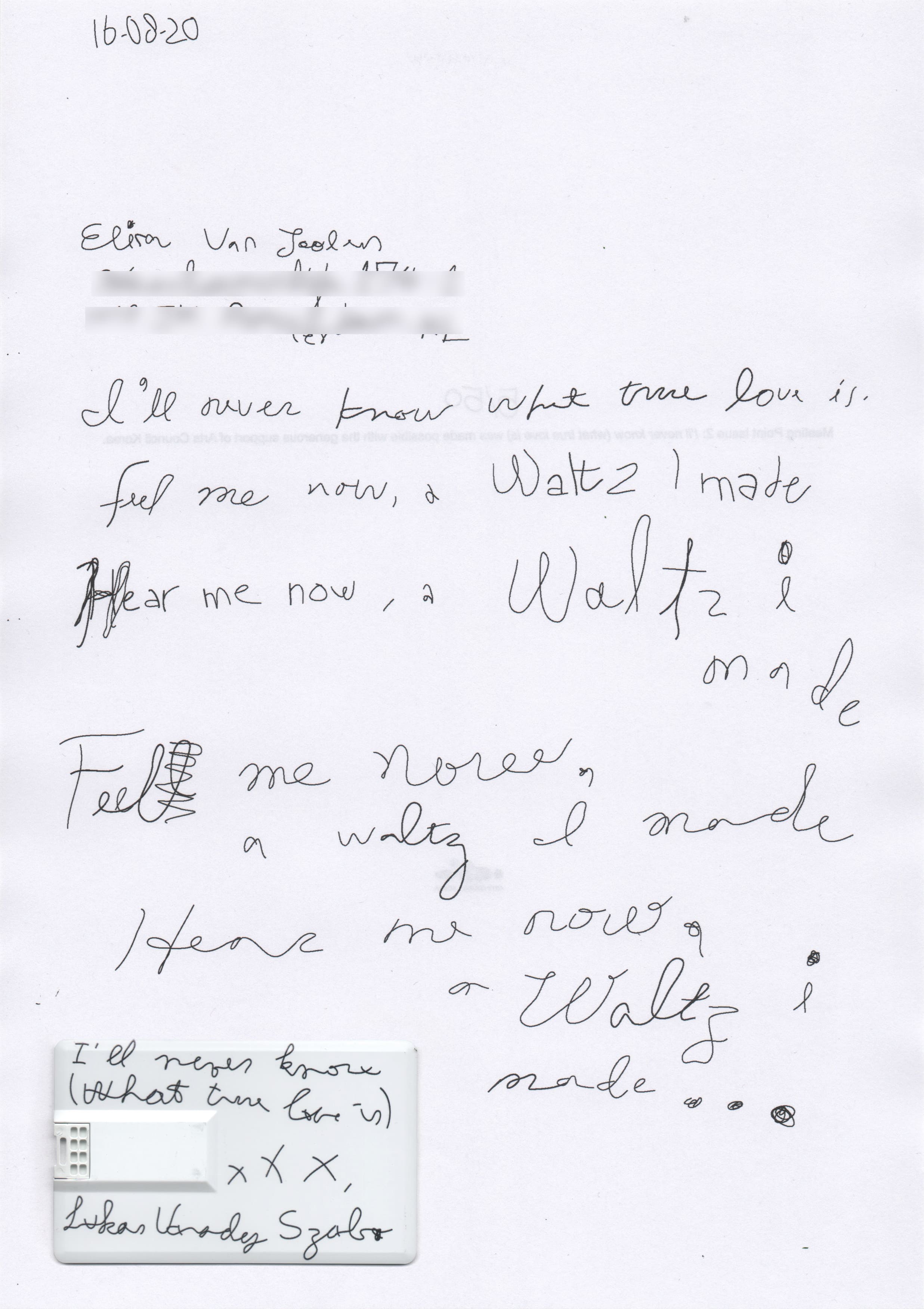
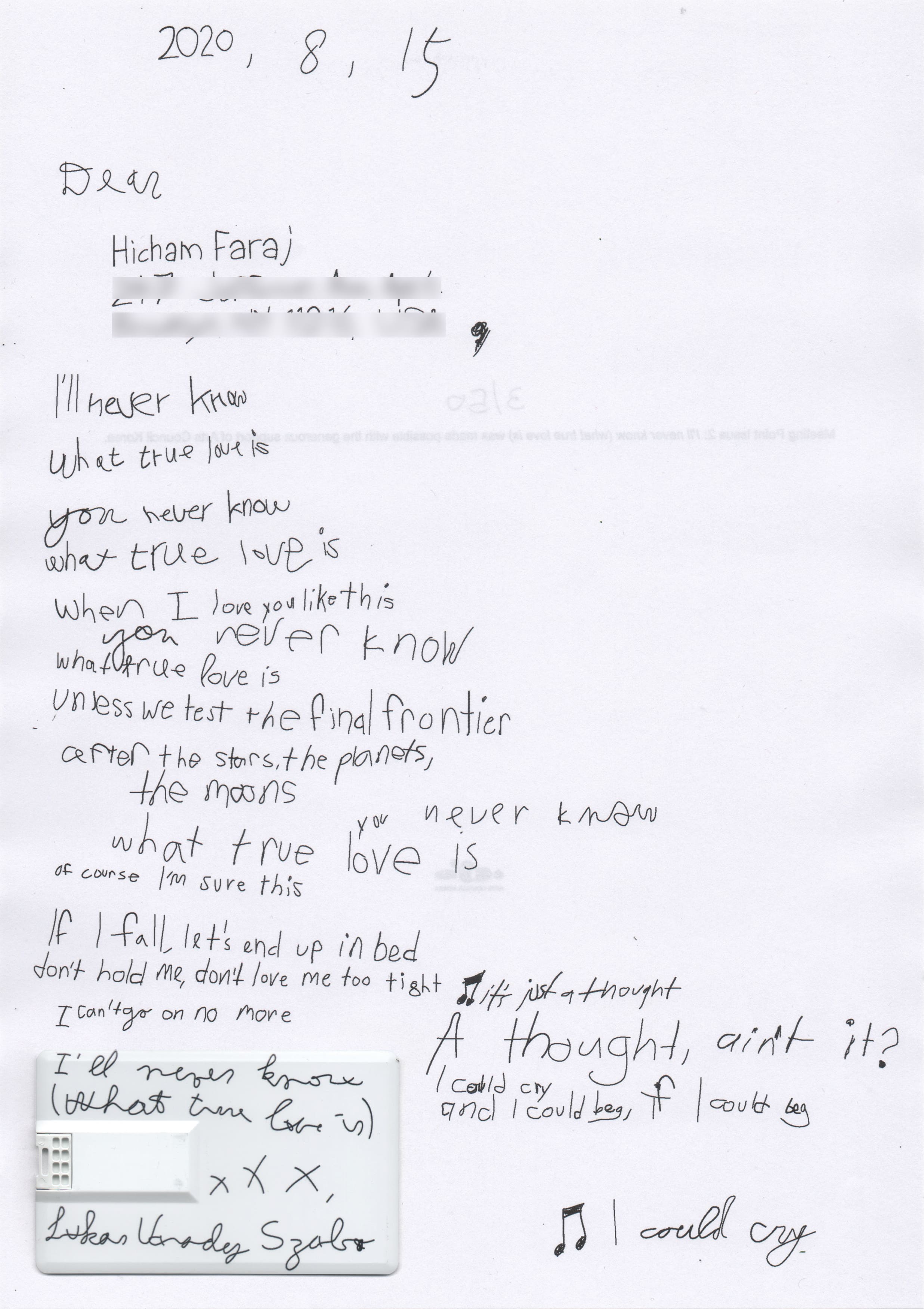
Meeting Point Issue 2: I’ll Never Know (What True Love is) is a love song made by Lukas Varady Szabo. The song is placed on a USB card and attached to a letter made with autogenerated text based on the lyrics.
Pouring Light in a Bucket is a light installation that shines brighter the more water is poured into the leaking bucket. As the water slowly drips out of the bucket, the room gradually turns back into darkness. Made in collaboration with William Wheeler.
Music player that is navigated with eleven fingers. The number of fingers touching the screen determines which of the eleven songs is played from the list. Songs are organized in reverse chronological order, thus more fingers reach older dates. Made in collaboration with Ayham Ghraowi
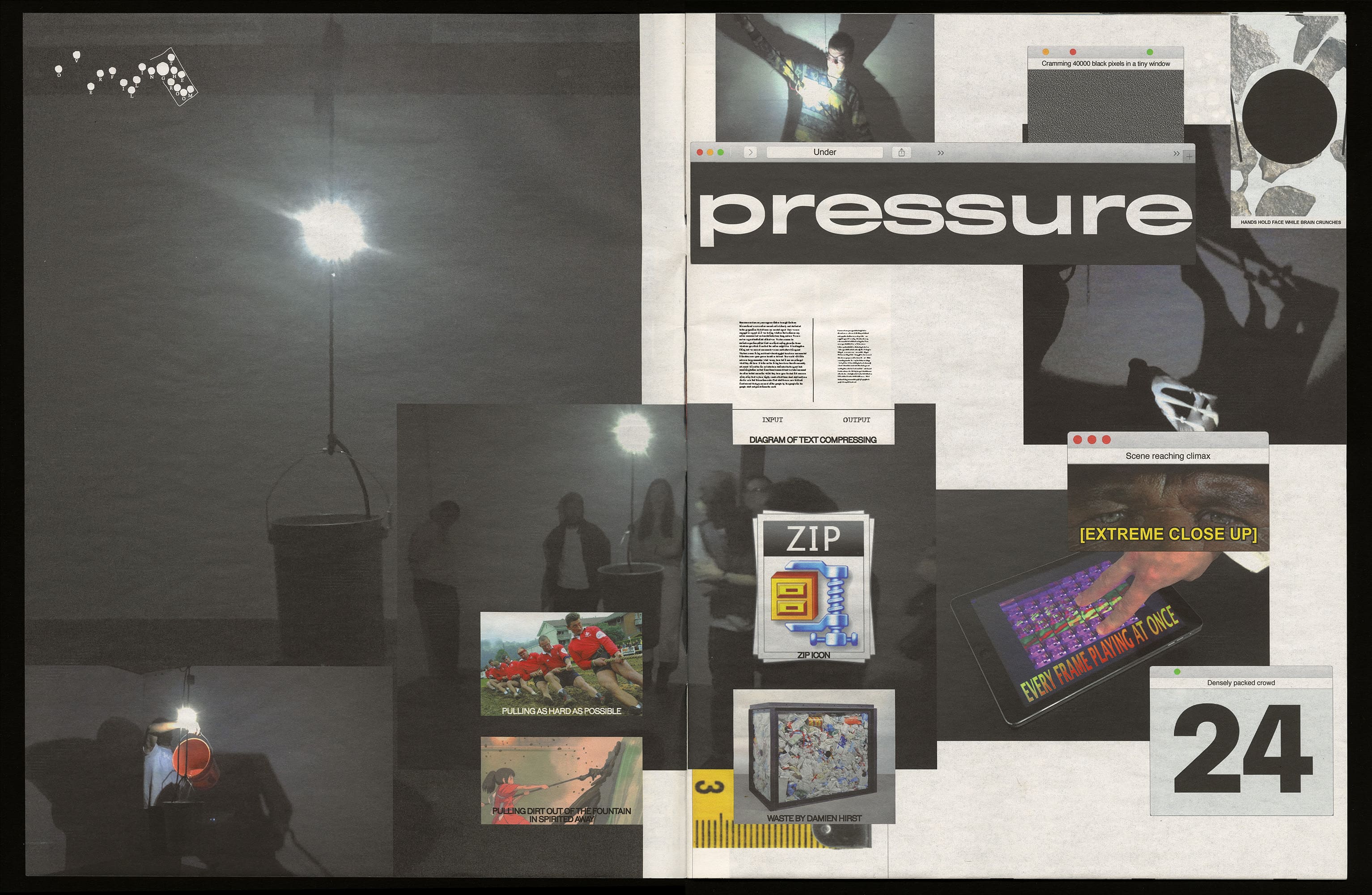
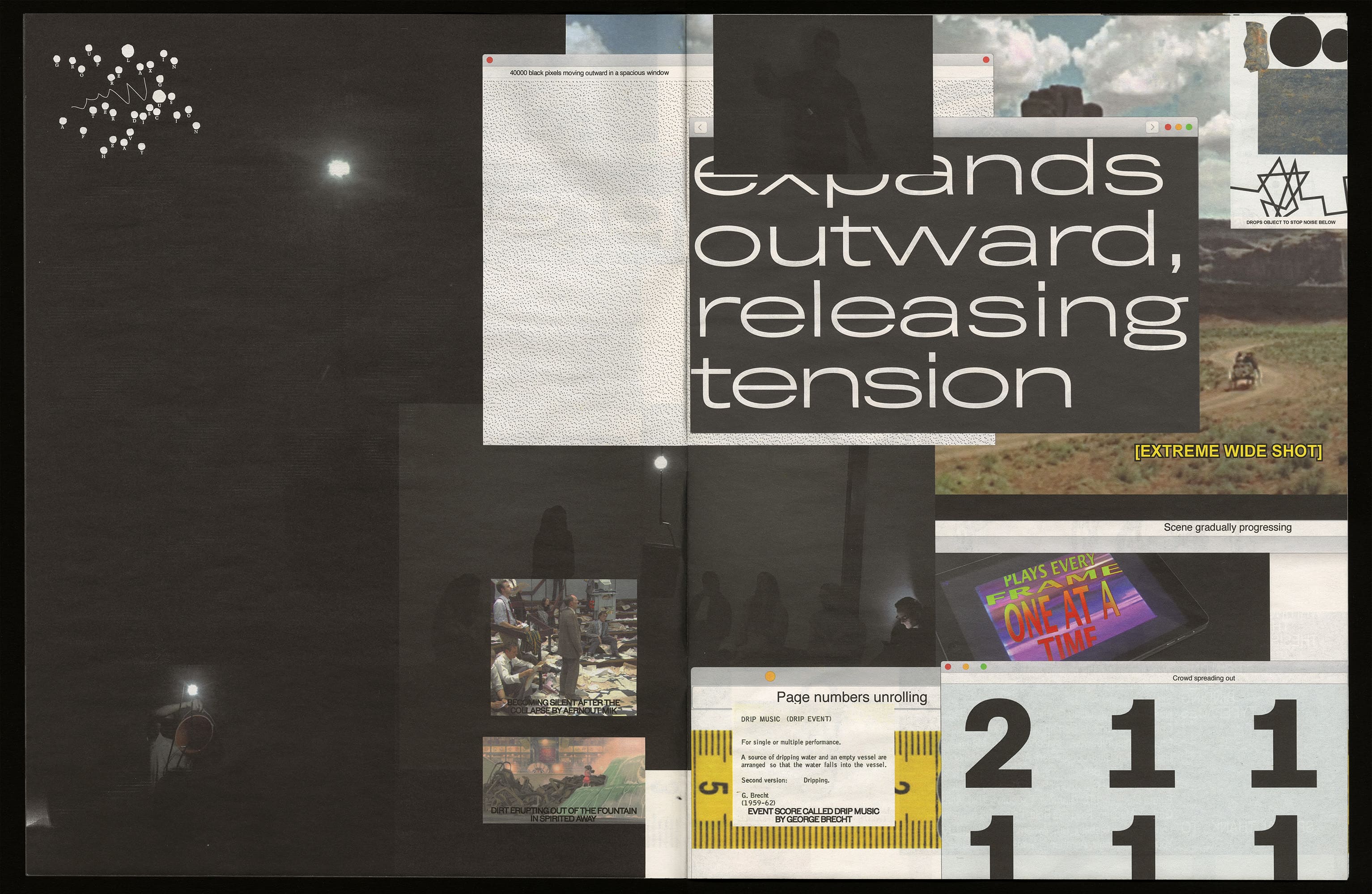
Packed is a website exploring what compression means in the space of a browser. It consists of a series of pop up windows that shrink or expand their content as their windows get resized.
Black White is a mobile game that encourages collaboration instead of rivalry. In it two opposing players around the world are connected at random. To advance in the game, the two players have to work together to grow the territory of the map.
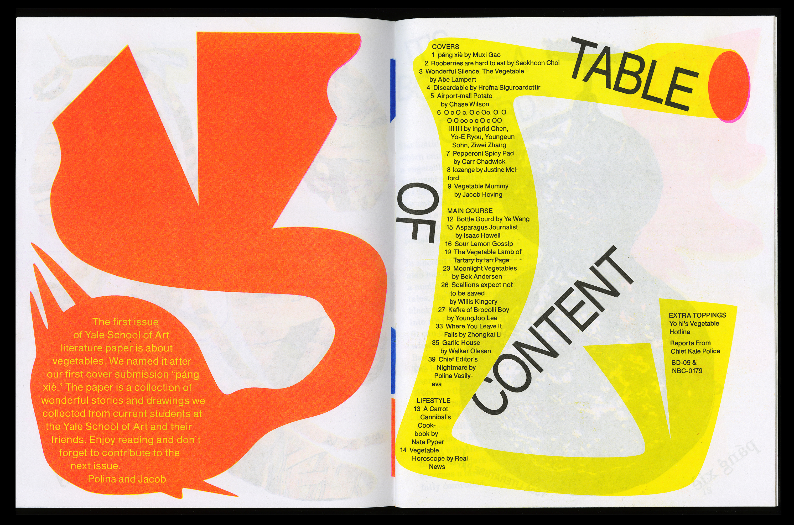
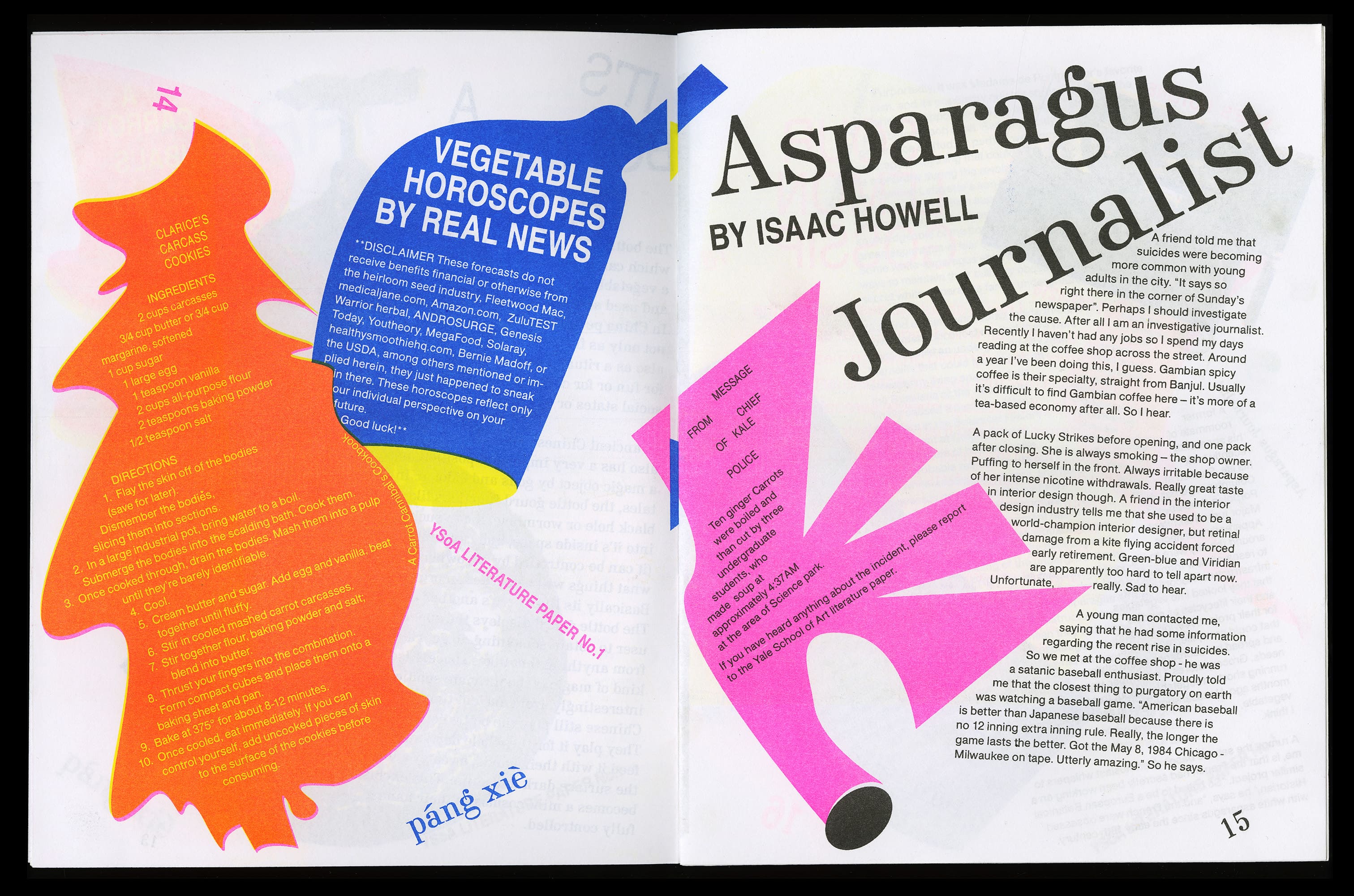
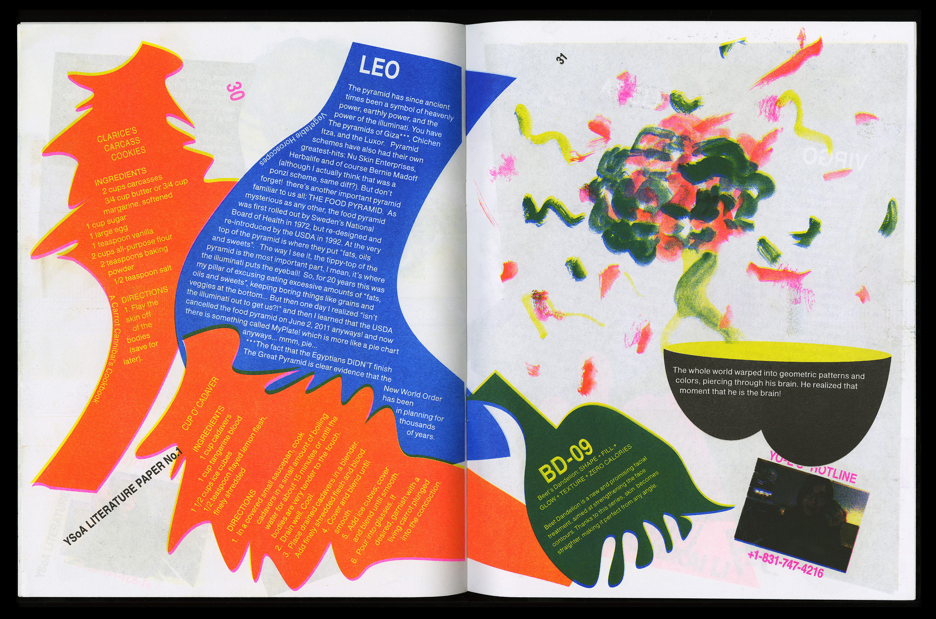
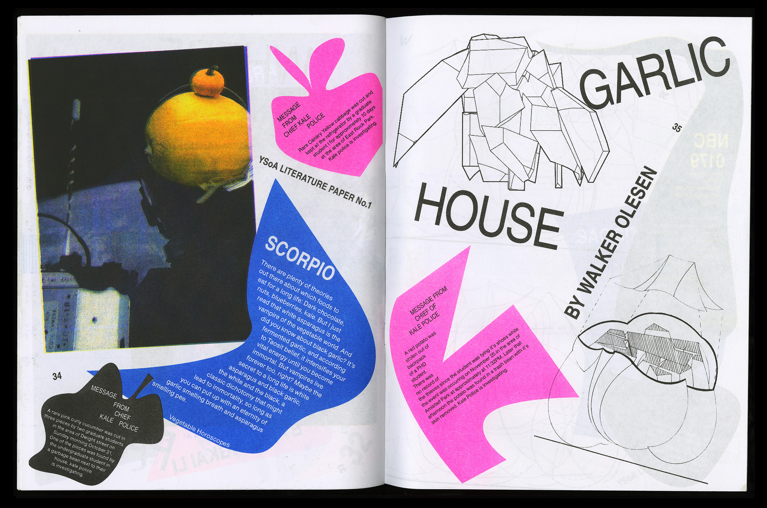
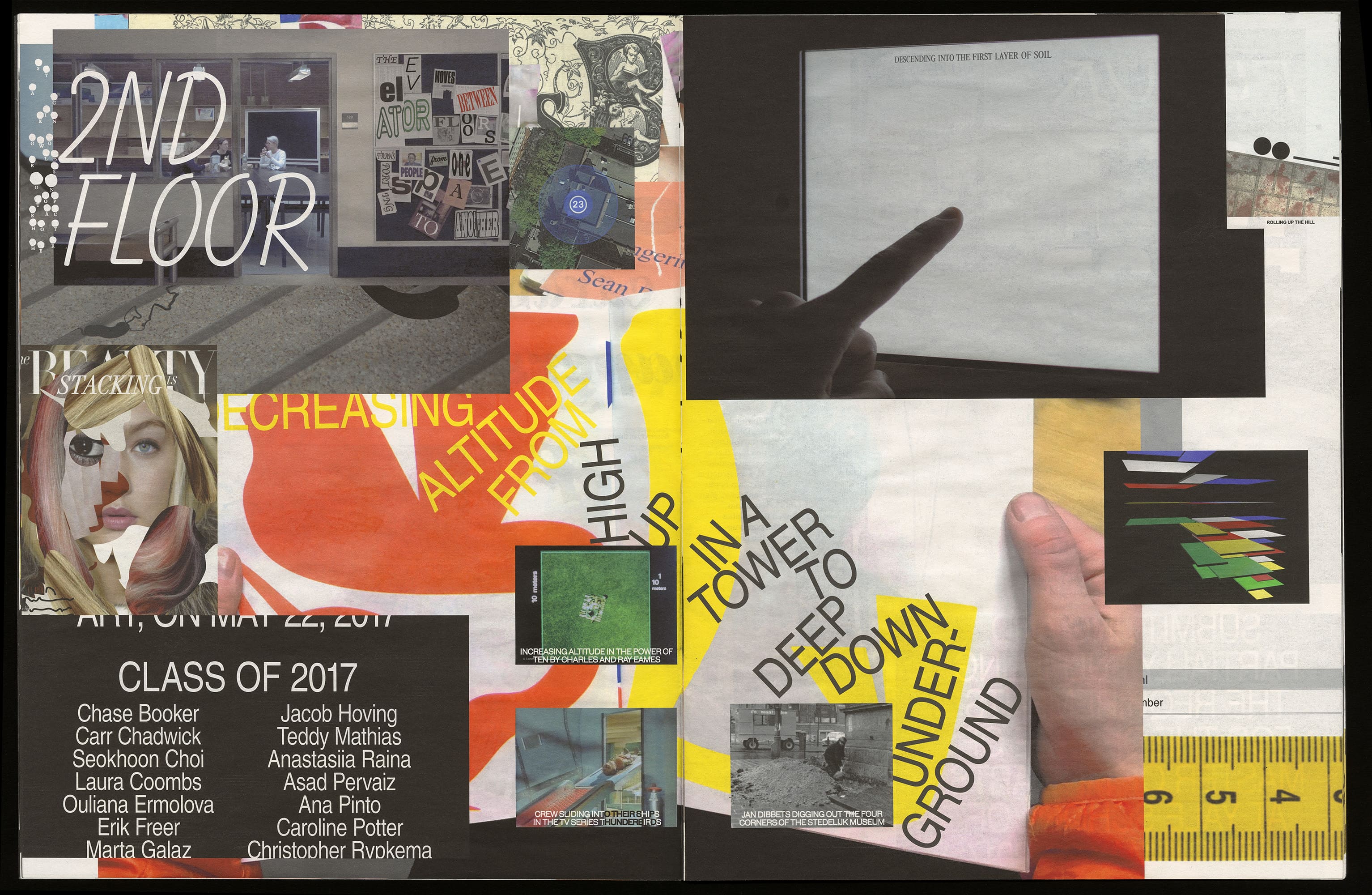
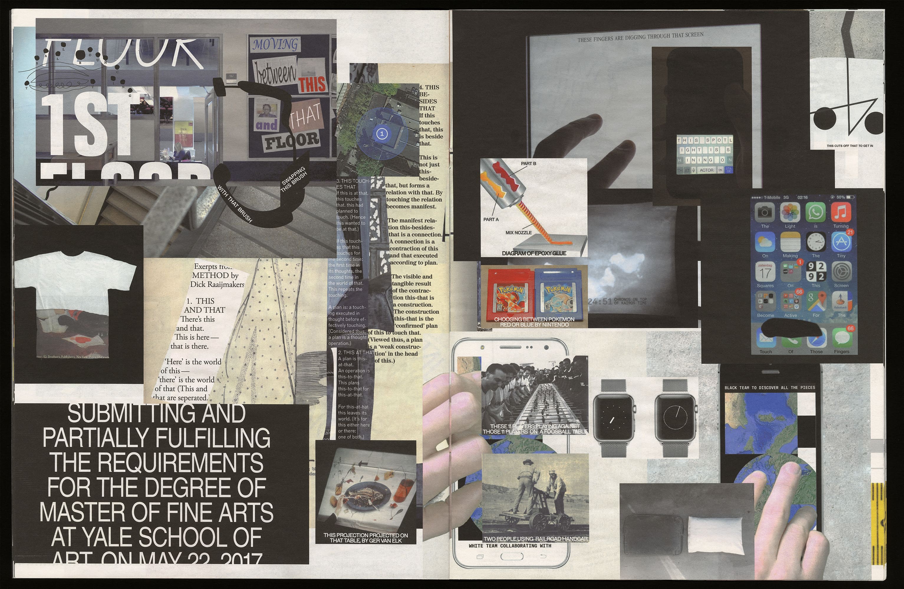
Yale School of Art Paper is a self-published magazine with students’ contributions from the School of Art. The aim was to create a platform where work from all the departments could come together and share their voices. For this issue we asked students to create writing and imagery about fictional vegetables. Edited and designed in collaboration with Polina Vasilyeva.
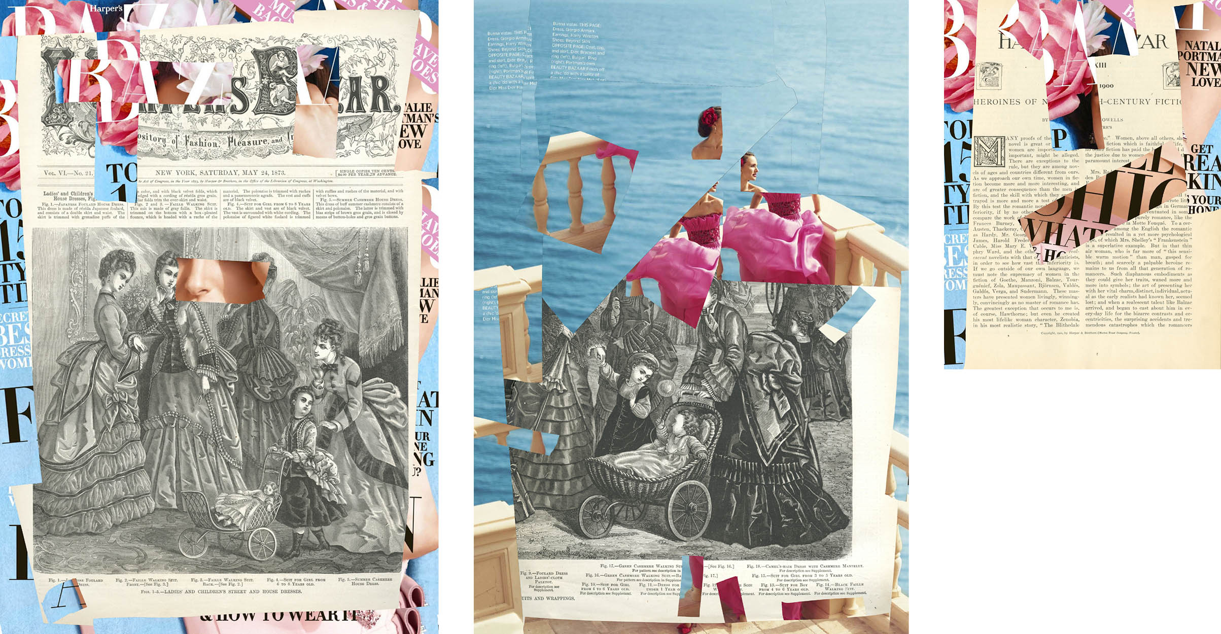
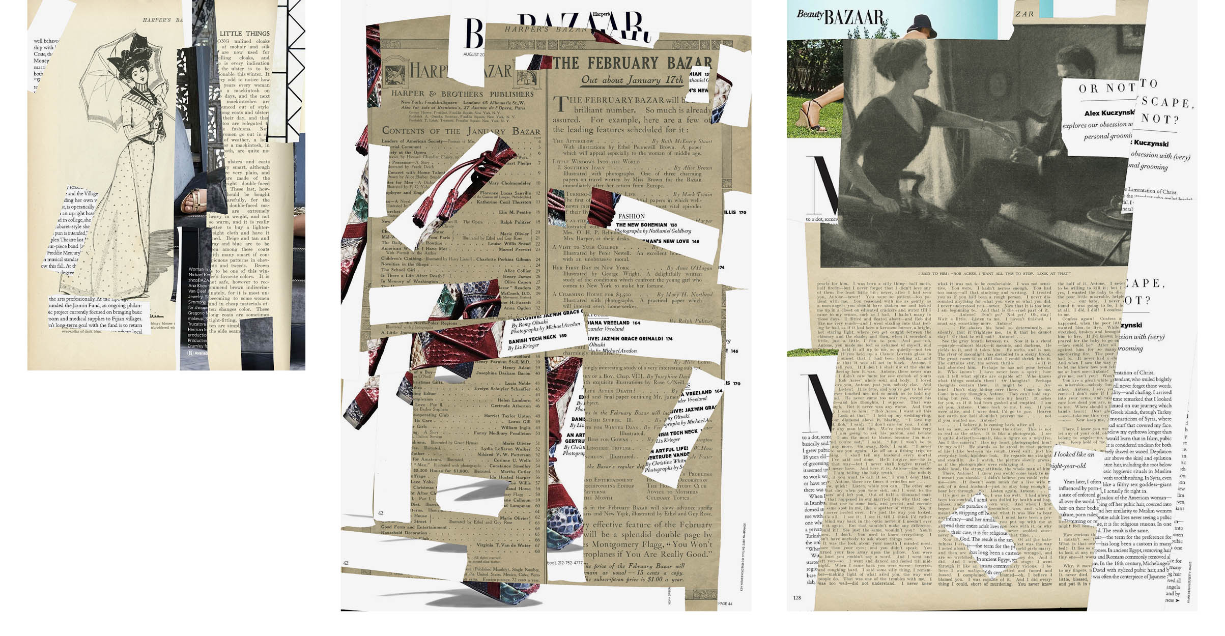
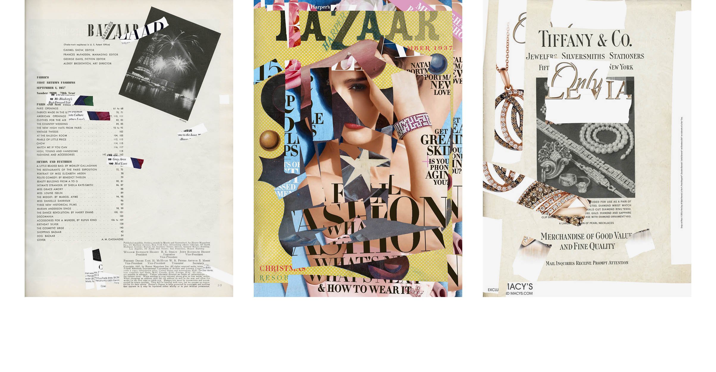
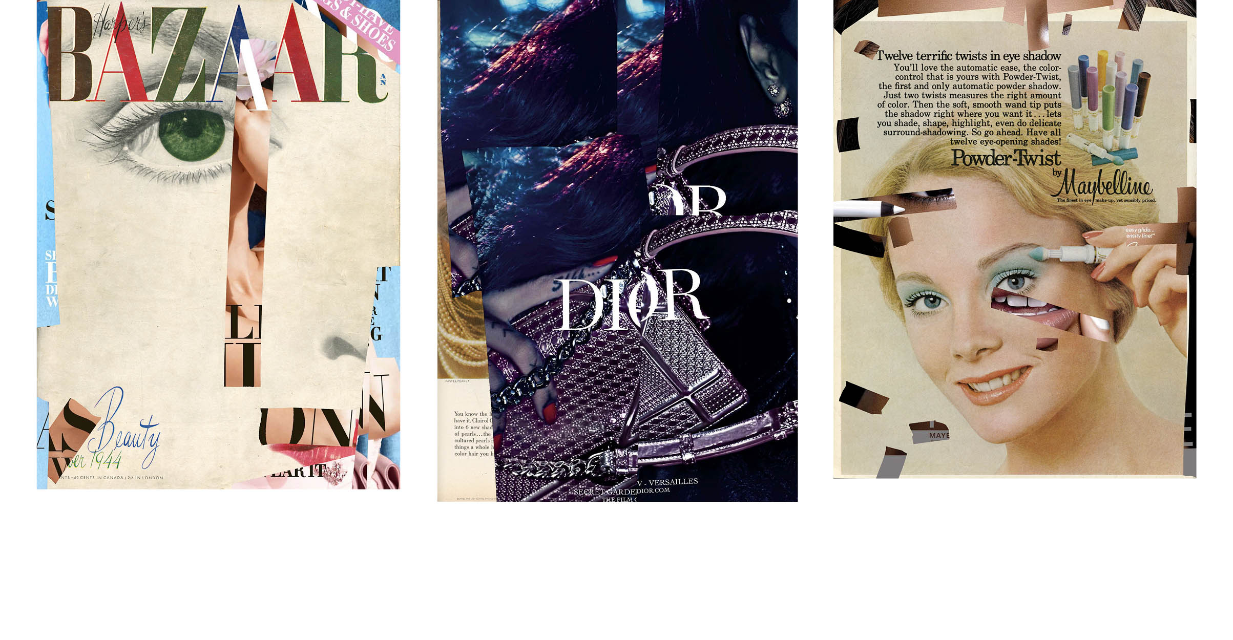
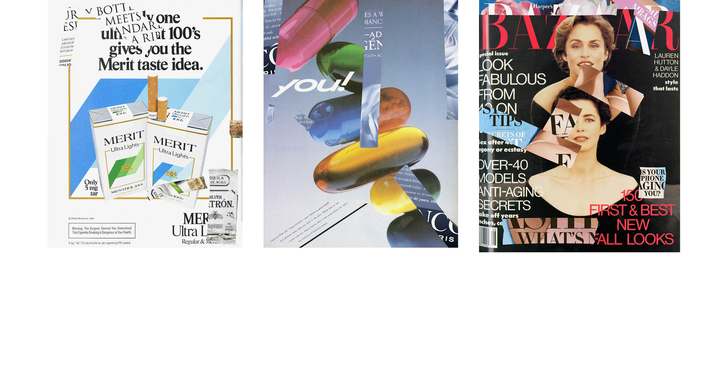
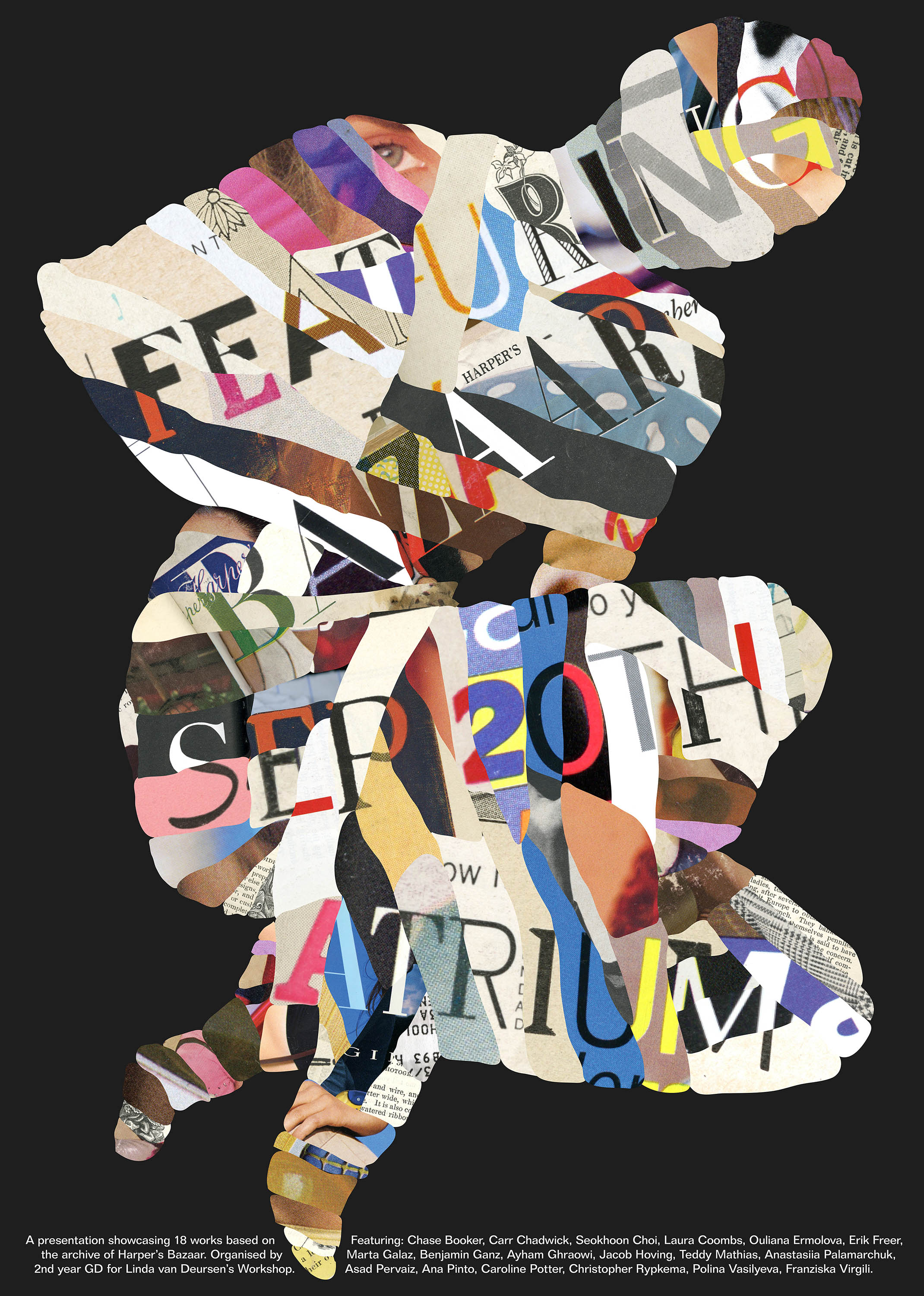
Archiving Beauty is a Poster series that attempts to repair Yale’s deteriorated archive of Harper’s Bazaar, by pasting the latest issue over it. The series explores the contradiction inherent in archiving fashion. Monthly released issues displaying the latest beauty and fashion, are kept in an archive where they slowly become outdated, fade, and crumble.
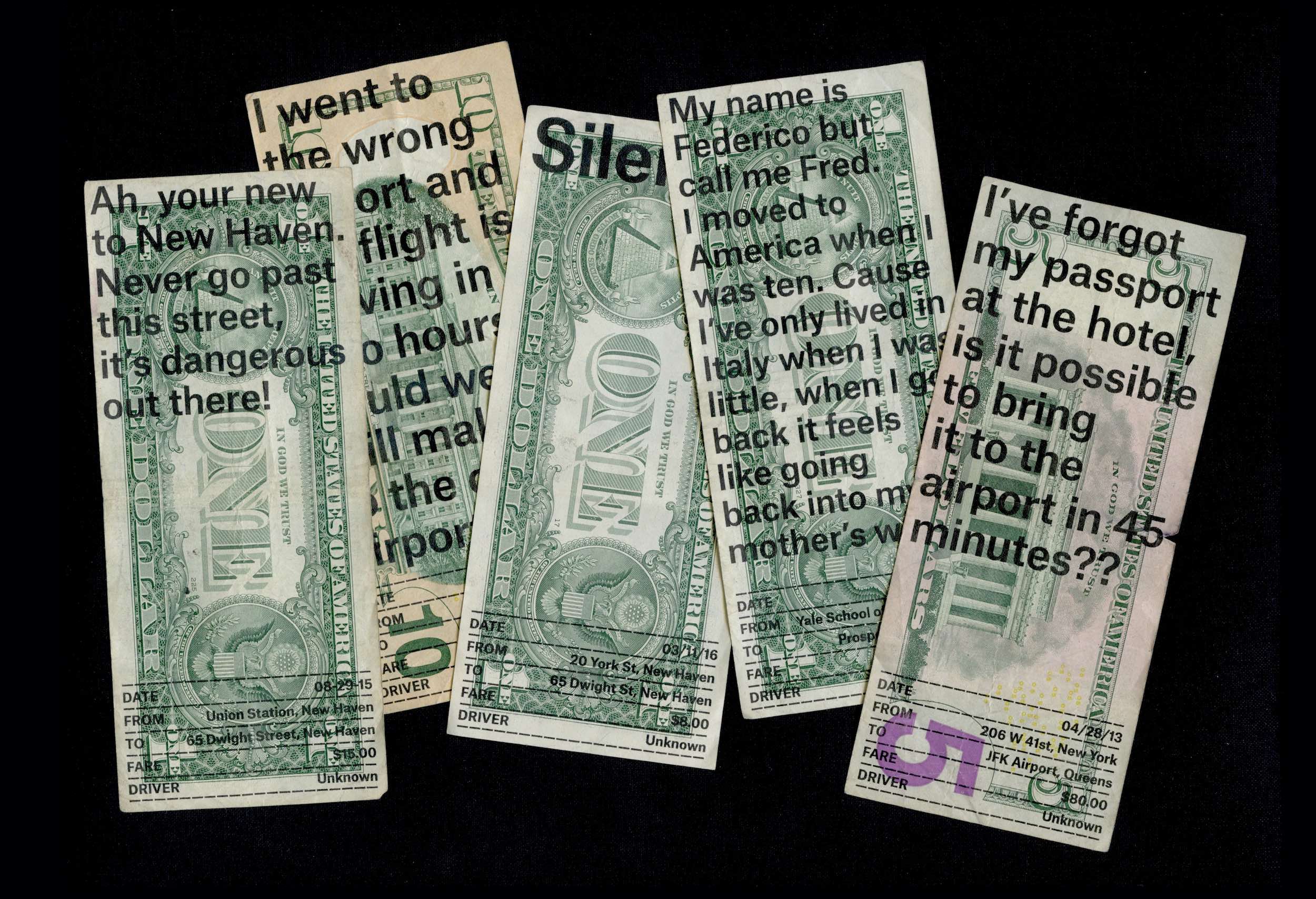
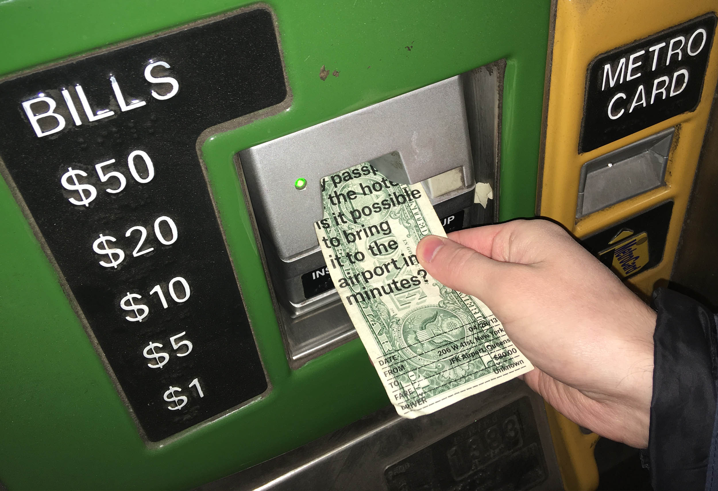
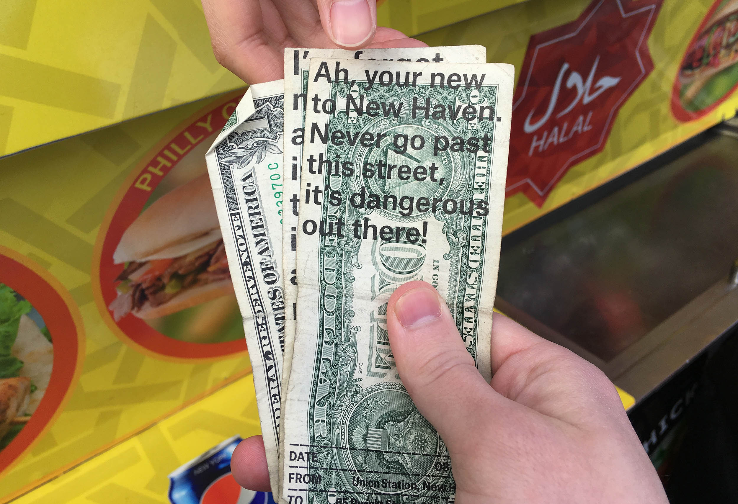
Noteworthy Rides is a series of notes from memorable rides that I took with taxi drivers. The notes are overprinted on dollar bills and distributed through the circulation of money.
Out of Touch is a video imagining an interface that turns to darkness the more it’s touched.